
Brook Thistle
Sans serif1 style24 languages
Pro · plan or Pass
A a g R Aa
Sans serif · 1 style · 79 characters · Version 0.1.2 · Published November 5, 2026
Kite Grotesk gives its upright sans lettering a rounded, even stroke. The open C and curled g keep those soft forms from becoming a row of closed circles, while the diagonal leg of R adds a sharper break in a short heading.
Aa
AagR
Direction
Try the actual title in Kite Grotesk before building the surrounding layout: an open C, a descending g, and a diagonal R give more useful checkpoints than the geometric label by itself.
Google Design uses repeating geometric shapes to describe Product Sans. That gives a useful vocabulary for looking at Kite Grotesk's bowls and open curves; it does not document a connection between the two fonts.
Here, O supplies a closed rounded contour, while C opens the right side and G adds an inward bar. These outlines support a rounded geometric description without implying every letter is a perfect circle or that the font shares another family's proportions.
The source concerns Google's own typefaces. The observations below concern this Kite Grotesk file only; neither authorship nor historical descent is inferred.
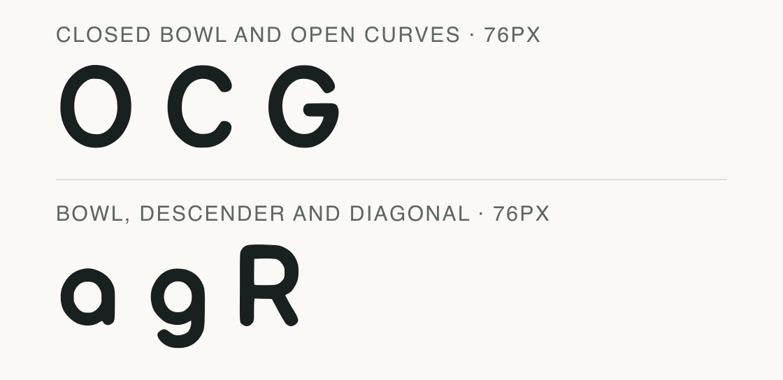
Google Design on geometric shapes and display use — The source discusses geometric shape repetition in Product Sans and separate work on smaller reading sizes. It establishes vocabulary, not Kite Grotesk ancestry.
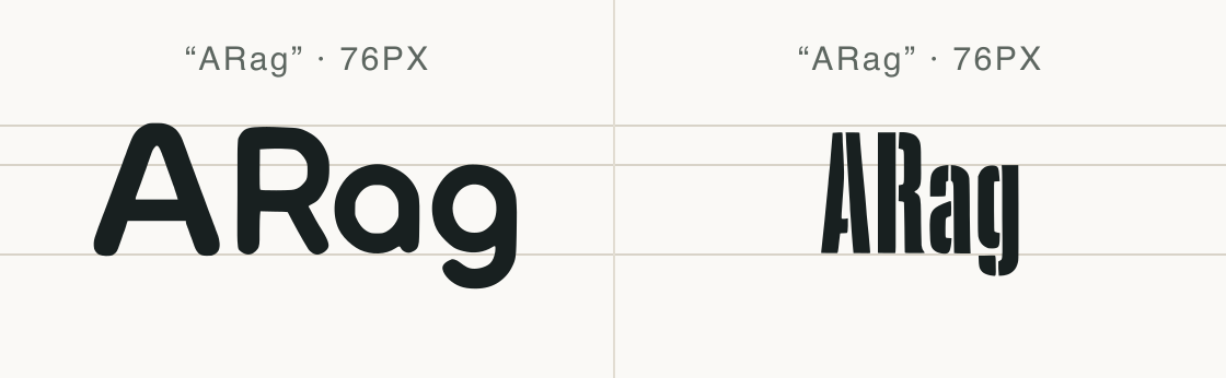
The ARag sample keeps the same pixels per em in Kite Grotesk and Acorn Birch. The comparison makes the shapes and layout space visible together without stretching either font.
In Kite Grotesk, the closed bowl of a sits on the baseline while g turns below it. R combines that rounded vocabulary with a sloping leg. Compare Acorn Birch's actual outlines below before choosing it for the same title; equal type size does not guarantee equal visual weight or width.
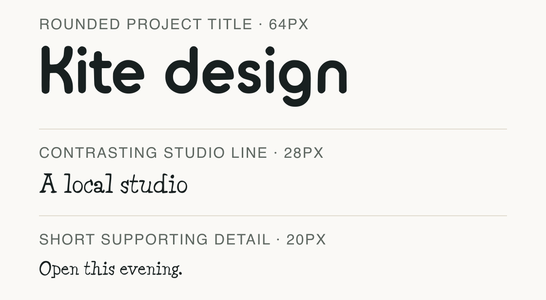
Kite Grotesk sets the title while Acorn Vetch supplies a more irregular serif rhythm below. This is a studio-card concept rather than a tested interface system.
Test
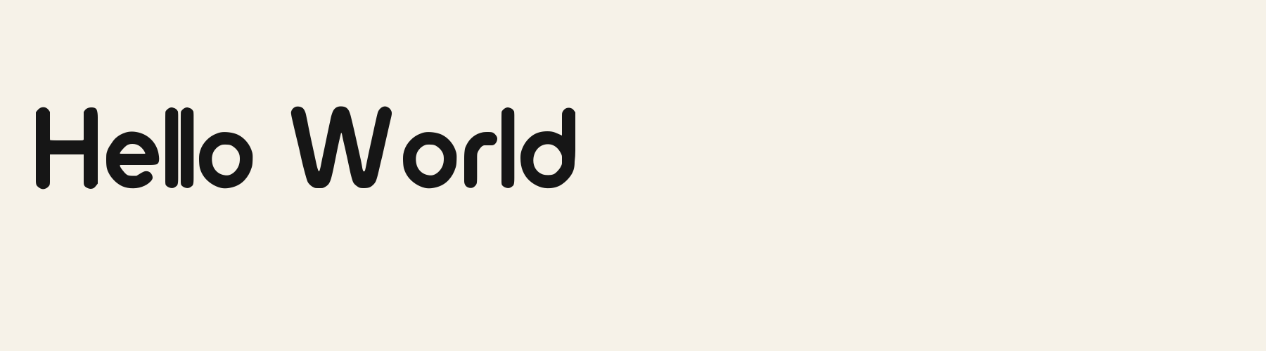
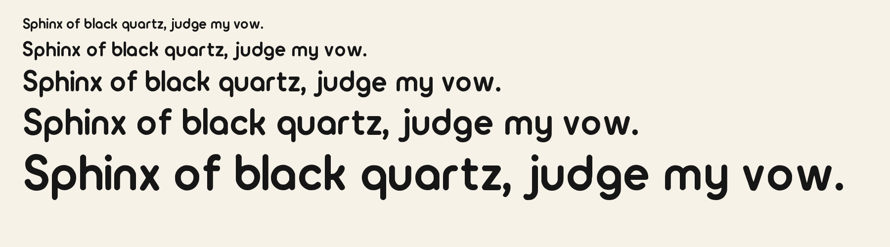
Type the words you plan to use and adjust size, line height, and letter spacing. The preview uses the final font file.
The quick brown fox jumps over the lazy dog
Like how it sets? It comes with Pro or Studio, or as a Font Pass pick for personal projects.
Get this fontSpecimens
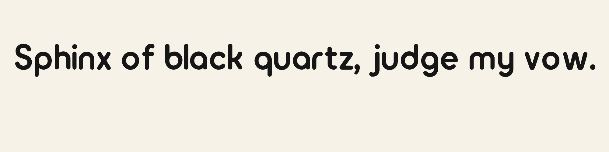
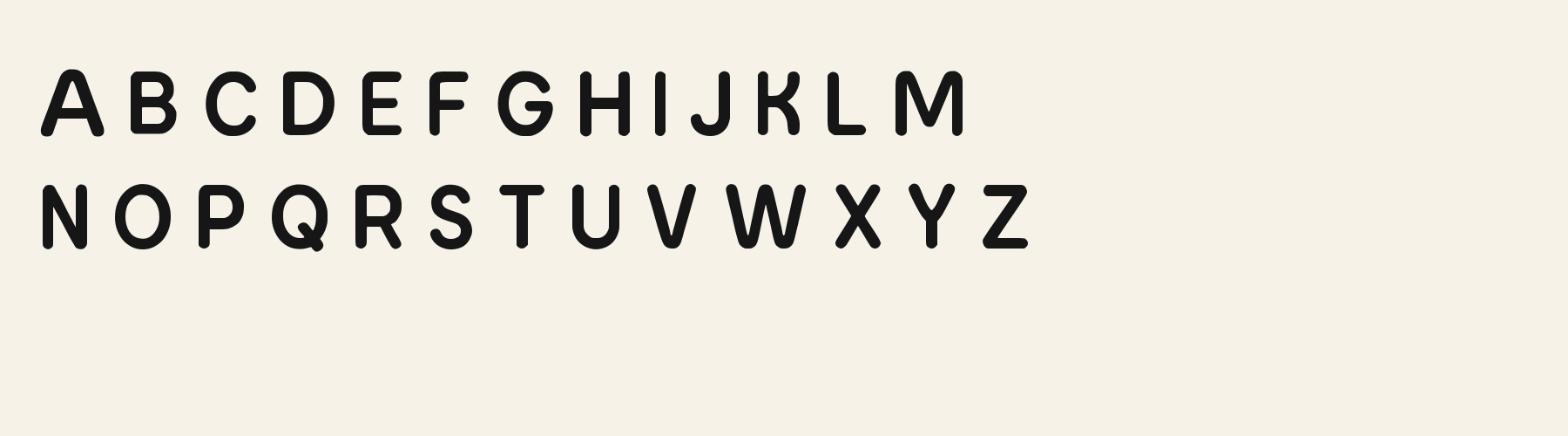
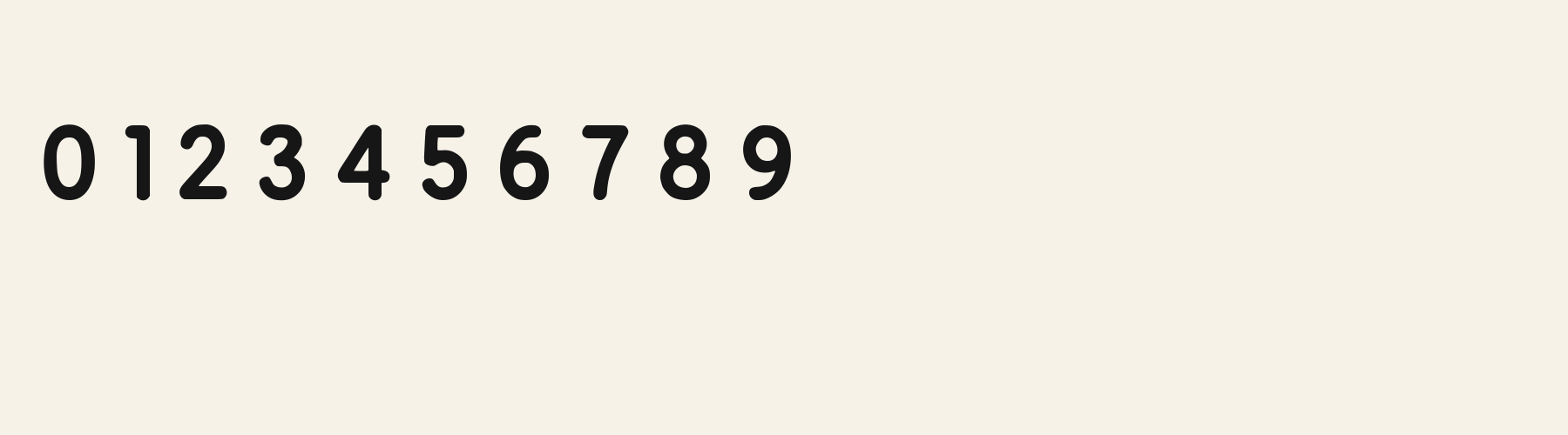
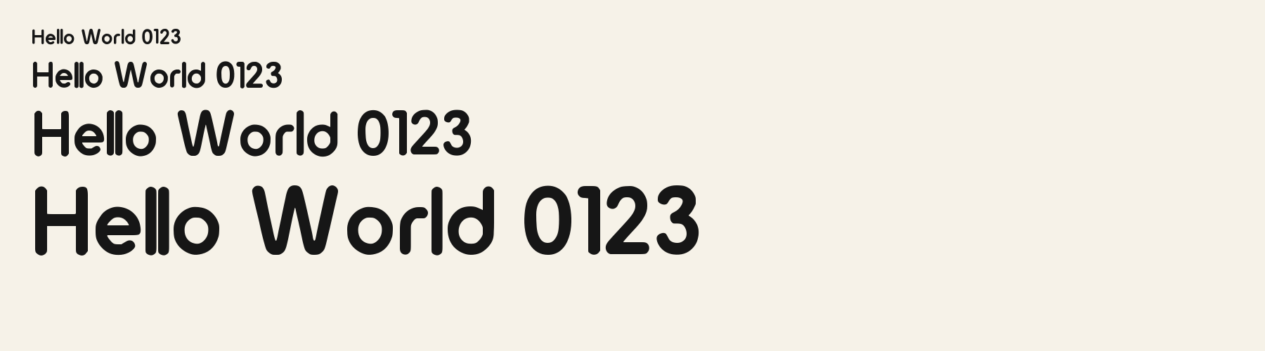
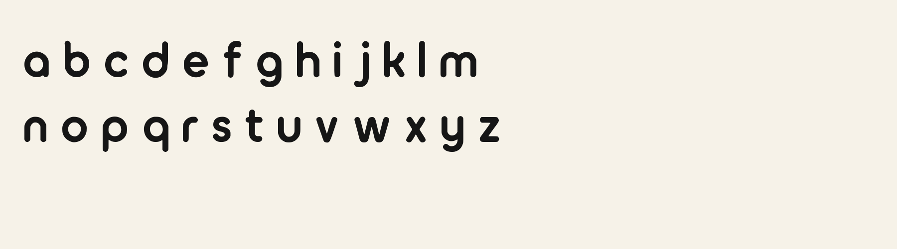
Rendered from the font files, without retouching.
Choose
The C ends in rounded tips with a clear opening on its right side.
The single-storey a has a closed bowl and a straight right stem; g adds a curved descender below its bowl.
The R joins a rounded upper bowl to a diagonal leg, contrasting with the simpler open curve of C.
Good for
A compact English project title, a name on a studio card, or a brief navigation heading can use Kite Grotesk's rounded outlines without asking it to carry accented names or currency symbols.
Check before using
Choose another face for text requiring accented letters, prices with currency signs, or unsupported operators. The rounded style label alone does not establish how a dense passage will read.
About
Kite Grotesk's lowercase x reaches 69.6% of the capital height, close to the 69.6% median for sans serif fonts. Ascenders on b, d, h, k and l line up with the capitals (99.7% of their height), and descenders on g, j, p, q and y drop 26.3% of the cap height below the baseline. The o is close to a circle, 0.96 times as wide as it is tall, and W is the widest capital, at 1.61 times the width of H. Round letters overshoot: O rises 1.1% of the cap height above H and dips 0.4% below the baseline.
The letters stand upright, leaning less than 2.5° either way. Vertical stems measure 17.4% of the cap height. It is close to monoline, with the sides of o and O 1.02 times as thick as their tops and bottoms.
Its 78 characters include 52 Latin letters, plus 26 figures, punctuation marks and symbols; there are no accented Latin letters beyond A to Z. The word space measures 32.5% of the cap height, and the blank space either side of a lowercase letter takes up 14.6% of its width. Spacing is adjusted with 4,135 kerning pairs, the most of all 1 sans serif fonts. The tightest of them is wT, which closes up by 30.2% of the cap height. The figures have different widths, so columns of numbers set in Kite Grotesk will not line up exactly.
Measured from the version 0.1.2 font file. Comparisons are with the 1 published library fonts measured on November 4, 2026, 1 of them sans serif fonts.
Characters
Download
Choose the license that matches your project before downloading.
See plans or browse fonts that are free to download.
Client work, products and redistribution need a commercial license. Library fonts include it with Pro or Studio; fonts you make include it when you make them on Pro or Studio. A Font Pass is for personal projects.
TTF · OTF · WOFF · WOFF2
Tools
Free tools that run in your browser. Images you make with them, such as a signature PNG, can be used for any purpose.
Similar
Sans serif1 style24 languages
Compared with Kite Grotesk: 26% narrower · heavier strokes
Sans serif1 style37 languages
Compared with Kite Grotesk: Taller x-height · 17% wider
Sans serif1 style37 languages
Compared with Kite Grotesk: Taller x-height · 7% wider
Sans serif1 style5 languages
Compared with Kite Grotesk: 42% narrower · taller x-height
Method
The supplied font files were checked for the characters and letter shapes shown here. AI helped describe the visible forms and draft the examples; each sample uses the named font file. Previews are illustrative, and file measurements come from the delivered files.
The current text and font-file specimens received an independent review.
For R, Acorn Birch reserves 0.332 em versus 0.637 em in Kite Grotesk. Its narrower advance can help when that capital repeats in a compact heading.
Acorn Vetch gives g a 0.424 em advance; here it is 0.593 em. The alternative sets that character more tightly.
FAQ