
Candy Heart Slab
Serif1 style38 languages
Pro · plan or Pass
a g R S & Aa
Serif · 1 style · 370 characters · Version 0.1.1 · Published November 5, 2026
Acorn Vetch sets a narrow, gently irregular serif rhythm. In the checked German and Portuguese lines, the accented characters sit within rounded, slightly curled forms; the English row makes the capital A and lowercase g easy to inspect. The overall impression comes from these fixed samples rather than a claim about historical origin.
Aa
agRS&
Direction
Try the exact name you plan to use in your own layout; the specimen shows which sample characters this version maps, not what every application will substitute.
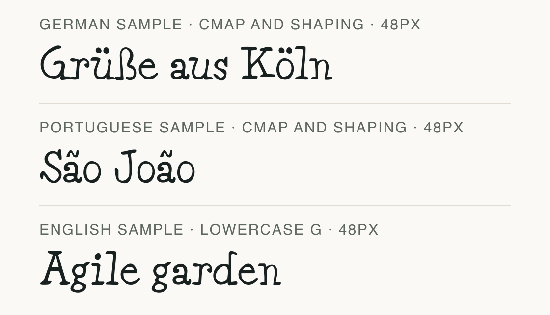
These short, public test strings are checked against Acorn Vetch locally. The German and Portuguese lines below contain accented letters; they are examples for inspecting this file, not text collected from a user.
A successful mapping means the font file contains glyphs for the displayed characters and its shaped run has no missing glyph. It does not prove support for every spelling, combining sequence, or text entry method.
For private copy, run the same check locally and discard the text after checking. If a character is absent, choose a supported spelling or test a deliberate fallback before exporting the layout.
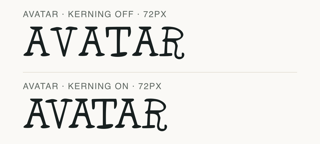
Acorn Vetch declares kerning support. This paired sample lets you inspect how the uppercase sequence AVATAR spaces when the feature is disabled or enabled in the preview renderer.
Compare the joins around A and V at the same size. The feature setting describes this renderer's specimen; spacing may differ in other software or after tracking is changed.
No alternate letter shapes are claimed here. The page focuses on the tested spacing path for this exact text and file.
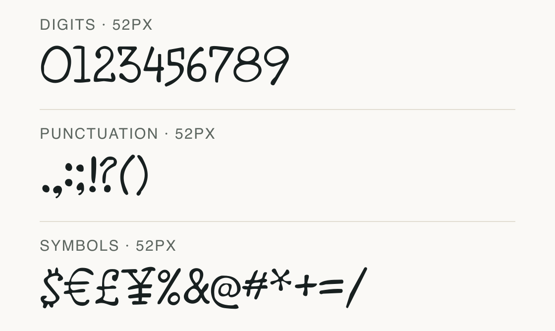
The sample separates the common groups that matter in short labels and prices. Every character shown here maps in the inspected Acorn Vetch file.
Test
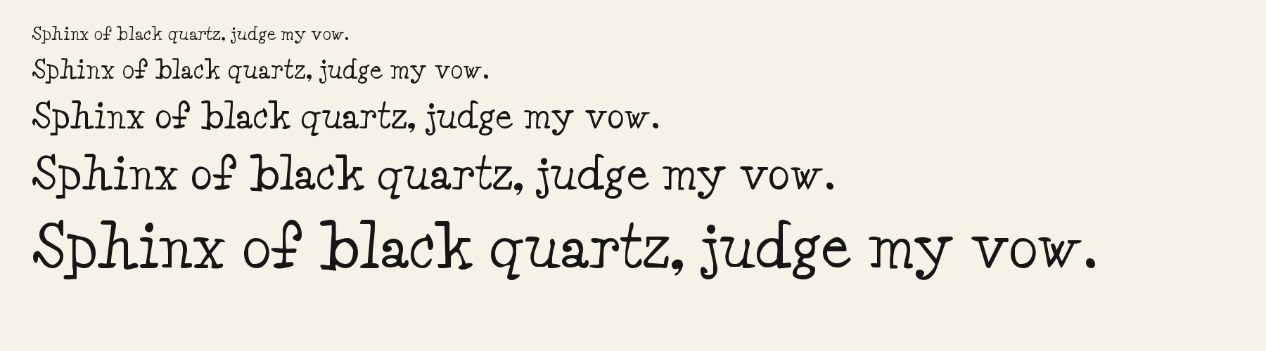
Type the words you plan to use and adjust size, line height, and letter spacing. The preview uses the final font file.
The quick brown fox jumps over the lazy dog
Like how it sets? It comes with Pro or Studio, or as a Font Pass pick for personal projects.
Get this fontSpecimens
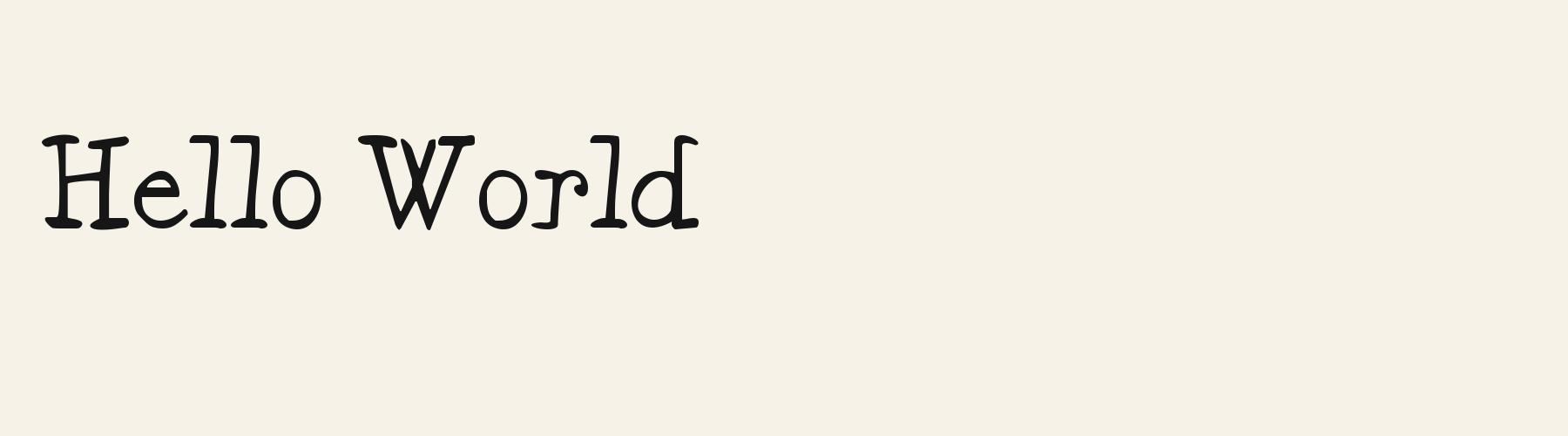
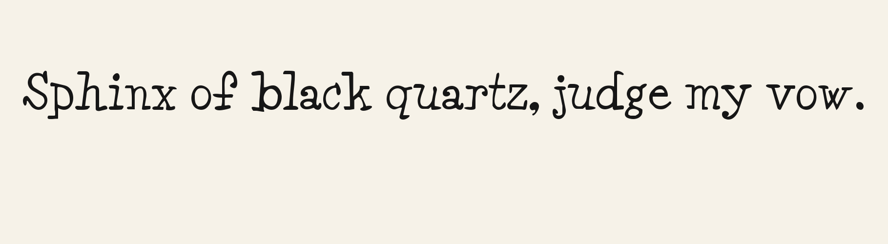
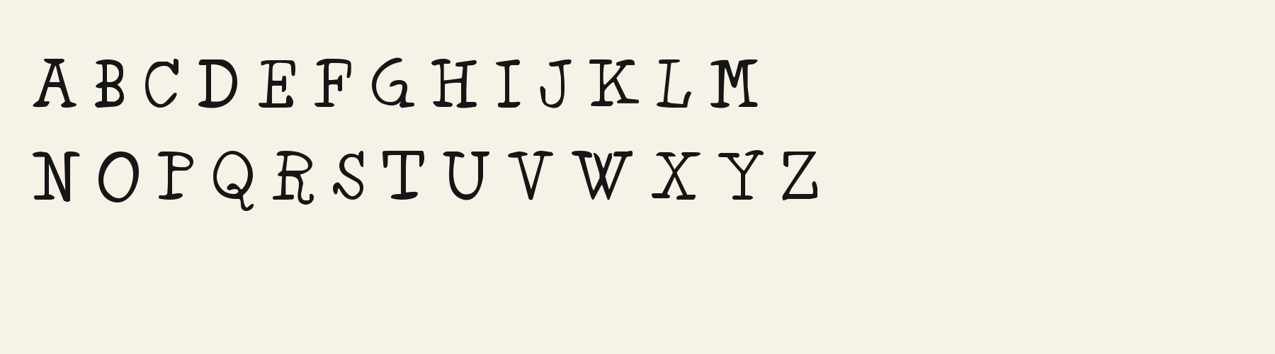
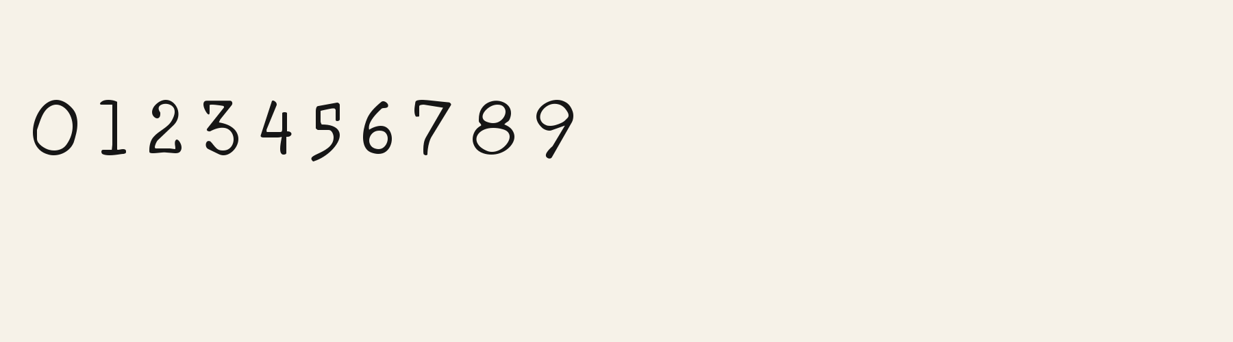
Rendered from the font files, without retouching.
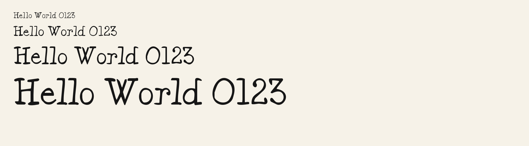
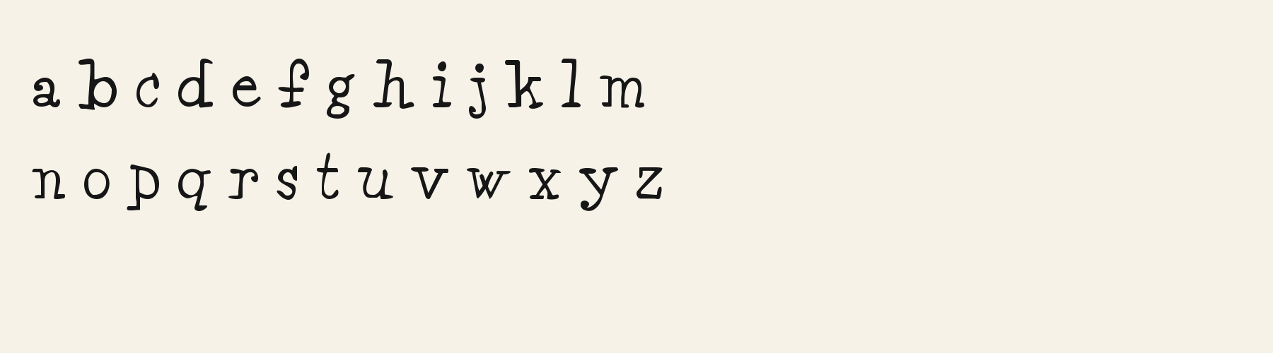
Choose
The capital A has a broad, blunt cap with short horizontal extensions at its top in the rendered sample.
The lowercase g is double-storey, with an upper bowl, a small ear, and a closed lower loop.
German and Portuguese test strings include their accented characters in this file’s cmap.
Good for
Use the language checks when setting a short German or Portuguese name, title, or label and you want to see the exact characters tested in this file.
Check before using
These fixed samples do not verify every word, combining-mark sequence, or language. A line that needs a character absent from the font must be revised or set with a separately checked fallback.
About
Its x-height is 64.4% of the cap height, near the 64.4% typical of serif fonts in the library. Ascenders on b, d, h, k and l line up with the capitals (100% of their height), and descenders on g, j, p, q and y drop 23.2% of the cap height below the baseline. The o is an upright oval, 0.81 times as wide as it is tall, and W is the widest capital, at 1.29 times the width of H. The O stops 0.7% of the cap height short of H and dips 4.6% below the baseline.
The letters stand upright, leaning less than 2.5° either way. Vertical stems measure 8.6% of the cap height. Strokes keep nearly one thickness in every direction: the sides and the tops of o and O differ by 2%.
Its 369 characters include 241 Latin and 2 Greek letters, plus 126 figures, punctuation marks and symbols; 189 of the Latin letters are accented or special forms beyond A to Z. The word space measures 34% of the cap height, and the blank space either side of a lowercase letter takes up 4.9% of its width. Spacing is adjusted with 7,419 kerning pairs, the most of all 1 serif fonts. The tightest of them is PA, which closes up by 20.8% of the cap height. The figures have different widths, so columns of numbers set in Acorn Vetch will not line up exactly.
Measured from the version 0.1.1 font file. Comparisons are with the 1 published library fonts measured on November 4, 2026, 1 of them serif fonts.
Příliš žluťoučký kůň úpěl ďábelské ódy.
Victor jagt zwölf Boxkämpfer quer über den großen Sylter Deich.
Árvíztűrő tükörfúrógép.
Quel vituperabile xenofobo zelante assaggia il whisky ed esclama: alleluja!
Pchnąć w tę łódź jeża lub ośm skrzyń fig.
À noite, vovô Kowalsky vê o ímã cair no pé do pinguim queixoso.
Înjurând pițigăiat, zoofobul comandă vexat whisky și tequila.
El veloz murciélago hindú comía feliz cardillo y kiwi.
Flygande bäckasiner söka hwila på mjuka tuvor.
Pijamalı hasta yağız şoföre çabucak güvendi.
Characters
Download
Choose the license that matches your project before downloading.
See plans or browse fonts that are free to download.
Client work, products and redistribution need a commercial license. Library fonts include it with Pro or Studio; fonts you make include it when you make them on Pro or Studio. A Font Pass is for personal projects.
TTF · OTF · WOFF · WOFF2
Tools
Free tools that run in your browser. Images you make with them, such as a signature PNG, can be used for any purpose.
Similar
Serif1 style38 languages
Compared with Acorn Vetch: Heavier strokes · 32% wider
Serif1 style26 languages
Compared with Acorn Vetch: 26% wider · heavier strokes
Serif1 style21 languages
Compared with Acorn Vetch: 47% wider · heavier strokes
Serif1 style17 languages
Compared with Acorn Vetch: 55% wider · heavier strokes
Method
The font files were checked locally for the characters shown, and the samples were rendered with the named fonts. AI helped describe the observed letterforms and draft sample compositions. These are specimen examples, not customer work; preview settings are illustrative.
The current text and font-file specimens received an independent review.
For R, Amber Brook reserves 0.673 em versus 0.634 em in Acorn Vetch. Its wider layout space can change a short title’s line break.
Acorn Birch gives g a 0.289 em advance; here it is 0.424 em. The alternative sets that character more tightly.
FAQ