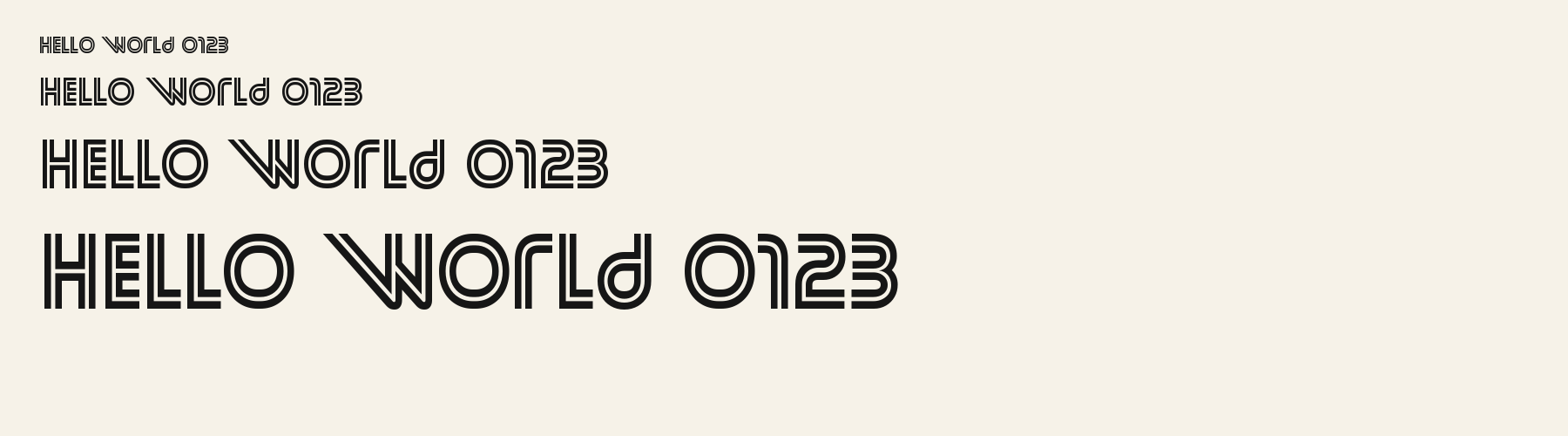
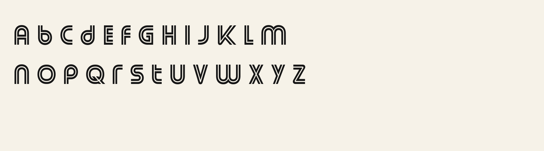
Bracken Quill Double Line Geometric Font

a g R S & Aa

AI-generated

Sans serif · 1 style · 366 characters · Version 0.1.1 · Published November 5, 2026

Personal use
With Pro or Studio, or as one of 5 Font Pass picks ($4.99 once, no subscription).
Commercial use
With Pro, $19/mo, or $15/mo billed $180 a year. Fonts you download on the plan stay licensed after it ends.
Get this fontTry it first

Bracken Quill outlines each capital with a second inner contour, making the forms read as hollow strokes rather than solid ink. The repeated AVATAR sample shows how the double line behaves around diagonal joins and rounded forms.

Aa

agRS&

Bracken Quill366 characters · 1 style

Direction

Bracken Quill: language coverage

Preflight the exact copy and test the narrowest display size before placing the outlined letters next to fine UI text.

Check the exact text in the outline file

A character can exist in the font even when its doubled contour looks crowded in a particular word. This preflight verifies mapping and shaping for a real sample, then leaves the visual decision to the final layout.

The measured file passes English, German, French, Spanish, Italian and Portuguese full repertoires. This is a bounded test set; it does not establish every language or special symbol.
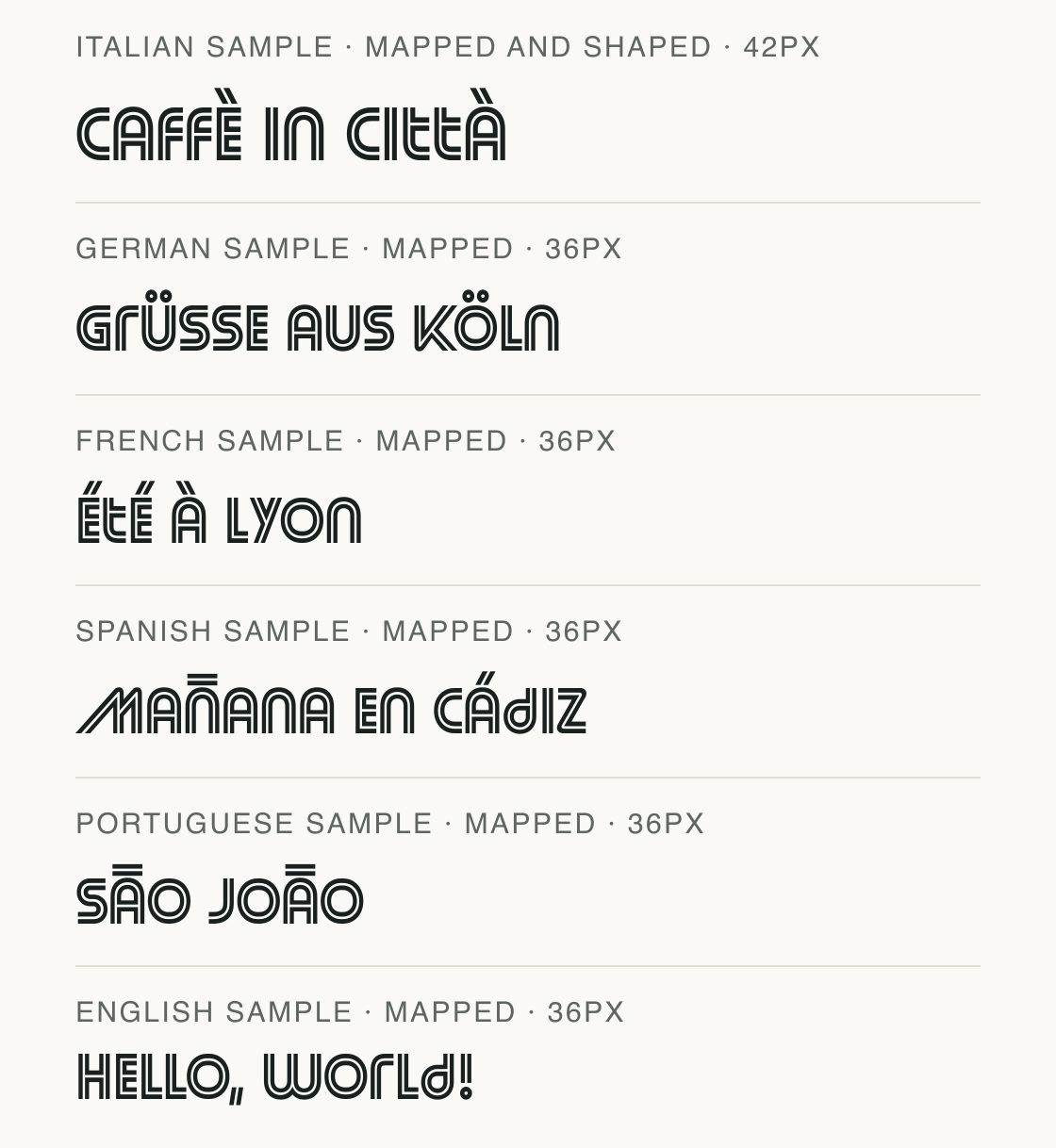
Check the exact text in the outline file: Italian sample · mapped and shaped; German sample · mapped; French sample · mapped; Spanish sample · mapped; Portuguese sample · mapped; English sample · mapped
Italian sample · mapped and shaped: Caffè in città (42px) · German sample · mapped: Grüße aus Köln (36px) · French sample · mapped: Été à Lyon (36px) · Spanish sample · mapped: Mañana en Cádiz (36px) · Portuguese sample · mapped: São João (36px) · English sample · mapped: Hello, world! (36px). Font-file rendering; preview settings, not a customer project.

Compare default spacing with kerning disabled

This same word is drawn twice at the same preview size. The second line disables the `kern` feature; inspect the joins around A and V to see whether spacing changes in this file.

The control is the font’s real shaping behavior. If the difference is subtle at this size, use the text sample to check the letters at the scale of your intended heading.
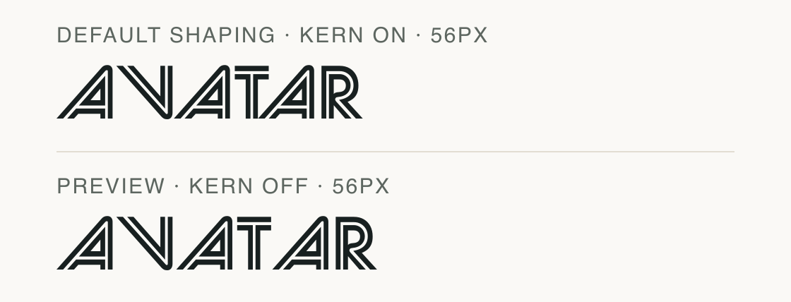
Compare default spacing with kerning disabled: Default shaping · kern on; Preview · kern off
Default shaping · kern on: AVATAR (56px) · Preview · kern off: AVATAR (56px). Font-file rendering; preview settings, not a customer project.

Bracken Quill: characters and symbols in brief

Common marks alongside outlined capitals

The character test maps digits, punctuation and the listed currencies in this file. Use the actual symbol line when checking a price or label so that the second contour has room to show.
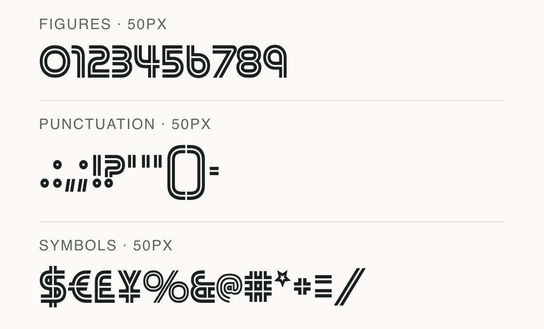
Common marks alongside outlined capitals: Figures; Punctuation; Symbols
Figures: 0123456789 (50px) · Punctuation: .:,;!?'"()- (50px) · Symbols: $€£¥%&@#*+=/ (50px). Font-file rendering; preview settings, not a customer project.

Test

Test Bracken Quill

Type the words you plan to use and adjust size, line height, and letter spacing. The preview uses the final font file.

The quick brown fox jumps over the lazy dog

Like how it sets? It comes with Pro or Studio, or as a Font Pass pick for personal projects.

Get this font

Specimens

Specimens

Rendered from the font files, without retouching.
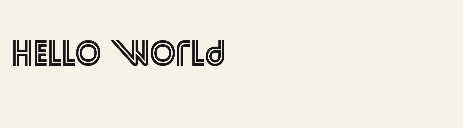
  • Bracken Quill cover specimen
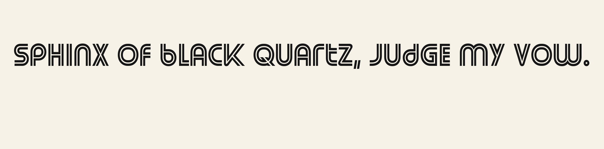
  • Bracken Quill pangram specimen
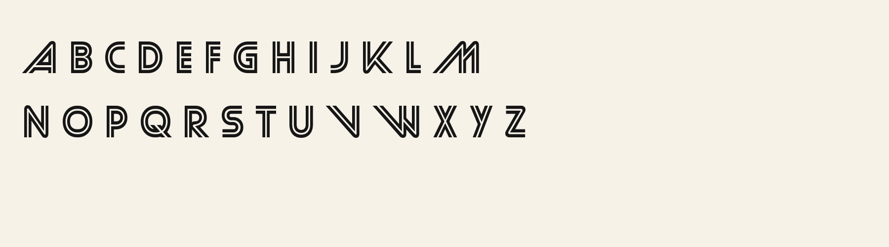
  • Bracken Quill alphabet specimen
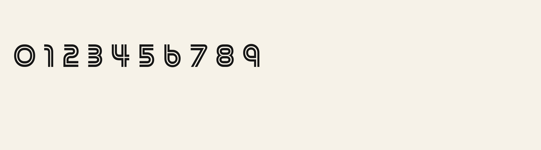
  • Bracken Quill numbers specimen
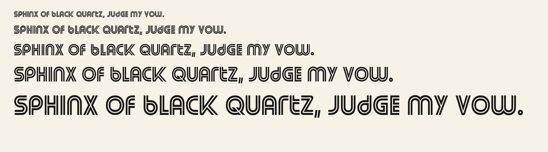
  • Bracken Quill waterfall specimen
  • Bracken Quill sizes specimen
  • Bracken Quill lowercase specimen

Choose

Choosing this lettering

  1. 01

    The displayed capitals are built from paired contour lines with open paper between them.

  2. 02

    A, V, T and R in AVATAR show the parallel outline at diagonals, crossbars and rounded joins.

  3. 03

    Six complete language repertoires pass, represented by the six rendered language samples.

Good for

Try it for short outlined headings, invitation names or a compact title that can be viewed large enough for the inner contour to remain clear.

Check before using

Avoid small navigation and dense text: the narrow forms and repeated contour detail turn into a compact texture when reduced.

About

About Bracken Quill

The lowercase is as tall as the capitals: its x-height measures 100% of the cap height. Ascenders on b, d, h, k and l line up with the capitals (100% of their height), and g, j, p, q and y barely drop below the baseline. The o is close to a circle, 0.94 times as wide as it is tall, and M and W are the widest capitals, at 1.86 times the width of H. O stands exactly as tall as H and sits on the baseline, with no overshoot.

Its 365 characters include 241 Latin letters, plus 124 figures, punctuation marks and symbols; 189 of the Latin letters are accented or special forms beyond A to Z. The word space measures 36.3% of the cap height, and the blank space either side of a lowercase letter takes up 11.2% of its width. Spacing is adjusted with 7,934 kerning pairs, the most of all 1 sans serif fonts. The tightest of them is YA, which closes up by 33% of the cap height. The figures have different widths, so columns of numbers set in Bracken Quill will not line up exactly.

Measured from the version 0.1.1 font file. Comparisons are with the 1 published library fonts measured on November 4, 2026, 1 of them sans serif fonts.

Bracken Quill in 10 languages

  • Czech

    Příliš žluťoučký kůň úpěl ďábelské ódy.

  • German

    Victor jagt zwölf Boxkämpfer quer über den großen Sylter Deich.

  • Hungarian

    Árvíztűrő tükörfúrógép.

  • Italian

    Quel vituperabile xenofobo zelante assaggia il whisky ed esclama: alleluja!

  • Polish

    Pchnąć w tę łódź jeża lub ośm skrzyń fig.

  • Portuguese

    À noite, vovô Kowalsky vê o ímã cair no pé do pinguim queixoso.

  • Romanian

    Înjurând pițigăiat, zoofobul comandă vexat whisky și tequila.

  • Spanish

    El veloz murciélago hindú comía feliz cardillo y kiwi.

  • Swedish

    Flygande bäckasiner söka hwila på mjuka tuvor.

  • Turkish

    Pijamalı hasta yağız şoföre çabucak güvendi.

Characters

Characters

In this file
366 characters
Verified language coverage
en, de, fr, es, it, pt (local alphabet and sample tests)
Structure
Provider-drawn TrueType outlines kept as generated
Stroke
Measured weight 0.0893, contrast 1.14, slant -12.4 deg
Best for
Sans Serif designs

Basic Latin · 95

  • !
  • "
  • #
  • $
  • %
  • &
  • '
  • (
  • )
  • *
  • +
  • ,
  • -
  • .
  • /
  • 0
  • 1
  • 2
  • 3
  • 4
  • 5
  • 6
  • 7
  • 8
  • 9
  • :
  • ;
  • <
  • =
  • >
  • ?
  • @
  • A
  • B
  • C
  • D
  • E
  • F
  • G
  • H
  • I
  • J
  • K
  • L
  • M
  • N
  • O
  • P
  • Q
  • R
  • S
  • T
  • U
  • V
  • W
  • X
  • Y
  • Z
  • [
  • \
  • ]
  • ^
  • _
  • `
  • a
  • b
  • c
  • d
  • e
  • f
  • g
  • h
  • i
  • j
  • k
  • l
  • m
  • n
  • o
  • p
  • q
  • r
  • s
  • t
  • u
  • v
  • w
  • x
  • y
  • z
  • {
  • |
  • }
  • ~

Other mapped characters · 79

  • ¡
  • ¢
  • £
  • ¥
  • ¦
  • ¨
  • ©
  • «
  • ®
  • ¯
  • °
  • ±
  • ²
  • ³
  • ´
  • ·
  • ¸
  • ¹
  • »
  • ¼
  • ½
  • ¾
  • ¿
  • ×
  • ÷
  • ˆ
  • ˇ
  • ˘
  • ˙
  • ˚
  • ˛
  • ˜
  • ˝
  • –
  • —
  • ‘
  • ’
  • ‚
  • “
  • ”
  • „
  • †
  • ‡
  • …
  • ‰
  • ‹
  • ›
  • ⁄
  • ⁰
  • ⁴
  • ⁵
  • ⁶
  • ⁷
  • ⁸
  • ⁹
  • ₀
  • ₁
  • ₂
  • ₃
  • ₄
  • ₅
  • ₆
  • ₇
  • ₈
  • ₉
  • €
  • ™
  • ⅓
  • ⅔
  • ⅛
  • ⅜
  • ⅝
  • ⅞
  • −
  • ≈
  • ≠
  • ≤
  • ≥
  • ￿

Accented Latin · 189

  • ª
  • º
  • À
  • Á
  • Â
  • Ã
  • Ä
  • Å
  • Æ
  • Ç
  • È
  • É
  • Ê
  • Ë
  • Ì
  • Í
  • Î
  • Ï
  • Ð
  • Ñ
  • Ò
  • Ó
  • Ô
  • Õ
  • Ö
  • Ø
  • Ù
  • Ú
  • Û
  • Ü
  • Ý
  • Þ
  • ß
  • à
  • á
  • â
  • ã
  • ä
  • å
  • æ
  • ç
  • è
  • é
  • ê
  • ë
  • ì
  • í
  • î
  • ï
  • ð
  • ñ
  • ò
  • ó
  • ô
  • õ
  • ö
  • ø
  • ù
  • ú
  • û
  • ü
  • ý
  • þ
  • ÿ
  • Ā
  • ā
  • Ă
  • ă
  • Ą
  • ą
  • Ć
  • ć
  • Ċ
  • ċ
  • Č
  • č
  • Ď
  • ď
  • Đ
  • đ
  • Ē
  • ē
  • Ĕ
  • ĕ
  • Ė
  • ė
  • Ę
  • ę
  • Ě
  • ě
  • Ğ
  • ğ
  • Ġ
  • ġ
  • Ģ
  • ģ
  • Ħ
  • ħ
  • Ī
  • ī
  • Ĭ
  • ĭ
  • Į
  • į
  • İ
  • ı
  • IJ
  • ij
  • Ķ
  • ķ
  • Ĺ
  • ĺ
  • Ļ
  • ļ
  • Ľ
  • ľ
  • Ŀ
  • ŀ
  • Ł
  • ł
  • Ń
  • ń
  • Ņ
  • ņ
  • Ň
  • ň
  • Ŋ
  • ŋ
  • Ō
  • ō
  • Ŏ
  • ŏ
  • Ő
  • ő
  • Œ
  • œ
  • Ŕ
  • ŕ
  • Ŗ
  • ŗ
  • Ř
  • ř
  • Ś
  • ś
  • Ş
  • ş
  • Š
  • š
  • Ţ
  • ţ
  • Ť
  • ť
  • Ŧ
  • ŧ
  • Ũ
  • ũ
  • Ū
  • ū
  • Ŭ
  • ŭ
  • Ů
  • ů
  • Ű
  • ű
  • Ų
  • ų
  • Ŵ
  • ŵ
  • Ŷ
  • ŷ
  • Ÿ
  • Ź
  • ź
  • Ż
  • ż
  • Ž
  • ž
  • Ș
  • ș
  • Ț
  • ț
  • Ẁ
  • ẁ
  • Ẃ
  • ẃ
  • Ẅ
  • ẅ
  • Ỳ
  • ỳ

Download

Download

Choose the license that matches your project before downloading.

Download

  • Every format with Pro or Studio
  • Or one of 5 Font Pass picks for personal projects, $4.99 once
  • Commercial use with Pro or Studio

See plans or browse fonts that are free to download.

Commercial use

Client work, products and redistribution need a commercial license. Library fonts include it with Pro or Studio; fonts you make include it when you make them on Pro or Studio. A Font Pass is for personal projects.

TTF · OTF · WOFF · WOFF2

Read the full font license

Tools

Similar

More sans serif fonts

See all sans serif fonts
  • Compared with Bracken Quill: Lower x-height · lighter strokes

  • Compared with Bracken Quill: Lower x-height · lighter strokes

  • Compared with Bracken Quill: 46% narrower · lower x-height

  • Compared with Bracken Quill: 52% narrower · lower x-height

Method

How this page was made

The supplied font files were checked for the characters and letter shapes shown here. AI helped describe the visible forms and draft the examples; each sample uses the named font file. Previews are illustrative, and file measurements come from the delivered files.

The current text and font-file specimens received an independent review.

  • Acorn Birch

    For R, Acorn Birch reserves 0.332 em versus 0.570 em in Bracken Quill. Its narrower advance can help when that capital repeats in a compact heading.

  • Acorn Vetch

    Acorn Vetch gives g a 0.424 em advance; here it is 0.558 em. The alternative sets that character more tightly.

FAQ

Bracken Quill questions

Can I use Bracken Quill commercially?
Bracken Quill is part of the Pro library. Pro and Studio include it with a commercial license that continues after the plan ends; a Font Pass can pick it as one of 5 fonts for personal use.
What character coverage was checked for Bracken Quill?
This file maps 366 characters. The local alphabet and sample tests passed for en, de, fr, es, it, pt; isolated mapped characters do not prove complete support for other languages.
When should I choose Bracken Quill?
Try it for short outlined headings, invitation names or a compact title that can be viewed large enough for the inner contour to remain clear. Avoid small navigation and dense text: the narrow forms and repeated contour detail turn into a compact texture when reduced.