
Agate Gantry
Sans serif1 style24 languages
Pro · plan or Pass
a g R S & Aa
Sans serif · 1 style · 386 characters · Version 0.1.1 · Published November 5, 2026
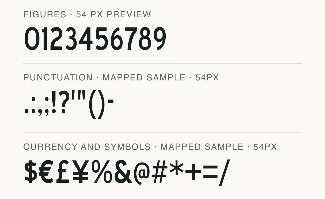
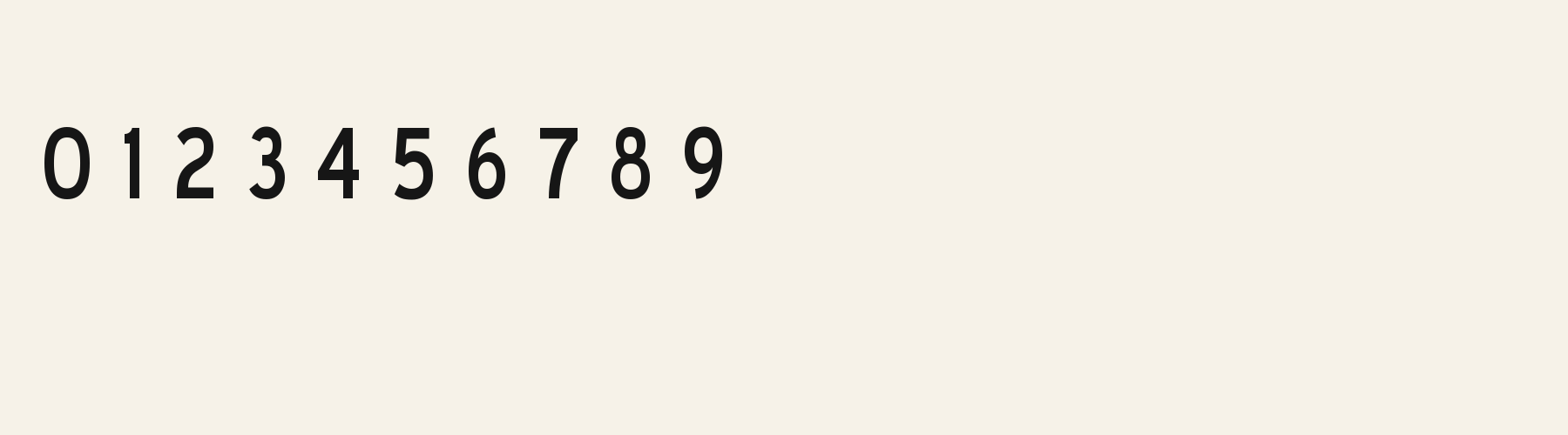
Bobbin Trillium’s rendered figures sit on a shared baseline with broadly even, substantial strokes. In the 0–9 line, 1 is especially narrow compared with 0, while the other numerals occupy intermediate widths; these measurements make the sample useful for checking price columns, not for assuming tabular figures.
Aa
agRS&
Direction
For a price list, use a layout column or align the text in your application; do not depend on glyph widths to create a table.
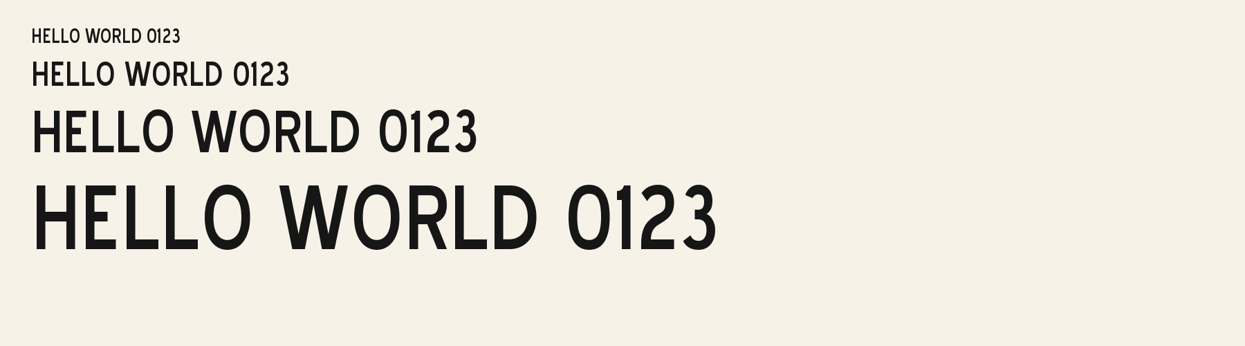
Bobbin Trillium maps the full digit set and the tested currency marks. Its 1 is much narrower than 0, so set a column using layout alignment when prices need a shared edge.
The advances are measured in em from the current file: 0 = 0.567; 1 = 0.250; 2 = 0.481; 3 = 0.458; 4 = 0.497; 5 = 0.496; 6 = 0.469; 7 = 0.461; 8 = 0.481; 9 = 0.472. The file does not have an established tabular-figure feature in this plan.
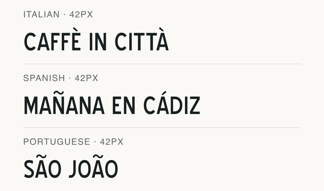
The six measured sets are English, German, French, Spanish, Italian and Portuguese. The file also maps a broader character inventory, but that count alone does not add language claims.
Test
Type the words you plan to use and adjust size, line height, and letter spacing. The preview uses the final font file.
The quick brown fox jumps over the lazy dog
Like how it sets? It comes with Pro or Studio, or as a Font Pass pick for personal projects.
Get this fontSpecimens
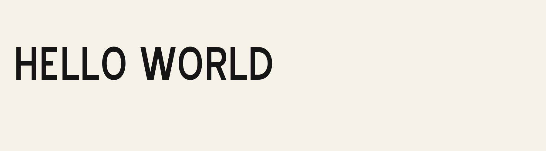
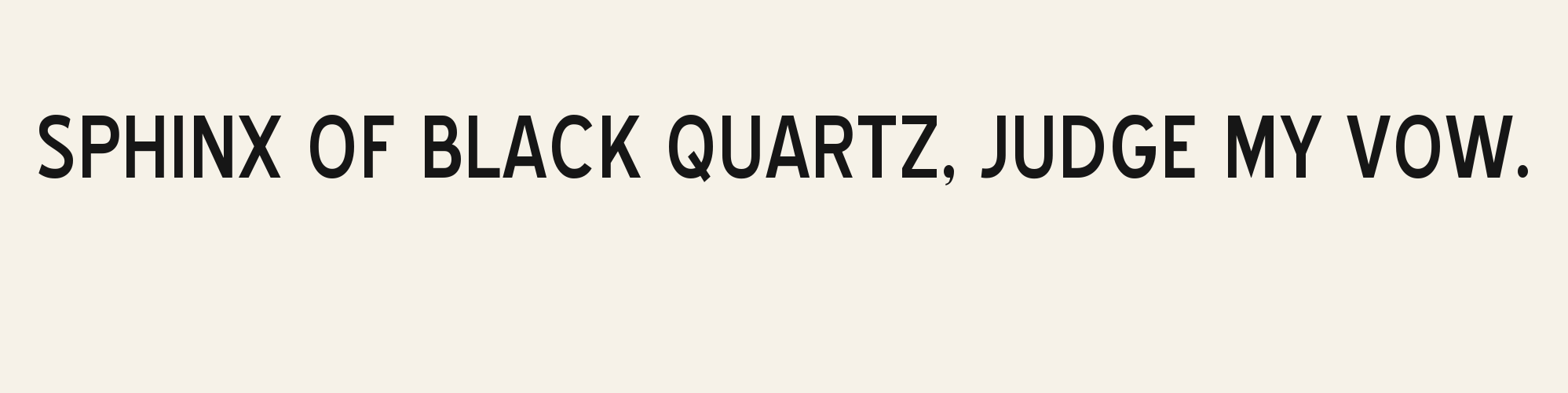
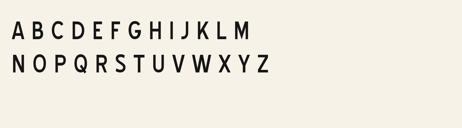
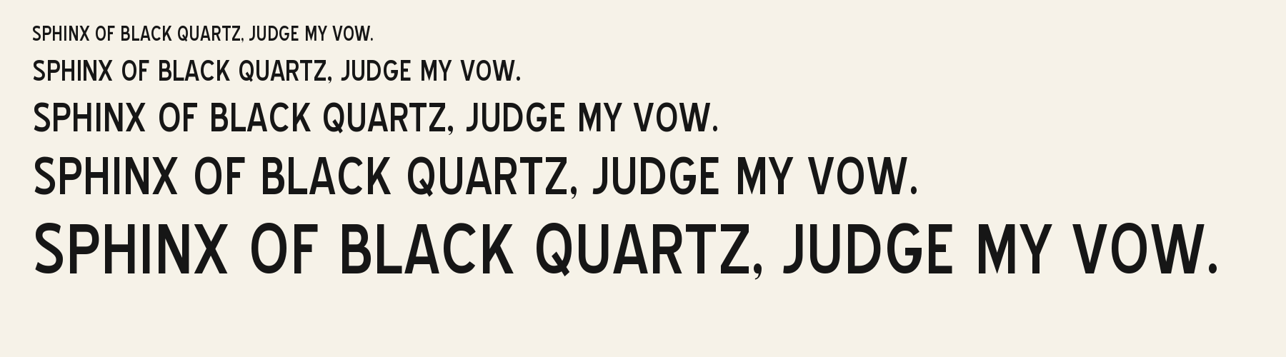
Rendered from the font files, without retouching.
Choose
The digit advances vary substantially: 1 measures 0.250 em while 0 measures 0.567 em; both are shown in the figure line.
The tested file includes all ten digits and the common punctuation and currency sample, including €, £ and ¥, shown below.
In the enlarged figure line, 0 has a closed oval counter and 8 has two enclosed counters; the shapes remain distinct at the sample size.
Good for
Use the numeric specimen to judge short prices or a small list where mixed-width figures can be aligned with deliberate layout settings.
Check before using
Do not assume the digits line up in a column: the measured advances vary, and no tabular-number feature was established for this file.
About
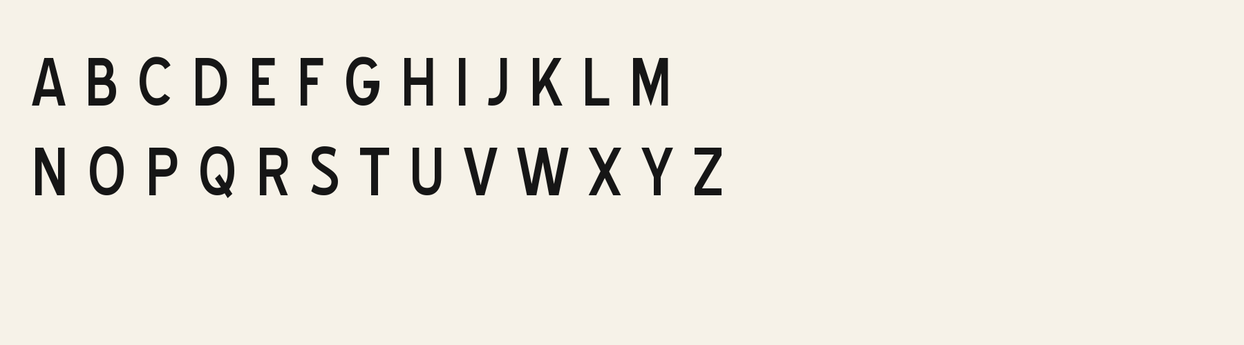
The lowercase is as tall as the capitals: its x-height measures 100% of the cap height. Ascenders on b, d, h, k and l line up with the capitals (100% of their height), and g, j, p, q and y barely drop below the baseline. The o is an upright oval, 0.69 times as wide as it is tall, and W is the widest capital, at 1.45 times the width of H. Round letters overshoot: O rises 1.4% of the cap height above H and dips 1.4% below the baseline.
The letters stand upright, leaning less than 2.5° either way. Vertical stems measure 13.9% of the cap height. It is close to monoline, with the sides of o and O 0.88 times as thick as their tops and bottoms.
Its 385 characters include 244 Latin and 4 Greek letters, plus 137 figures, punctuation marks and symbols; 192 of the Latin letters are accented or special forms beyond A to Z. The word space measures 37% of the cap height, and the blank space either side of a lowercase letter takes up 17% of its width. Spacing is adjusted with 15,023 kerning pairs, the most of all 1 sans serif fonts. The tightest of them is LT, which closes up by 11.1% of the cap height. The figures have different widths, so columns of numbers set in Bobbin Trillium will not line up exactly.
Measured from the version 0.1.1 font file. Comparisons are with the 1 published library fonts measured on November 4, 2026, 1 of them sans serif fonts.
Příliš žluťoučký kůň úpěl ďábelské ódy.
Victor jagt zwölf Boxkämpfer quer über den großen Sylter Deich.
Árvíztűrő tükörfúrógép.
Quel vituperabile xenofobo zelante assaggia il whisky ed esclama: alleluja!
Pchnąć w tę łódź jeża lub ośm skrzyń fig.
À noite, vovô Kowalsky vê o ímã cair no pé do pinguim queixoso.
Înjurând pițigăiat, zoofobul comandă vexat whisky și tequila.
El veloz murciélago hindú comía feliz cardillo y kiwi.
Flygande bäckasiner söka hwila på mjuka tuvor.
Pijamalı hasta yağız şoföre çabucak güvendi.
Characters
Download
Choose the license that matches your project before downloading.
See plans or browse fonts that are free to download.
Client work, products and redistribution need a commercial license. Library fonts include it with Pro or Studio; fonts you make include it when you make them on Pro or Studio. A Font Pass is for personal projects.
TTF · OTF · WOFF · WOFF2
Tools
Free tools that run in your browser. Images you make with them, such as a signature PNG, can be used for any purpose.
Similar
Sans serif1 style24 languages
Compared with Bobbin Trillium: Lower x-height · lighter strokes
Sans serif1 style5 languages
Compared with Bobbin Trillium: 41% narrower · lower x-height
Sans serif1 style37 languages
Compared with Bobbin Trillium: 47% narrower · lower x-height
Sans serif1 style5 languages
Compared with Bobbin Trillium: Lower x-height · 7% narrower
Method
The supplied font files were checked for the characters and letter shapes shown here. AI helped describe the visible forms and draft the examples; each sample uses the named font file. Previews are illustrative, and file measurements come from the delivered files.
The current text and font-file specimens received an independent review.
For R, Acorn Birch reserves 0.332 em versus 0.519 em in Bobbin Trillium. Its narrower advance can help when that capital repeats in a compact heading.
Acorn Vetch gives g a 0.424 em advance; here it is 0.598 em. The alternative sets that character more tightly.
FAQ