
Atrium Sans
Sans serif1 style18 languages
Pro · plan or Pass
a g R S & Aa
Sans serif · 1 style · 192 characters · Version 0.1.1 · Published November 5, 2026
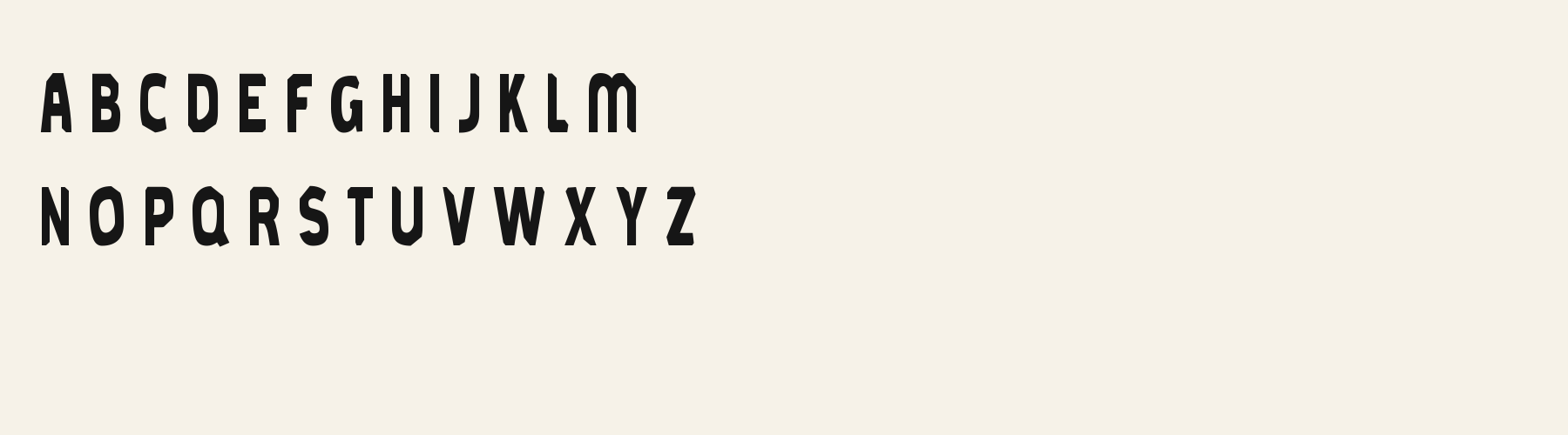
Brook Thistle uses heavy, angular capitals with broad verticals. Its number set is compact, so the price sample is useful for checking both the actual currency coverage and the amount of width each digit reserves.
Aa
agRS&
Direction
Choose a currency-compatible fallback if ¥ is required, and align numeric columns with layout rules rather than by eye.
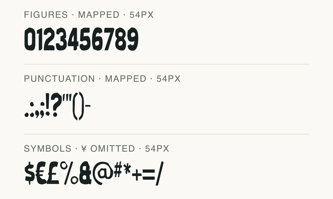
The tested symbols include dollars, euros and pounds but omit yen. The digits also have different advances, so a price list needs a deliberate alignment method.
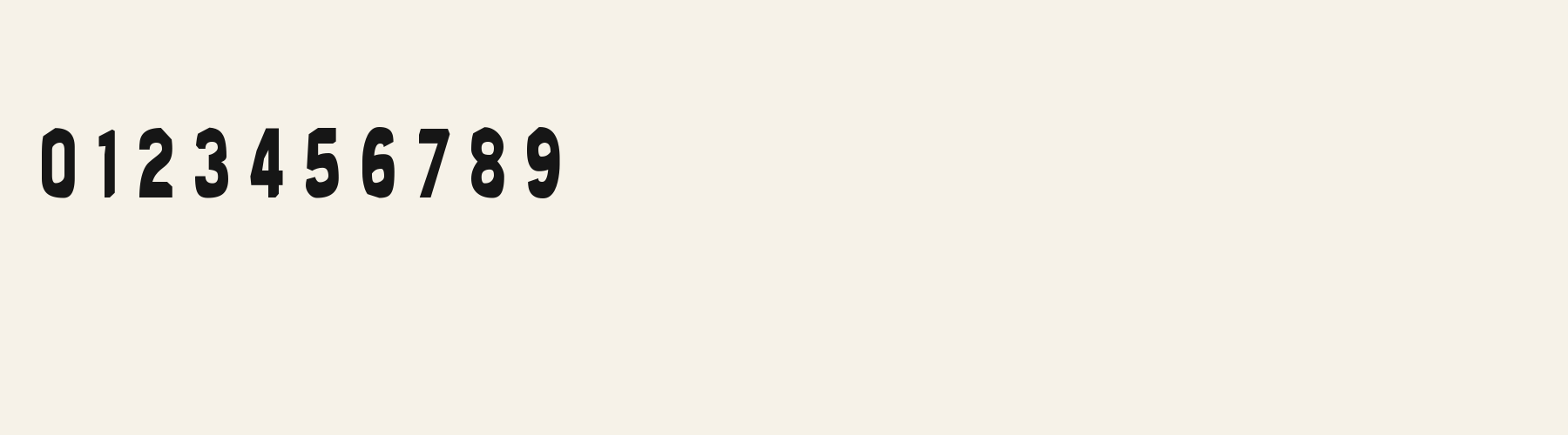
Advances in em from the current file: 0 = 0.384; 1 = 0.215; 2 = 0.382; 3 = 0.379; 4 = 0.359; 5 = 0.380; 6 = 0.382; 7 = 0.345; 8 = 0.380; 9 = 0.380. No tabular-number feature is claimed.
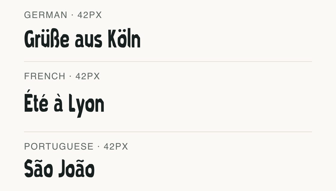
English, German, French, Spanish, Italian and Portuguese pass the complete local test sets. The ¥ omission still matters for price text even though these language samples pass.
Test
Type the words you plan to use and adjust size, line height, and letter spacing. The preview uses the final font file.
The quick brown fox jumps over the lazy dog
Like how it sets? It comes with Pro or Studio, or as a Font Pass pick for personal projects.
Get this fontSpecimens
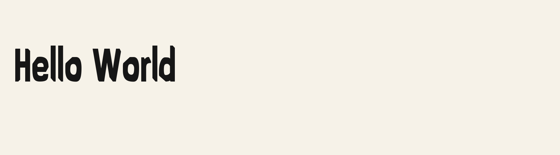
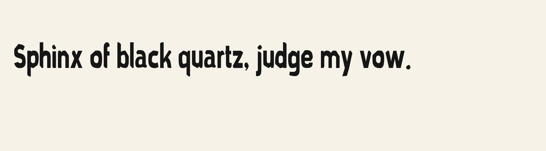
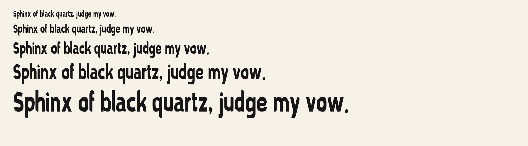
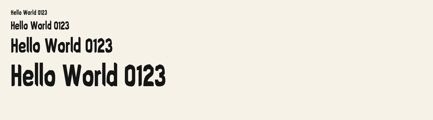
Rendered from the font files, without retouching.
Choose
The ten figures and punctuation are shown in the mapped specimen; its tested currencies include $, € and £, while ¥ is missing.
The digit advances vary: 1 reserves 0.215 em, while 0 reserves 0.384 em; those figures are listed beside the rendered sequence.
The rendered numerals have compact shapes: 0 and 8 each contain enclosed counters, while the 1 is a narrow stroke with a short angled head.
Good for
Use the compact figures for short prices or bold labels when the actual symbol set matches the content.
Check before using
Do not publish a yen price with this file alone, and do not rely on the different digit widths for column alignment.
About
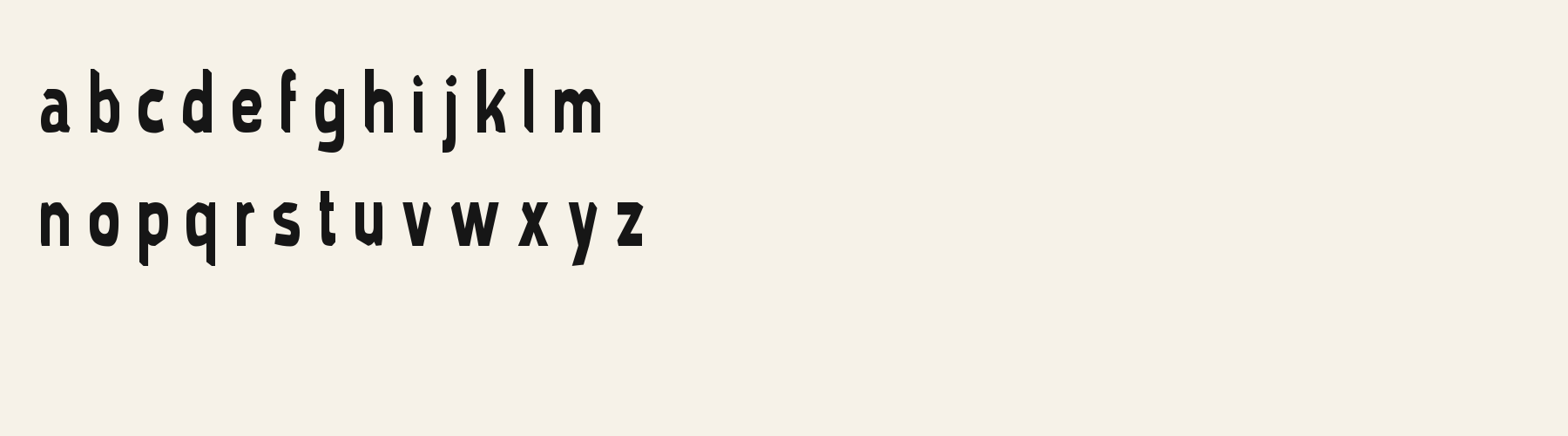
Brook Thistle's lowercase x reaches 73.5% of the capital height, close to the 73.5% median for sans serif fonts. Ascenders on b, d, h, k and l rise 9.2% above the capitals, and descenders on g, j, p, q and y drop 35% of the cap height below the baseline. The o is an upright oval, 0.66 times as wide as it is tall, and W is the widest capital, at 1.72 times the width of H. Round letters overshoot: O rises 1.3% of the cap height above H and dips 1.3% below the baseline.
The letters stand upright, leaning less than 2.5° either way. Vertical stems measure 15.4% of the cap height. The contrast is reversed: the tops and bottoms of o and O are 1.4 times as thick as their sides.
Its 191 characters include 124 Latin letters, plus 67 figures, punctuation marks and symbols; 72 of the Latin letters are accented or special forms beyond A to Z. The word space measures 28.4% of the cap height, and the blank space either side of a lowercase letter takes up 12.7% of its width. Spacing is adjusted with 856 kerning pairs, the most of all 1 sans serif fonts. The tightest of them is LY, which closes up by 10% of the cap height. The figures have different widths, so columns of numbers set in Brook Thistle will not line up exactly.
Measured from the version 0.1.1 font file. Comparisons are with the 1 published library fonts measured on November 4, 2026, 1 of them sans serif fonts.
Characters
Download
Choose the license that matches your project before downloading.
See plans or browse fonts that are free to download.
Client work, products and redistribution need a commercial license. Library fonts include it with Pro or Studio; fonts you make include it when you make them on Pro or Studio. A Font Pass is for personal projects.
TTF · OTF · WOFF · WOFF2
Tools
Free tools that run in your browser. Images you make with them, such as a signature PNG, can be used for any purpose.
Similar
Sans serif1 style18 languages
Compared with Brook Thistle: Lighter strokes · 27% wider
Sans serif1 style24 languages
Compared with Brook Thistle: 56% wider · lighter strokes
Sans serif1 style5 languages
Compared with Brook Thistle: 14% narrower · lighter strokes
Sans serif1 style37 languages
Compared with Brook Thistle: 24% narrower
Method
The supplied font files were checked for the characters and letter shapes shown here. AI helped describe the visible forms and draft the examples; each sample uses the named font file. Previews are illustrative, and file measurements come from the delivered files.
The current text and font-file specimens received an independent review.
For R, Acorn Birch reserves 0.332 em versus 0.397 em in Brook Thistle. Its narrower advance can help when that capital repeats in a compact heading.
Acorn Vetch gives g a 0.424 em advance; here it is 0.390 em. Allow more horizontal room for the alternative.
FAQ