
Kite Grotesk
Sans serif1 style5 languages
Pro · plan or Pass
a g R S & Aa
Sans serif · 1 style · 346 characters · Version 0.1.2 · Published November 5, 2026
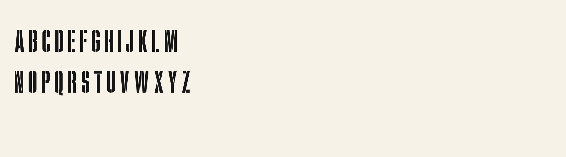
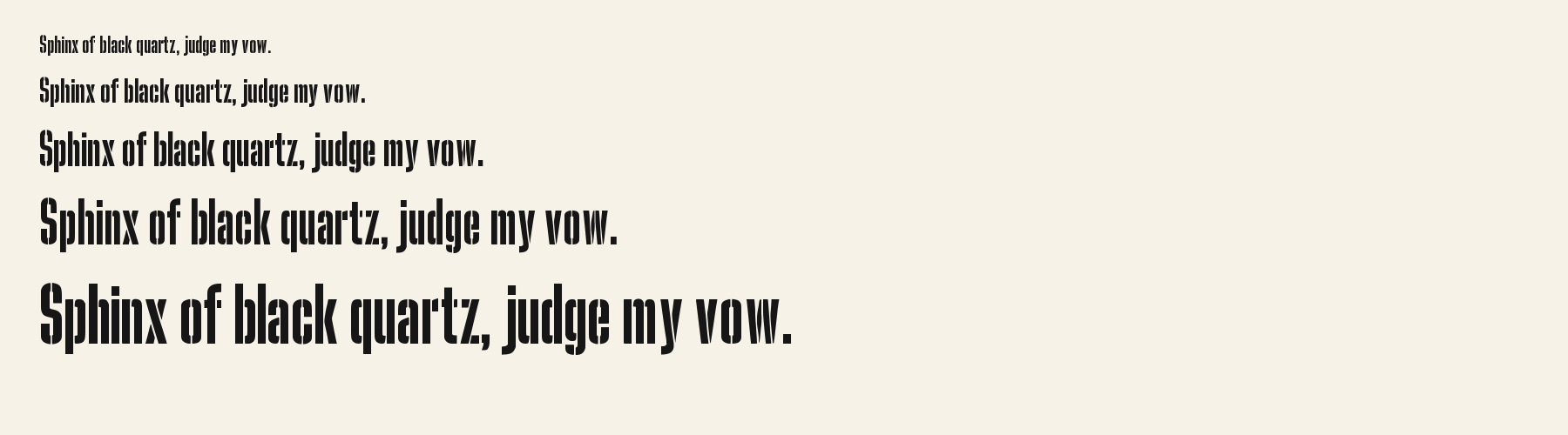
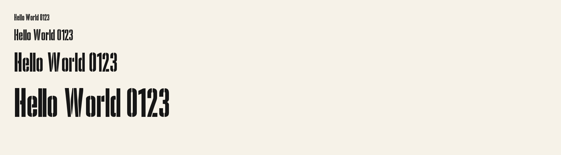
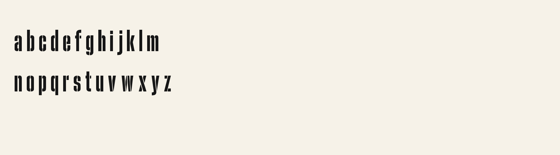
Acorn Birch compresses upright letters into very narrow forms, with dark vertical strokes interrupted by small repeated breaks. ACORN 08 shows the cut pattern across capitals, while the lowercase line in the text samples keeps the same tall, compact rhythm. That density gives short words a strong block shape, but makes this face a deliberate display choice rather than neutral running text.
Aa
agRS&
Direction
Set a short phrase first, then check its breaks and counters at the final size before using the face across a larger interface.
The current WOFF2 file is 74,888 bytes and maps 346 characters. This reports the delivered file itself; it does not predict transfer time or page speed.
The supplied pack also contains OTF, TTF and WOFF files. The sample CSS below uses this site’s internal font-file route and measured character ranges; it is an implementation example for this local draft, not proof that an anonymous visitor can fetch the preview file or that another site can use this URL. For cross-site embedding, use a WOFF2 file that the license permits you to download and self-host at your own public URL. unicode-range helps select a face but does not create a smaller subset.
No optimized subset has been generated for this preview, so there is no before-and-after saving to report.

@font-face {
  font-family: "Acorn Birch";
  src: url("/font-files/fa7b4506-72c7-4c92-84e4-cbdf9f9b9f57/1/AcornBirch-Regular.woff2") format("woff2");
  font-weight: 400;
  font-style: normal;
  font-display: swap;
  unicode-range: U+20-7E, U+A0-A3, U+A5, U+A7-AB, U+AE-B0, U+B4, U+B6-B8, U+BA-BB, U+BF-107, U+10A-11B, U+11E-123, U+126-127, U+12A-131, U+136-137, U+139-13E, U+141-148, U+14C-155, U+158-165, U+16A-17E, U+1CD-1CE, U+1D3-1D4, U+1E6-1E9, U+1FE-1FF, U+218-21B, U+21E-21F, U+237, U+2C6-2C7, U+2D8-2DD, U+300-304, U+306-308, U+30A-30C, U+326-328, U+1E80-1E85, U+1E9E, U+1EF2-1EF3, U+2013-2014, U+2018-201A, U+201C-201E, U+2022, U+2026, U+2039-203A, U+20AC, U+2122, U+2212, U+FFFF;
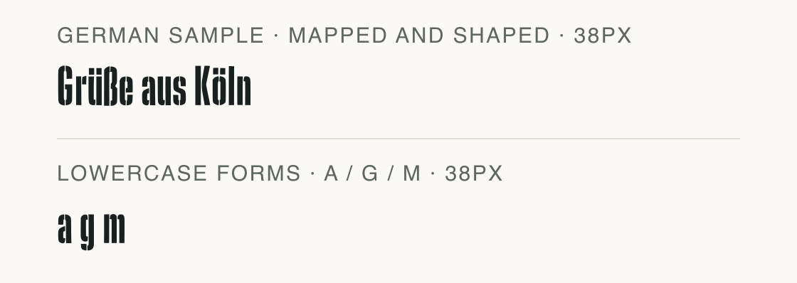
}A short string can look complete while one accented name or symbol falls outside the font’s cmap. The sample below is verified in the supplied file; test the exact copy your page will use before relying on it.
The six measured language repertoires are English, German, French, Spanish, Italian and Portuguese. The manifest also names other languages, but their full required character sets were not reverified in this measurement run.
If your content includes a character outside the measured coverage, choose a fallback deliberately and check the mixed line in the browser.
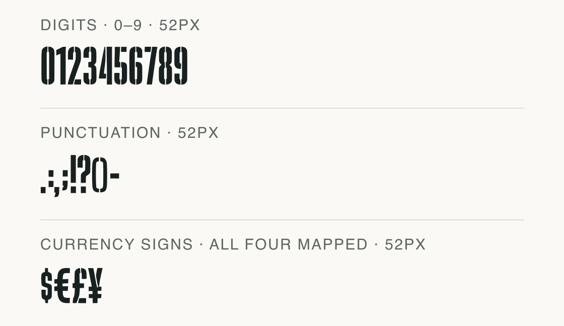
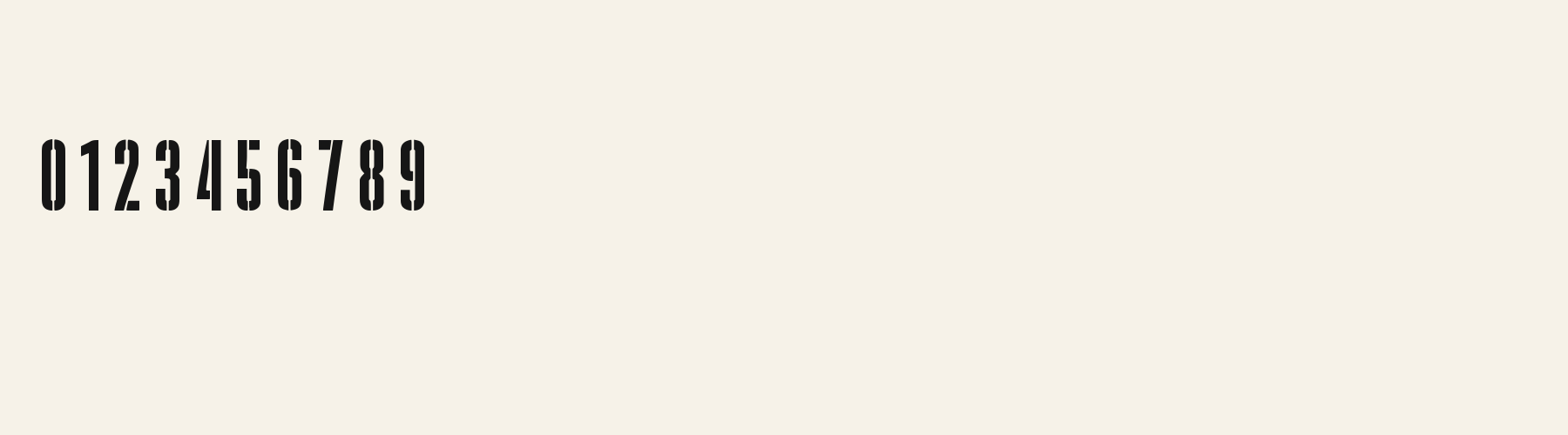
The checked Acorn Birch file maps all ten digits, the punctuation shown, and the four currency signs in the last row.
Test
Type the words you plan to use and adjust size, line height, and letter spacing. The preview uses the final font file.
The quick brown fox jumps over the lazy dog
Like how it sets? It comes with Pro or Studio, or as a Font Pass pick for personal projects.
Get this fontSpecimens
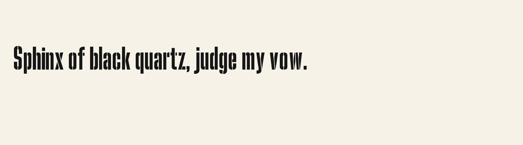
Rendered from the font files, without retouching.
Choose
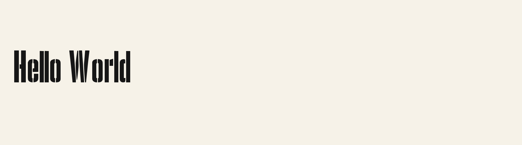
The capitals are markedly condensed, with the breaks visible through several vertical stems.
The lowercase a, g and m keep the same narrow proportions; the M11 glyph row shows all three at one scale.
The current file maps 346 characters; the displayed alphabet-like specimens are selections from that cmap.
Good for
Try it for a short storefront wordmark, a compact event heading or a brief label where the broken strokes can be seen at display size.
Check before using
Avoid long instructions and small utility text: the tight spacing and repeated cuts can make continuous reading harder, especially when the line is reduced.
About
Its x-height is 73.1% of the cap height, near the 73.1% typical of sans serif fonts in the library. Ascenders on b, d, h, k and l line up with the capitals (98.6% of their height), and descenders on g, j, p, q and y drop 17.7% of the cap height below the baseline. The o is an upright oval, 0.45 times as wide as it is tall, and W is the widest capital, at 1.76 times the width of H. Round letters overshoot: O rises 0.5% of the cap height above H and dips 0.5% below the baseline.
The letters stand upright, leaning less than 2.5° either way. Vertical stems measure 14.4% of the cap height.
Its 345 characters include 245 Latin letters, plus 100 figures, punctuation marks and symbols; 193 of the Latin letters are accented or special forms beyond A to Z. The word space measures 17.5% of the cap height, and the blank space either side of a lowercase letter takes up 15.4% of its width. Spacing is adjusted with 31,935 kerning pairs, the most of all 1 sans serif fonts. The tightest of them is PJ, which closes up by 17.4% of the cap height. The figures have different widths, so columns of numbers set in Acorn Birch will not line up exactly.
Measured from the version 0.1.2 font file. Comparisons are with the 1 published library fonts measured on November 4, 2026, 1 of them sans serif fonts.
Příliš žluťoučký kůň úpěl ďábelské ódy.
Høj bly gom vandt fræk sexquiz på wc.
Pa’s wijze lynx bezag vroom het fikse aquaduct.
Victor jagt zwölf Boxkämpfer quer über den großen Sylter Deich.
Árvíztűrő tükörfúrógép.
Quel vituperabile xenofobo zelante assaggia il whisky ed esclama: alleluja!
Pchnąć w tę łódź jeża lub ośm skrzyń fig.
À noite, vovô Kowalsky vê o ímã cair no pé do pinguim queixoso.
Înjurând pițigăiat, zoofobul comandă vexat whisky și tequila.
El veloz murciélago hindú comía feliz cardillo y kiwi.
Flygande bäckasiner söka hwila på mjuka tuvor.
Pijamalı hasta yağız şoföre çabucak güvendi.
Characters
Download
Choose the license that matches your project before downloading.
See plans or browse fonts that are free to download.
Client work, products and redistribution need a commercial license. Library fonts include it with Pro or Studio; fonts you make include it when you make them on Pro or Studio. A Font Pass is for personal projects.
TTF · OTF · WOFF · WOFF2
Tools
Free tools that run in your browser. Images you make with them, such as a signature PNG, can be used for any purpose.
Similar
Sans serif1 style5 languages
Compared with Acorn Birch: 77% wider · lighter strokes
Sans serif1 style5 languages
Compared with Acorn Birch: Lighter strokes · 23% wider
Sans serif1 style29 languages
Compared with Acorn Birch: 104% wider · lighter strokes
Sans serif1 style24 languages
Compared with Acorn Birch: 31% wider
Method
The supplied font files were checked for the characters and letter shapes shown here. AI helped describe the visible forms and draft the examples; each sample uses the named font file. Previews are illustrative, and file measurements come from the delivered files.
The current text and font-file specimens received an independent review.
For R, Agate Acorn reserves 0.391 em versus 0.332 em in Acorn Birch. Its wider layout space can change a short title’s line break.
Acorn Vetch gives g a 0.424 em advance; here it is 0.289 em. Allow more horizontal room for the alternative.
FAQ