
Agate Gantry
Sans serif1 style24 languages
Pro · plan or Pass
a g R S Aa
Sans serif · 1 style · 79 characters · Version 0.1.1 · Published November 5, 2026
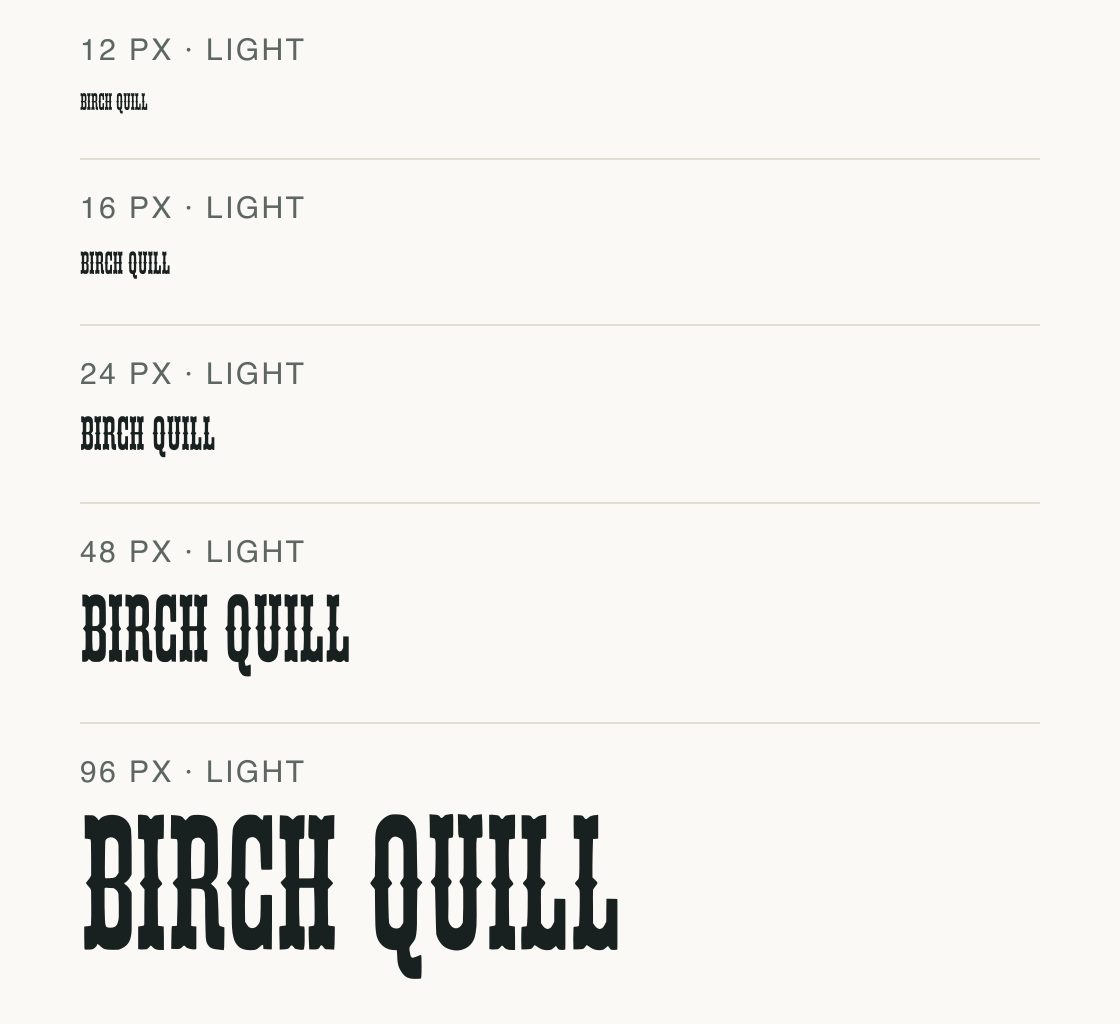
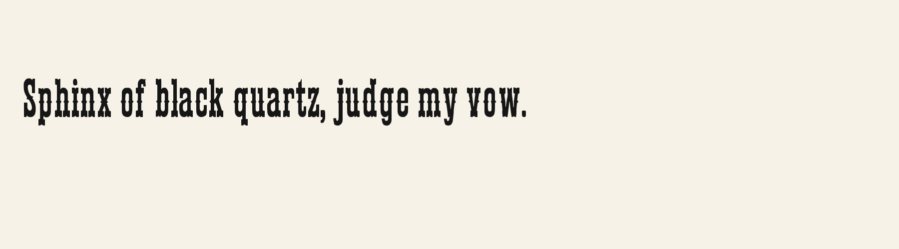
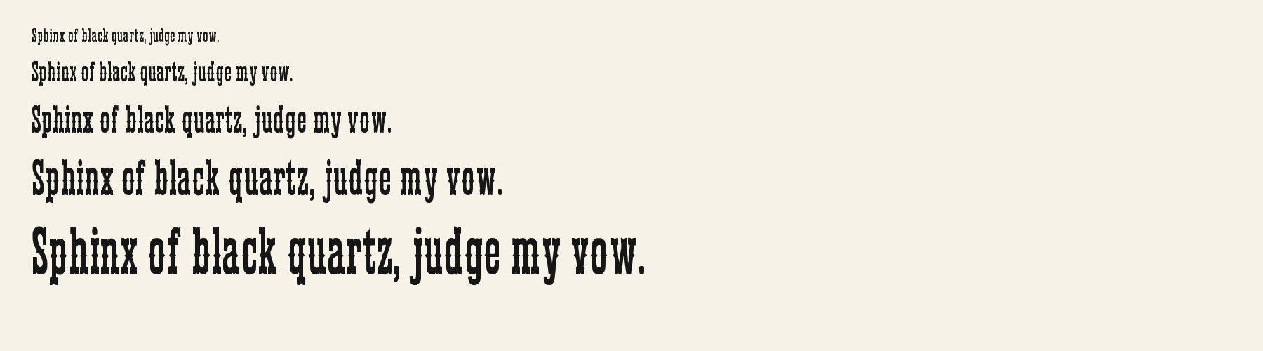
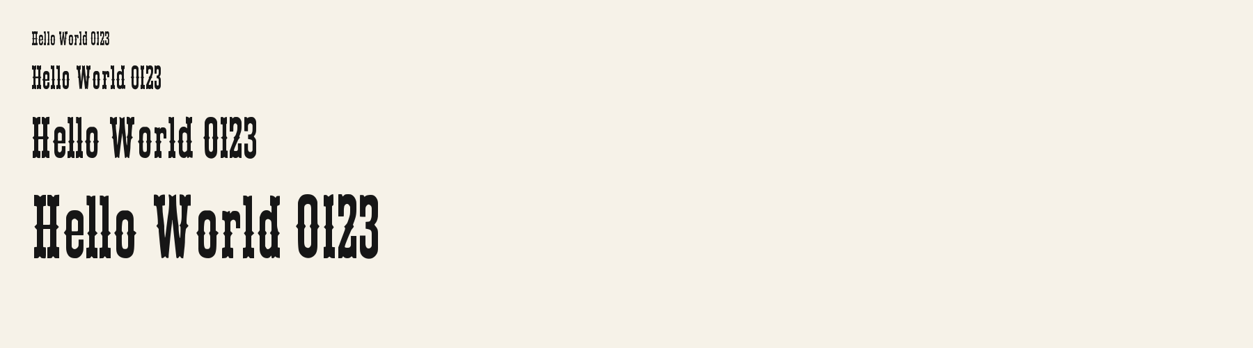
Birch Quill sets tall, tightly packed capitals with dense strokes, small cuts and ornamental end shapes. The 12–24 px samples compress those details into a dark texture; at 48 px, the separate terminals and counters become easier to inspect.
Aa
agRS
Direction
Check the full phrase, including punctuation, at its final size before pairing it with another typeface.
The phrase stays constant while its size changes. At the smallest settings, inspect the short serifs and enclosed spaces rather than judging only the overall width.
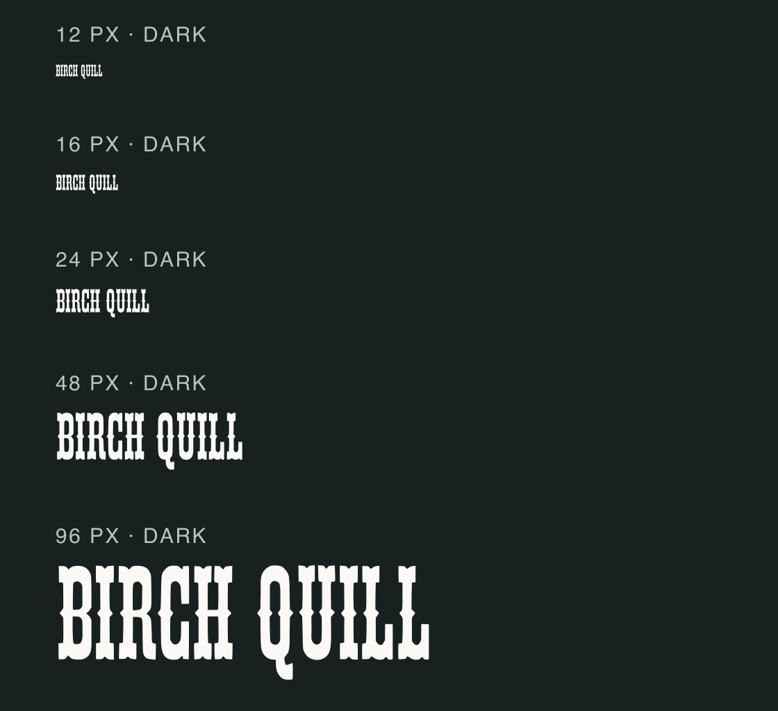
This dark panel repeats the words at the same five sizes. Compare thin strokes and the small serif endings against the light version; the image is a controlled preview, not a readability certification.
The test file has only the basic English repertoire, so do not infer multilingual or symbol coverage from this uppercase sample. A page heading and a utility label need separate size checks in their actual layouts.
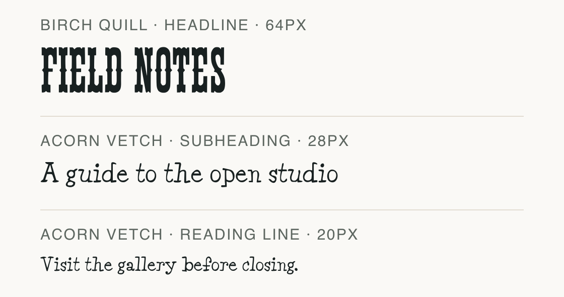
Birch Quill handles the short title; Acorn Vetch sets the explanatory lines. The sample keeps the more delicate face out of the smallest reading role.
Test
Type the words you plan to use and adjust size, line height, and letter spacing. The preview uses the final font file.
The quick brown fox jumps over the lazy dog
Like how it sets? It comes with Pro or Studio, or as a Font Pass pick for personal projects.
Get this fontSpecimens
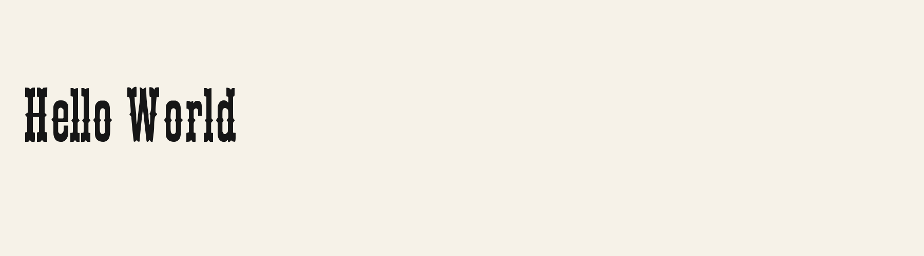
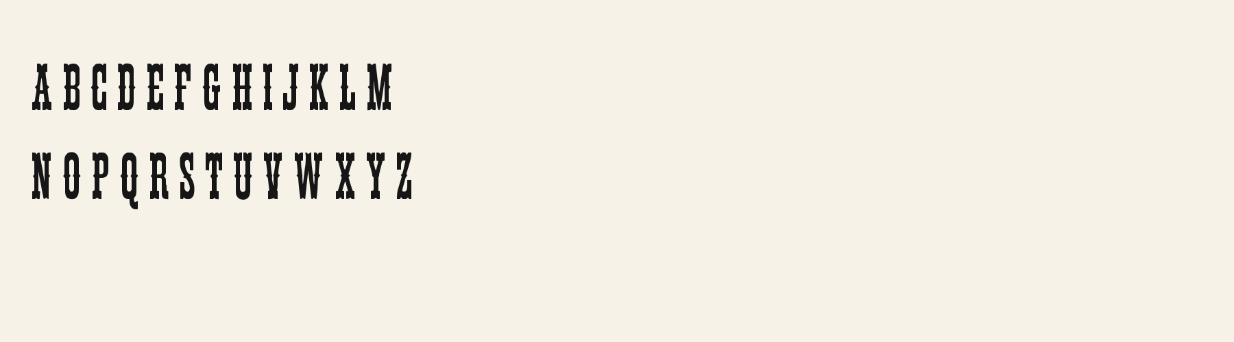
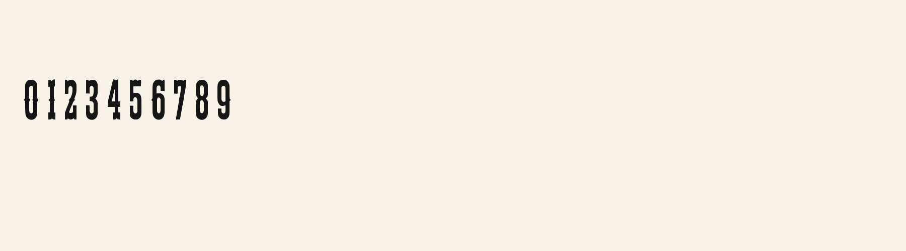
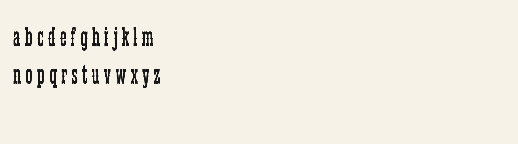
Rendered from the font files, without retouching.
Choose
The FIELD NOTES uppercase line is extremely condensed, with pointed and notched terminals that interrupt otherwise vertical strokes.
B, R and Q keep enclosed counters within narrow, dark forms; the large-scale rendering shows the inner openings more clearly than the smallest rows.
The English test repertoire passes; the measured symbol set omits common currency and layout marks.
Good for
Try a short book-jacket label or an editorial kicker when the display scale can preserve its fine serifs and compact letter shapes.
Check before using
Do not use it for prices or symbol-heavy controls: parentheses, currency signs, percent, ampersand, at sign, number sign, asterisk, plus, equals and slash are absent from the tested set.
About
Its x-height is 76.3% of the cap height, near the 76.3% typical of sans serif fonts in the library. Ascenders on b, d, h, k and l line up with the capitals (99% of their height), and descenders on g, j, p, q and y drop 21.6% of the cap height below the baseline. The o is an upright oval, 0.46 times as wide as it is tall, and W is the widest capital, at 1.44 times the width of H. The O rises 0.5% of the cap height above H and sits on the baseline.
The letters stand upright, leaning less than 2.5° either way. Vertical stems measure 9.9% of the cap height. Strokes keep nearly one thickness in every direction: the sides and the tops of o and O differ by 9%.
Its 78 characters include 52 Latin letters, plus 26 figures, punctuation marks and symbols; there are no accented Latin letters beyond A to Z. The word space measures 19% of the cap height, and the blank space either side of a lowercase letter takes up 15.2% of its width. Spacing is adjusted with 4,031 kerning pairs, the most of all 1 sans serif fonts. The tightest of them is oY, which closes up by 14.6% of the cap height. The figures have different widths, so columns of numbers set in Birch Quill will not line up exactly.
Measured from the version 0.1.1 font file. Comparisons are with the 1 published library fonts measured on November 4, 2026, 1 of them sans serif fonts.
Characters
Download
Choose the license that matches your project before downloading.
See plans or browse fonts that are free to download.
Client work, products and redistribution need a commercial license. Library fonts include it with Pro or Studio; fonts you make include it when you make them on Pro or Studio. A Font Pass is for personal projects.
TTF · OTF · WOFF · WOFF2
Tools
Free tools that run in your browser. Images you make with them, such as a signature PNG, can be used for any purpose.
Similar
Sans serif1 style24 languages
Compared with Birch Quill: 98% wider · taller x-height
Sans serif1 style5 languages
Compared with Birch Quill: 9% wider · lower x-height
Sans serif1 style37 languages
Compared with Birch Quill: Heavier strokes
Sans serif1 style5 languages
Compared with Birch Quill: 71% wider · lower x-height
Method
The supplied font files were checked for the characters and letter shapes shown here. AI helped describe the visible forms and draft the examples; each sample uses the named font file. Previews are illustrative, and file measurements come from the delivered files.
The current text and font-file specimens received an independent review.
For R, Acorn Birch reserves 0.332 em versus 0.330 em in Birch Quill. Its wider layout space can change a short title’s line break.
Acorn Vetch gives g a 0.424 em advance; here it is 0.302 em. Allow more horizontal room for the alternative.
FAQ