
Bobbin Trillium
Sans serif1 style37 languages
Pro · plan or Pass
a g R S Aa
Sans serif · 1 style · 79 characters · Version 0.1.1 · Published November 5, 2026
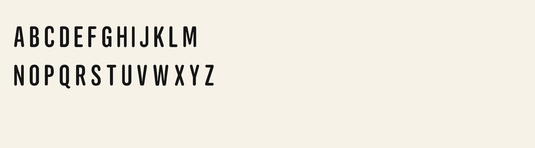
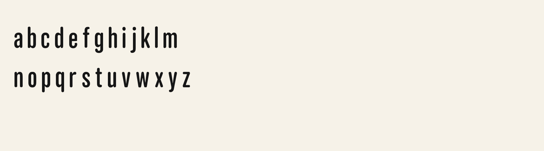
Agate Acorn packs tall, rounded capitals into a narrow footprint. The alphabet sample keeps its strokes plain and upright, while the compressed proportions make the letter sequence feel more like a compact sign than a neutral paragraph face.
Aa
agRS
Direction
Place the exact title beside its supporting copy and test every character before committing to the layout.
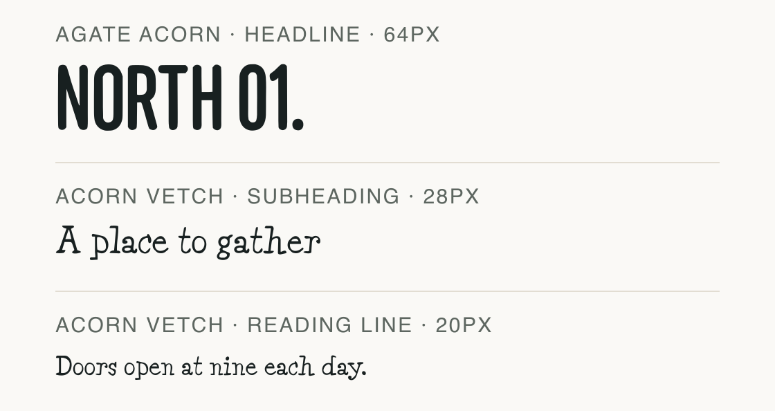
Agate Acorn takes the headline slot; Acorn Vetch carries the explanatory lines. The sample separates a short display phrase from the copy that needs more room to read.
The headline is set at 64 px, the subheading at 28 px and the reading line at 20 px as preview settings. Both files are the actual paired fonts; the arrangement is a proposed composition, not a proven brand pairing.
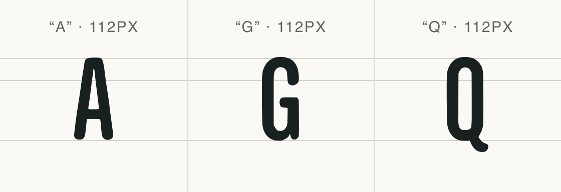
These three capitals show the tall proportions and rounded turns visible in the supplied alphabet sample.
Test
Type the words you plan to use and adjust size, line height, and letter spacing. The preview uses the final font file.
The quick brown fox jumps over the lazy dog
Like how it sets? It comes with Pro or Studio, or as a Font Pass pick for personal projects.
Get this fontSpecimens
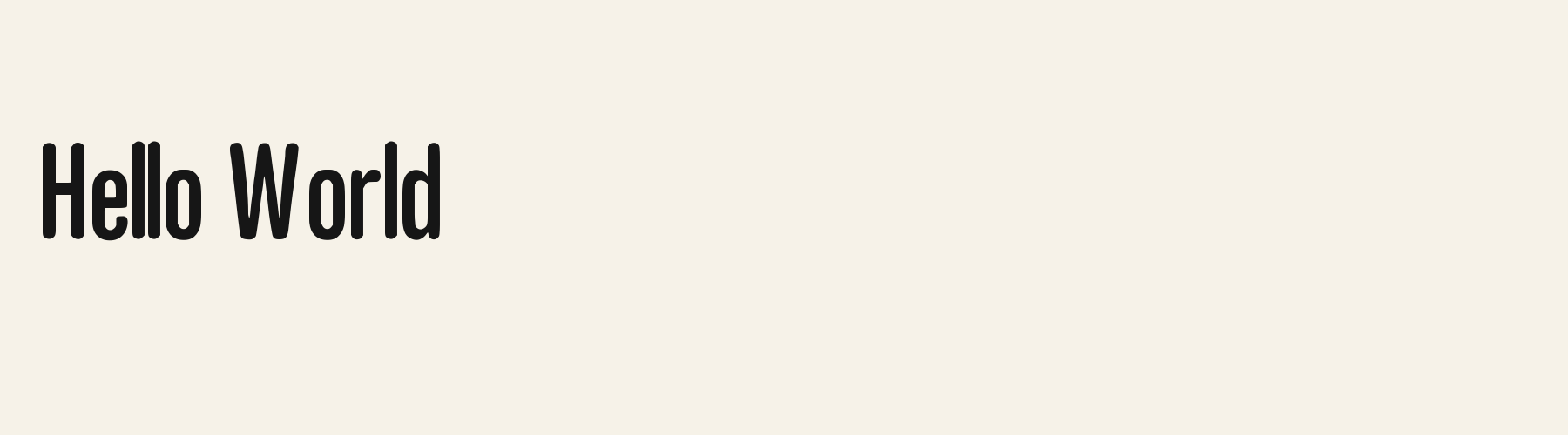
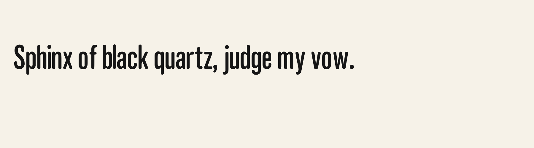
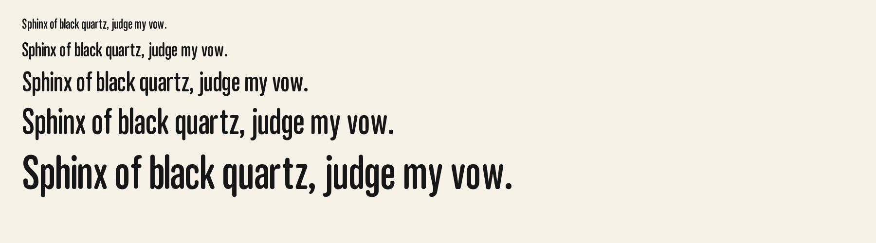
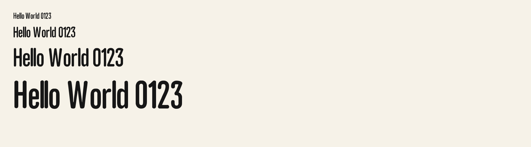
Rendered from the font files, without retouching.
Choose
The capital stems are tall and close-set, with rounded outer turns rather than sharp corners.
A, G and Q keep distinct openings and tails inside the same narrow silhouette; the adjacent specimen shows each form at one scale.
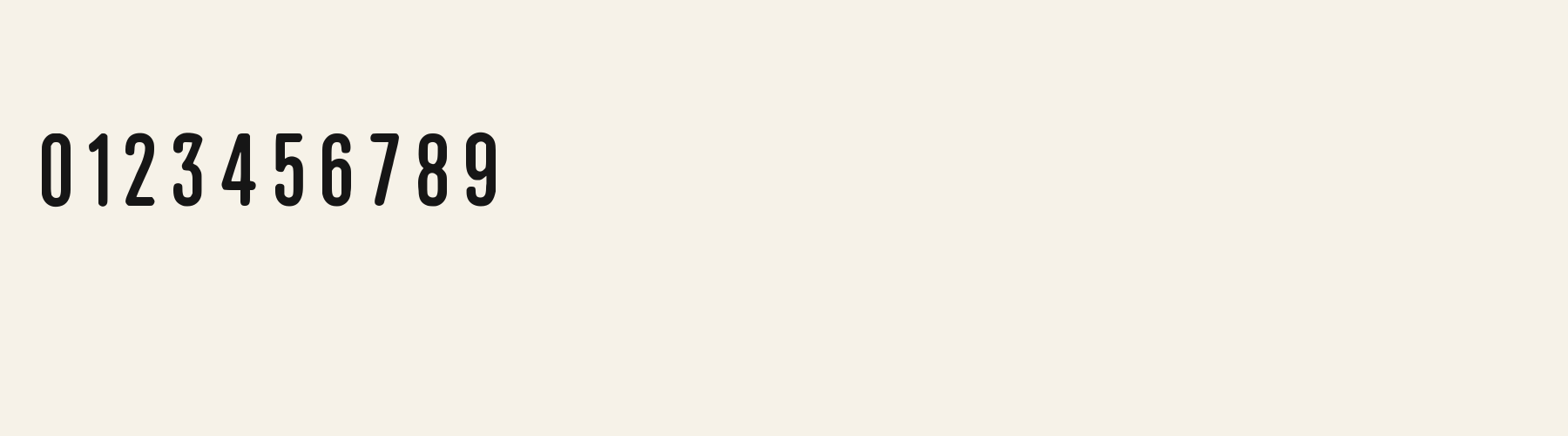
The NORTH 01. heading shows the supported figures and period in the same narrow display face.
Good for
Use it for a brief shop name or a short masthead when a tall, compact word is more useful than a wide display line.
Check before using
Do not set prices or symbol-heavy copy without checking coverage: this file lacks parentheses, currency signs, percent, ampersand, at sign, number sign, asterisk, plus, equals and slash.
About
Its x-height is 72% of the cap height, near the 72% typical of sans serif fonts in the library. Ascenders on b, d, h, k and l line up with the capitals (100.3% of their height), and descenders on g, j, p, q and y drop 23.3% of the cap height below the baseline. The o is an upright oval, 0.51 times as wide as it is tall, and W is the widest capital, at 1.65 times the width of H. Round letters overshoot: O rises 0.8% of the cap height above H and dips 0.9% below the baseline.
The letters stand upright, leaning less than 2.5° either way. Vertical stems measure 13.4% of the cap height. Strokes keep nearly one thickness in every direction: the sides and the tops of o and O differ by 13%.
Its 78 characters include 52 Latin letters, plus 26 figures, punctuation marks and symbols; there are no accented Latin letters beyond A to Z. The word space measures 20% of the cap height, and the blank space either side of a lowercase letter takes up 15.3% of its width. Spacing is adjusted with 3,711 kerning pairs, the most of all 1 sans serif fonts. The tightest of them is FJ, which closes up by 20.4% of the cap height. The figures have different widths, so columns of numbers set in Agate Acorn will not line up exactly.
Measured from the version 0.1.1 font file. Comparisons are with the 1 published library fonts measured on November 4, 2026, 1 of them sans serif fonts.
Characters
Download
Choose the license that matches your project before downloading.
See plans or browse fonts that are free to download.
Client work, products and redistribution need a commercial license. Library fonts include it with Pro or Studio; fonts you make include it when you make them on Pro or Studio. A Font Pass is for personal projects.
TTF · OTF · WOFF · WOFF2
Tools
Free tools that run in your browser. Images you make with them, such as a signature PNG, can be used for any purpose.
Similar
Sans serif1 style37 languages
Compared with Agate Acorn: 69% wider · taller x-height
Sans serif1 style5 languages
Compared with Agate Acorn: 8% narrower · taller x-height
Sans serif1 style18 languages
Compared with Agate Acorn: 48% wider · lighter strokes
Sans serif1 style24 languages
Compared with Agate Acorn: 82% wider · taller x-height
Method
The supplied font files were checked for the characters and letter shapes shown here. AI helped describe the visible forms and draft the examples; each sample uses the named font file. Previews are illustrative, and file measurements come from the delivered files.
The current text and font-file specimens received an independent review.
For R, Acorn Birch reserves 0.332 em versus 0.391 em in Agate Acorn. Its narrower advance can help when that capital repeats in a compact heading.
Acorn Vetch gives g a 0.424 em advance; here it is 0.334 em. Allow more horizontal room for the alternative.
FAQ