
Birch Quill
Sans serif1 style5 languages
Pro · plan or Pass
a g R S Aa
Sans serif · 1 style · 79 characters · Version 0.1.1 · Published November 5, 2026
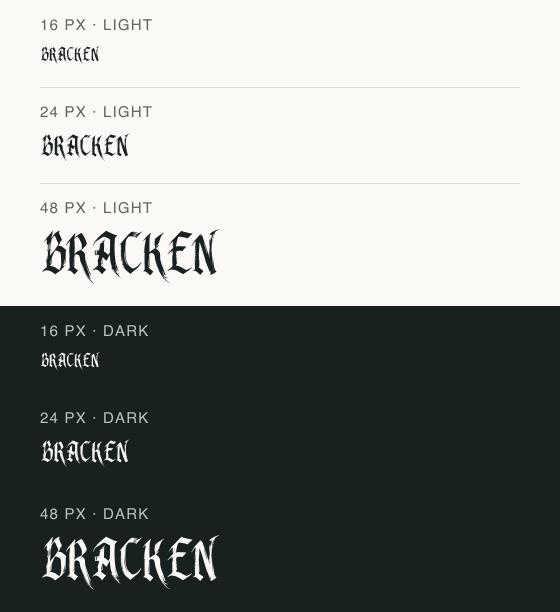
Bracken Knoll draws its sample in an ornate, blackletter-like display texture. In the cap line, the strokes taper into sharp tips and the outlines carry fine breaks that can disappear when the word is small; this makes size and background part of the choice.
Aa
agRS
Direction
Compare the light and dark versions at your output size, then inspect the actual words rather than relying on the font name or category.
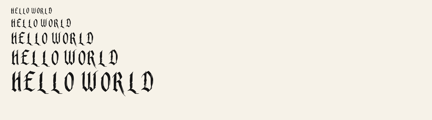
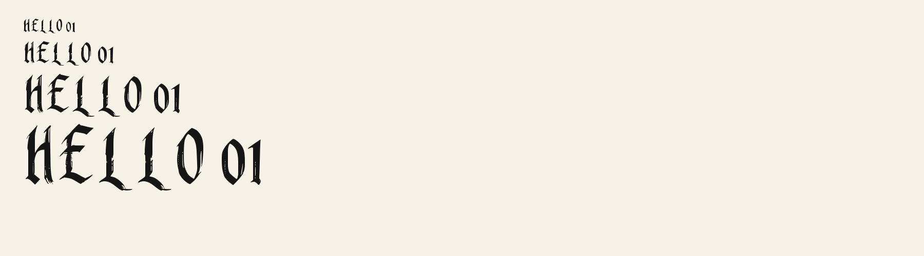
Each panel uses the same wording at 16, 24 and 48 px. The dark panels reverse the ink and background so you can inspect whether thin joins stay visible in this render.
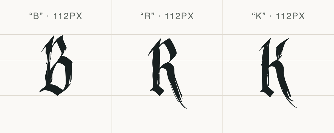
A central-scanline ink-interval estimate on the sampled o, n and H gives 0.0173 em for H, the lowest of those three samples. It is not a global minimum or a measurement of the B/R/K joins. These controlled previews show selected sizes and backgrounds, not a universal readability threshold.
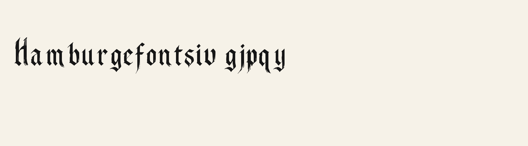
The enlarged glyphs isolate the angular edges and interior breaks that give the full word its ornamental texture.
Test
Type the words you plan to use and adjust size, line height, and letter spacing. The preview uses the final font file.
The quick brown fox jumps over the lazy dog
Like how it sets? It comes with Pro or Studio, or as a Font Pass pick for personal projects.
Get this fontSpecimens
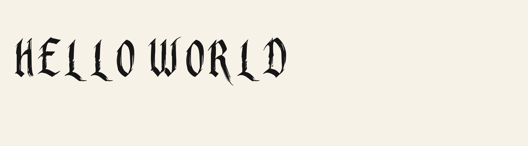
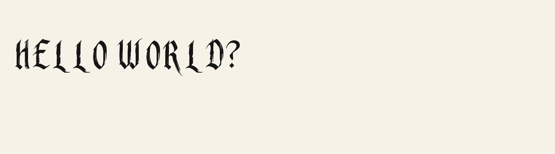
Rendered from the font files, without retouching.
Choose
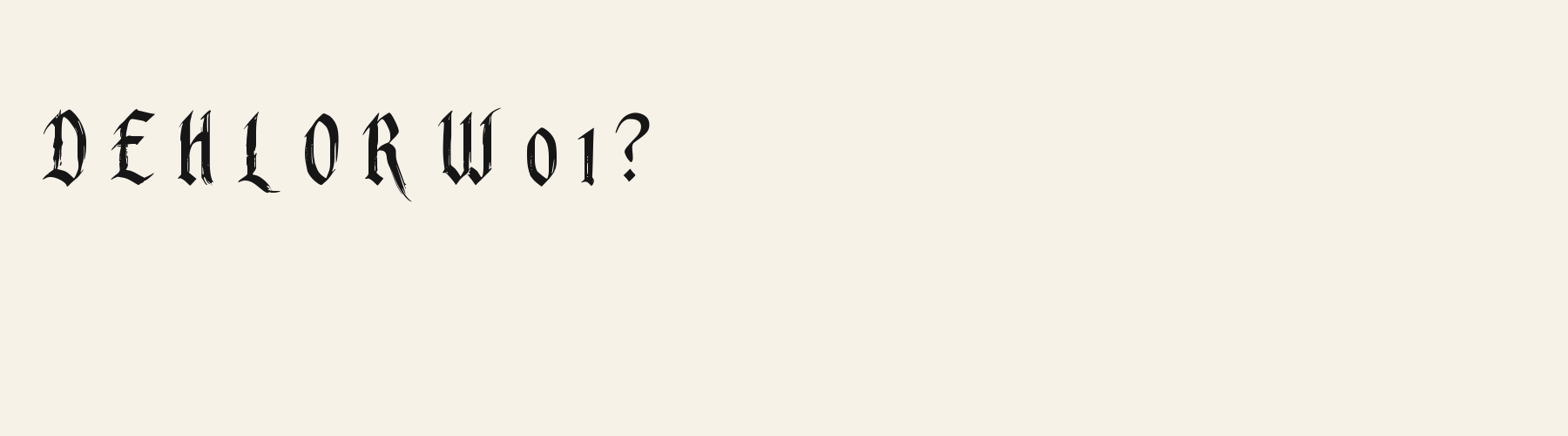
The capitals in BRACKEN use pointed, irregular edges rather than a plain geometric outline.
A central-scanline estimate on the sampled o, n and H gives 0.0173 em for H, the lowest of those three samples; it is not a global minimum or a measurement of the B/R/K joins.
The BRACKEN and B/R/K samples show tested English capitals; most common currency and layout symbols are absent from this file.
Good for
Use a short title or a single decorative word at a size where the fine edges remain visible.
Check before using
Avoid small reversed labels and continuous instructions; the low measured minimum stroke and ornate edges need visual checking at the final size.
About
Bracken Knoll's lowercase x reaches 60.5% of the capital height, close to the 60.5% median for sans serif fonts. Ascenders on b, d, h, k and l stop at 81.7% of the capital height, and descenders on g, j, p, q and y drop 25.3% of the cap height below the baseline. The o is an upright oval, 0.59 times as wide as it is tall, and W is the widest capital, at 1.73 times the width of H. The O stops 4.6% of the cap height short of H and sits on the baseline.
The letters stand upright, leaning less than 2.5° either way.
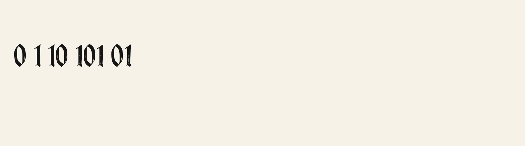
Its 78 characters include 52 Latin letters, plus 26 figures, punctuation marks and symbols; there are no accented Latin letters beyond A to Z. The word space measures 23.4% of the cap height, and the blank space either side of a lowercase letter takes up 14.9% of its width. Spacing is adjusted with 4,502 kerning pairs, the most of all 1 sans serif fonts. The tightest of them is Fg, which closes up by 41.7% of the cap height. The figures have different widths, so columns of numbers set in Bracken Knoll will not line up exactly.
Measured from the version 0.1.1 font file. Comparisons are with the 1 published library fonts measured on November 4, 2026, 1 of them sans serif fonts.
Characters
Download
Choose the license that matches your project before downloading.
See plans or browse fonts that are free to download.
Client work, products and redistribution need a commercial license. Library fonts include it with Pro or Studio; fonts you make include it when you make them on Pro or Studio. A Font Pass is for personal projects.
TTF · OTF · WOFF · WOFF2
Tools
Free tools that run in your browser. Images you make with them, such as a signature PNG, can be used for any purpose.
Similar
Sans serif1 style5 languages
Compared with Bracken Knoll: Heavier strokes · taller x-height
Sans serif1 style18 languages
Compared with Bracken Knoll: 35% wider · taller x-height
Sans serif1 style24 languages
Compared with Bracken Knoll: 66% wider · taller x-height
Sans serif1 style5 languages
Compared with Bracken Knoll: Heavier strokes · taller x-height
Method
The supplied font files were checked for the characters and letter shapes shown here. AI helped describe the visible forms and draft the examples; each sample uses the named font file. Previews are illustrative, and file measurements come from the delivered files.
The current text and font-file specimens received an independent review.
For R, Acorn Birch reserves 0.332 em versus 0.671 em in Bracken Knoll. Its narrower advance can help when that capital repeats in a compact heading.
Acorn Vetch gives g a 0.424 em advance; here it is 0.424 em. The measured advance is equal; use the outline comparison for a shape decision.
FAQ