
Cursive School Upright
Script1 style17 languages
Pro · plan or Pass
a g R S & Aa
Script · 1 style · 149 characters · Version 0.1.2 · Published November 5, 2026
Executive Sign uses a fine, slanted signature construction with paired interior strokes in its display forms. Here the focus is how the numerals and everyday marks sit beside a script word, rather than assuming every character carries the same formal flourish.
Aa
agRS&
Direction
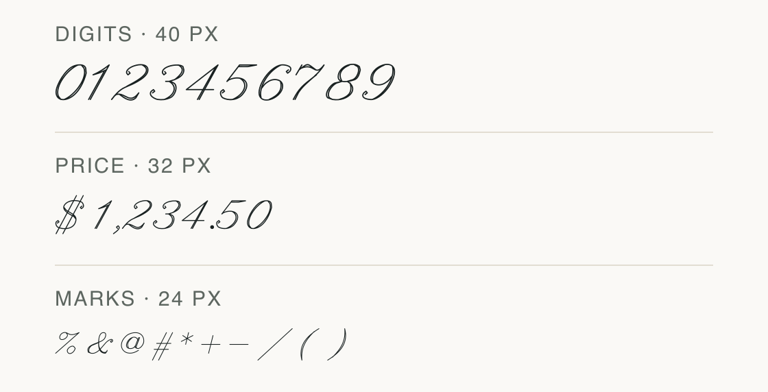
Check the zero, one, and seven in the chosen amount, then verify every currency mark against the exact file.
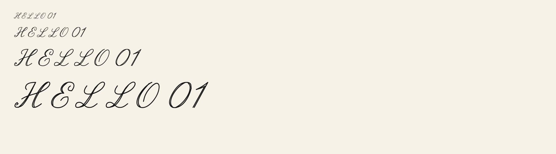
This board separates a digit run, a price string, and common display marks. It reports the shapes present in this exact font file; spacing shown is a preview, not tabular alignment.
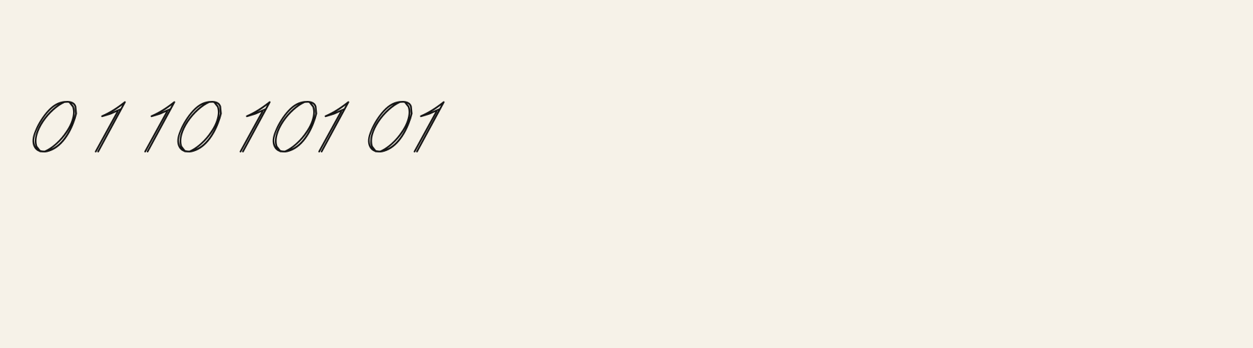
At 1000 UPM, the 1 advances 0.419 em and 2 advances 0.707 em; 0 is 0.593 em. The 1 and 2 therefore reserve different horizontal space even at one nominal size.
The dollar sign is available for the price row, but euro, pound, and yen signs are absent from this file; the missing marks cannot be supplied by the specimen. Missing from the common currency sample: € £ ¥.
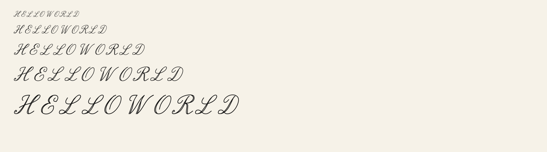
This neutral poster strip uses one compact phrase to keep the letter shapes visible beside the number board.

Test
Type the words you plan to use and adjust size, line height, and letter spacing. The preview uses the final font file.
The quick brown fox jumps over the lazy dog
Like how it sets? It comes with Pro or Studio, or as a Font Pass pick for personal projects.
Get this fontSpecimens
Rendered from the font files, without retouching.
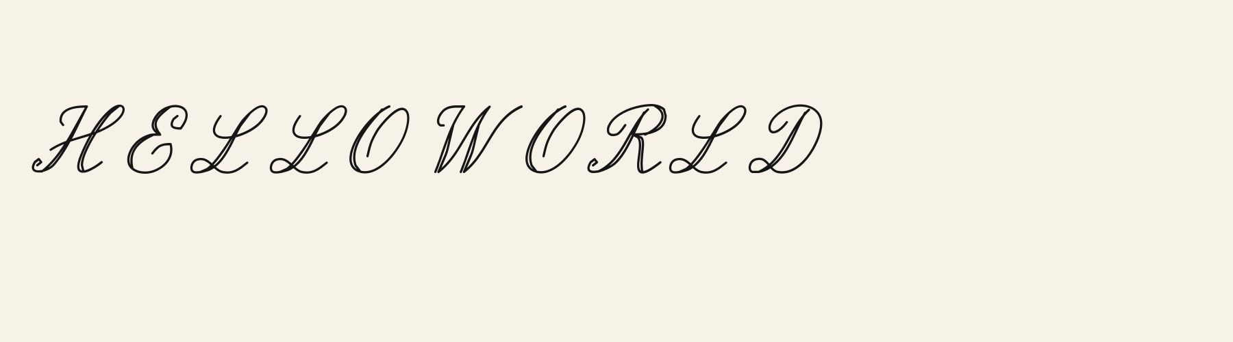
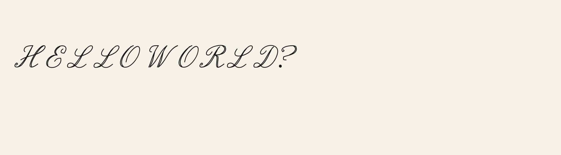
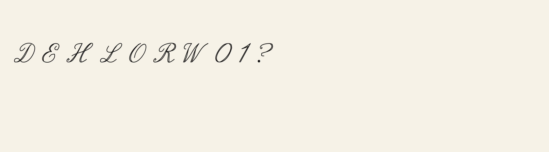
Choose
The 0 is a narrow oval; its measured advance is 0.593 em, compared with 0.419 em for 1 and 0.707 em for 2.
The 1 has a simple upright profile, while 7 and 4 keep distinct angled joins in the same numeral row.
The dollar sign is available for the price row, but euro, pound, and yen signs are absent from this file; the missing marks cannot be supplied by the specimen.
Good for
Use Executive Sign when a display word needs a fine slant and the amount can be expressed with its available marks. The number row lets you check the actual figures and punctuation before assembling a short price or date.
Check before using
This sample contains digits 0–9 and the supported dollar sign, but not €, £, or ¥. A price string needing any of those three symbols needs a different font or a separately verified fallback; the fallback is outside this file-level comparison.
About
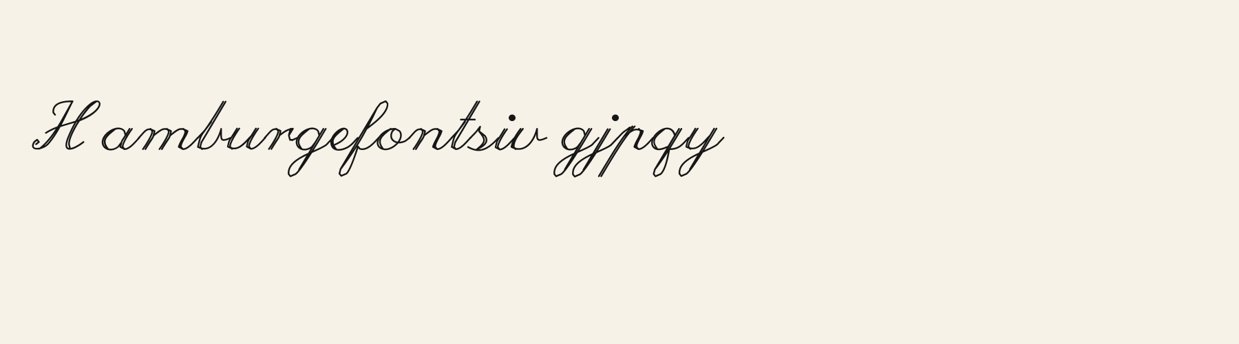
Its x-height is 45% of the cap height, near the 45% typical of script fonts in the library. Ascenders on b, d, h, k and l line up with the capitals (99.1% of their height), and descenders on g, j, p, q and y drop 53.5% of the cap height below the baseline. The o is wider than it is tall, 1.50 to 1, and N is the widest capital, at 1.15 times the width of H. The O stops 0.9% of the cap height short of H and sits on the baseline.
Its 148 characters include 105 Latin letters, plus 43 figures, punctuation marks and symbols; 53 of the Latin letters are accented or special forms beyond A to Z. The word space measures 32.9% of the cap height, and lowercase letters reach 29.7% past their own widths into the space of their neighbours. Spacing is adjusted with 37 kerning pairs, the most of all 1 script fonts. The tightest of them is TA, which closes up by 30.4% of the cap height. The figures have different widths, so columns of numbers set in Executive Sign will not line up exactly.
Measured from the version 0.1.2 font file. Comparisons are with the 1 published library fonts measured on November 4, 2026, 1 of them script fonts.
Characters
Download
Choose the license that matches your project before downloading.
See plans or browse fonts that are free to download.
Client work, products and redistribution need a commercial license. Library fonts include it with Pro or Studio; fonts you make include it when you make them on Pro or Studio. A Font Pass is for personal projects.
TTF · OTF · WOFF · WOFF2
Tools
Free tools that run in your browser. Images you make with them, such as a signature PNG, can be used for any purpose.
Similar
Script1 style17 languages
Compared with Executive Sign: Taller x-height · 16% wider
Script1 style17 languages
Compared with Executive Sign: Taller x-height · 28% wider
Script1 style17 languages
Compared with Executive Sign: 39% wider · heavier strokes
Script1 style17 languages
Compared with Executive Sign: Heavier strokes · 15% wider
Method
We use the local font files to check which characters they contain and how each sample looks. AI helped prepare these observations and example wording. The images use the named font files without replacement letters; measurements describe those supplied files. Previews are examples, and display can vary between apps.
The current text and font-file specimens received an independent review.
For R, Amore Nib reserves 0.773 em versus 0.798 em in Executive Sign. Its narrower advance can help when that capital repeats in a compact heading.
Acorn Birch gives g a 0.289 em advance; here it is 0.468 em. The alternative sets that character more tightly.
FAQ