
Agate Gantry
Sans serif1 style24 languages
Pro · plan or Pass
a g R S & Aa
Sans serif · 1 style · 176 characters · Version 0.1.4 · Published November 5, 2026
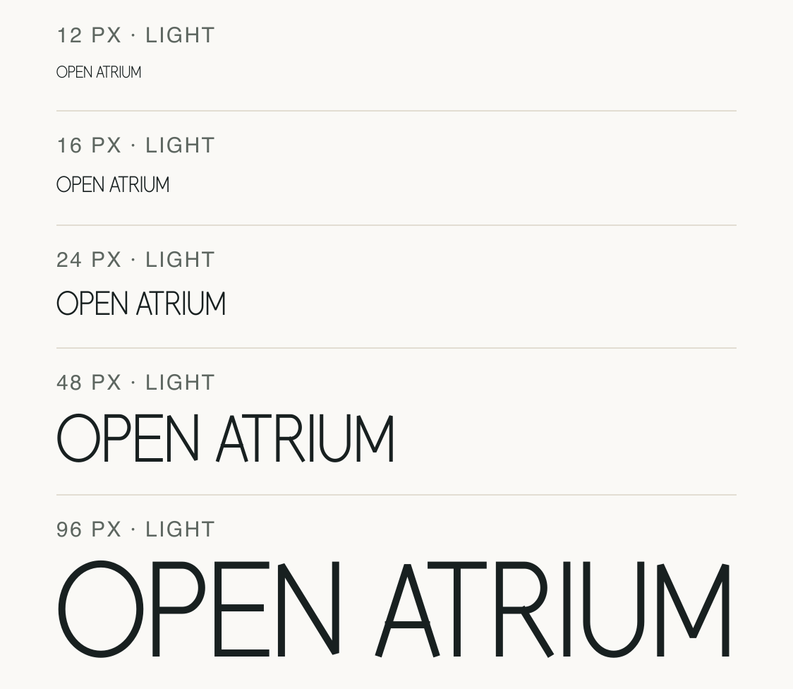
Atrium Sans draws the capitals with very fine, nearly even strokes and generous open interiors. The repeated OPEN ATRIUM specimen leaves white space inside the O and A, so the face reads as a light display voice rather than a heavy label style.
Aa
agRS&
Direction
Compare the actual final-size line on both backgrounds; a thin outline can behave differently once color, display density and surrounding contrast change.
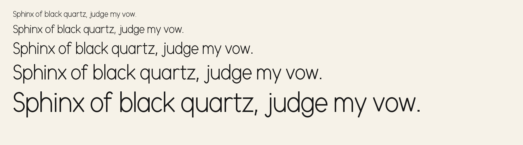
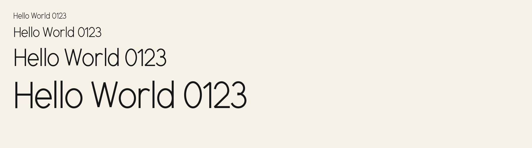
The same words and tracking are shown at five preview sizes. Look at the thin diagonals and open bowls as the lettering shrinks; no minimum readable size is implied.
The sample uses a clean light field so the fine strokes are easy to isolate.
The sample repeats the phrase from the light panel in white on a dark field. Compare the thinnest diagonals at each size rather than assuming the light-background result transfers unchanged.
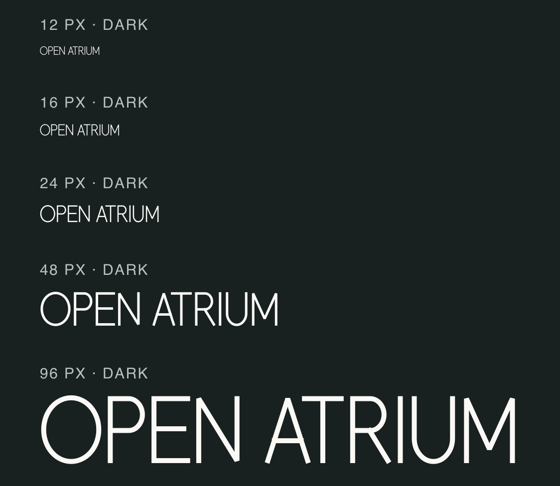
Atrium Sans is an unusually light face in this measured sample. Test it in the real contrast and display conditions where the title will appear; this specimen does not establish a device-independent threshold.
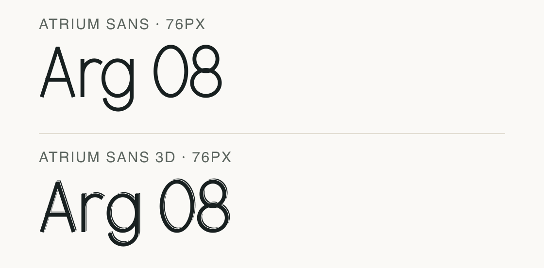
The related Atrium Sans 3D file is a separate font record with a different character count. Compare its own preview and access terms before choosing between the two.
Atrium Sans and the related files below use matching wording and scale. The effect changes the silhouette; it does not merge their licenses or font records.
Test
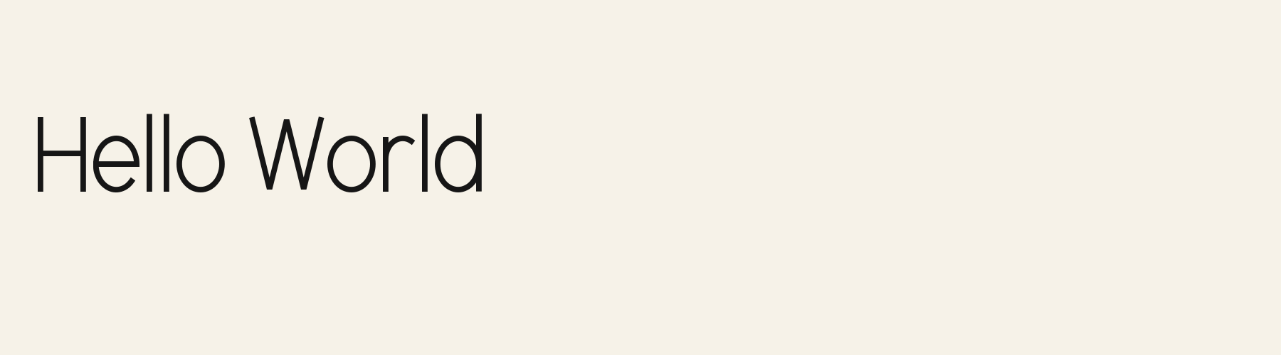
Type the words you plan to use and adjust size, line height, and letter spacing. The preview uses the final font file.
The quick brown fox jumps over the lazy dog
Like how it sets? It comes with Pro or Studio, or as a Font Pass pick for personal projects.
Get this fontSpecimens
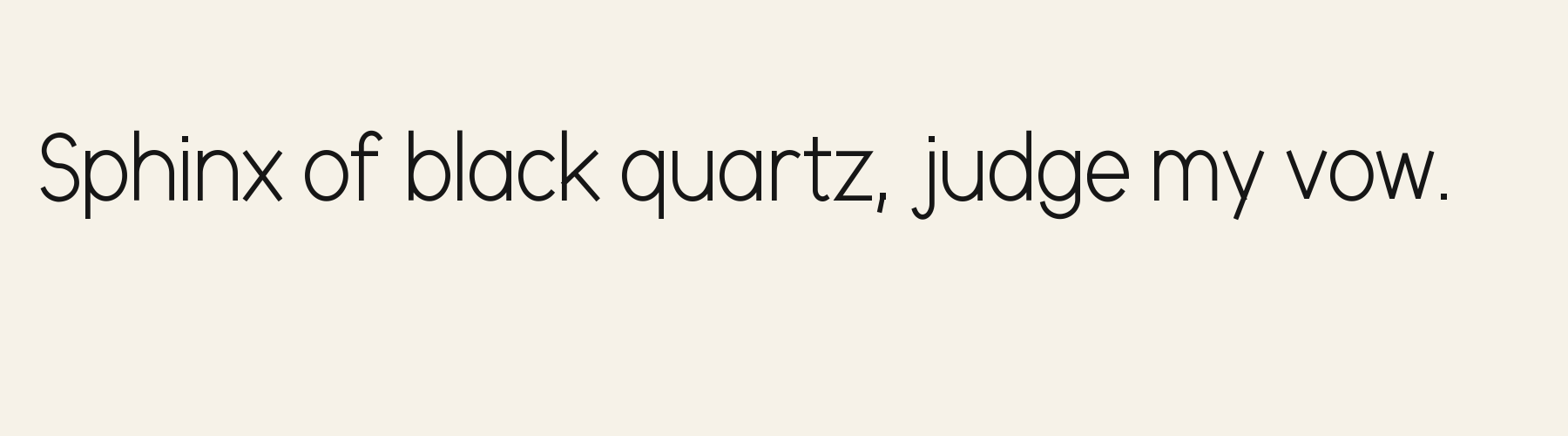
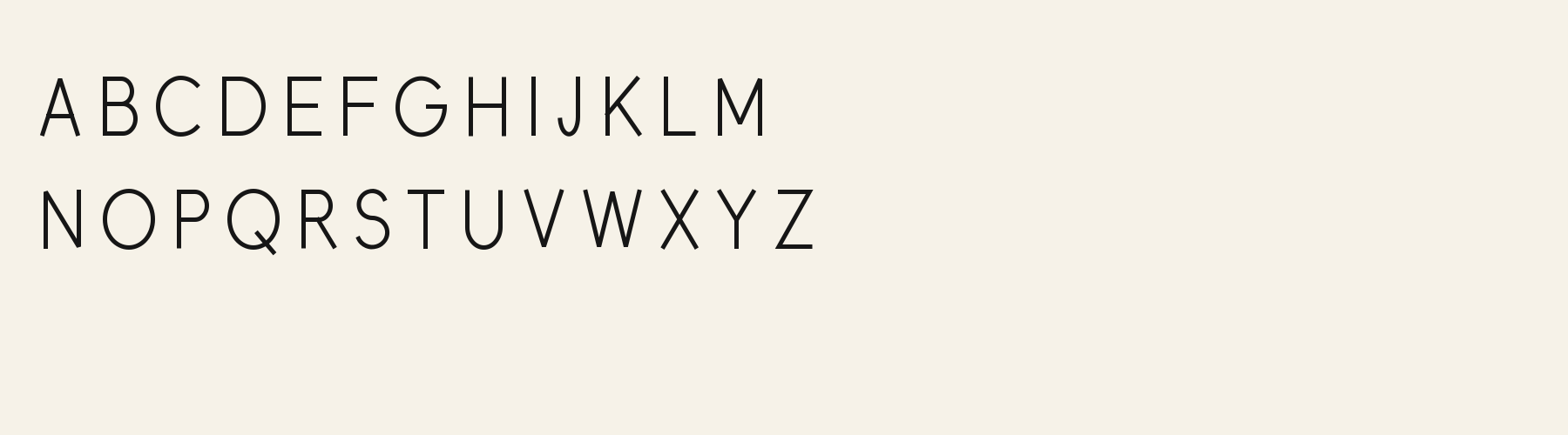
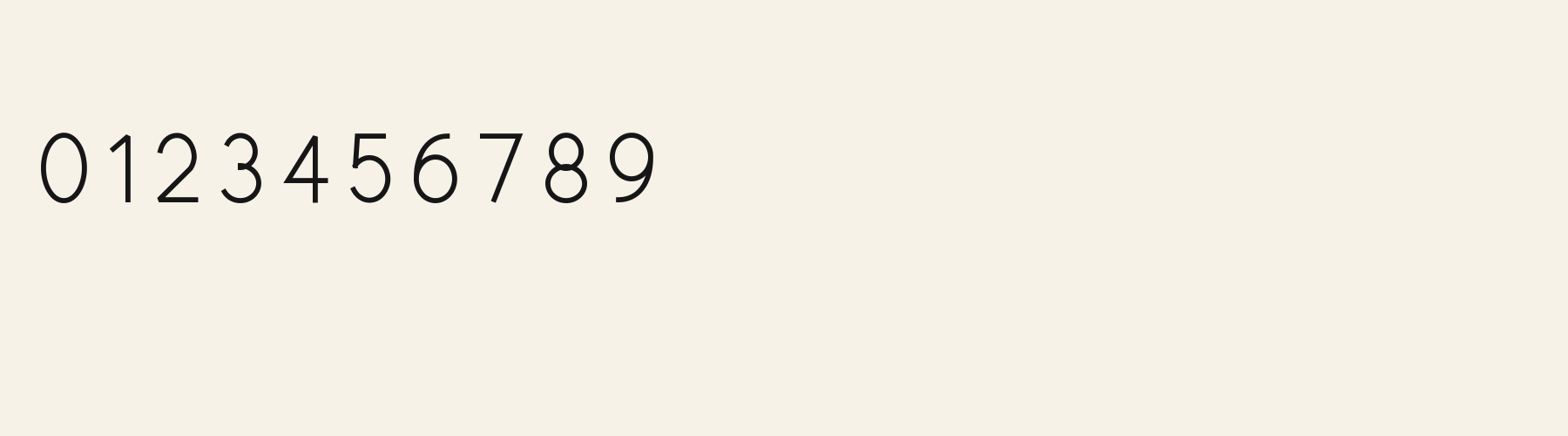
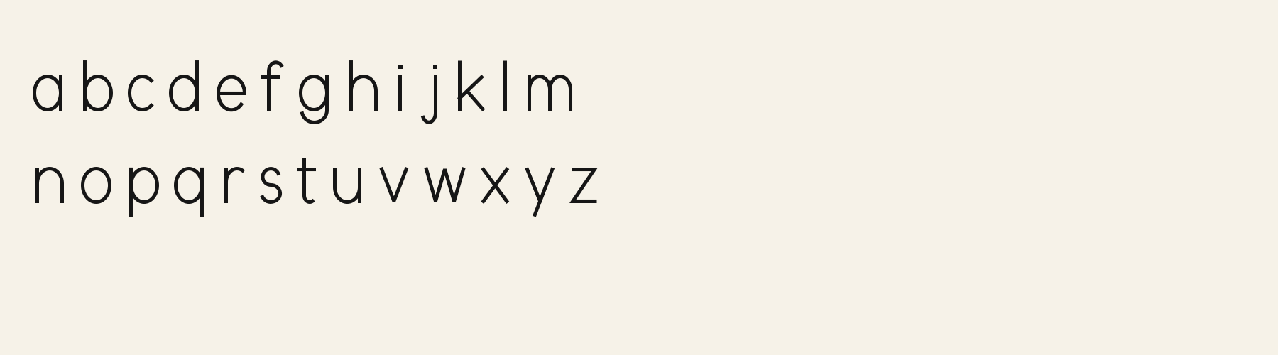
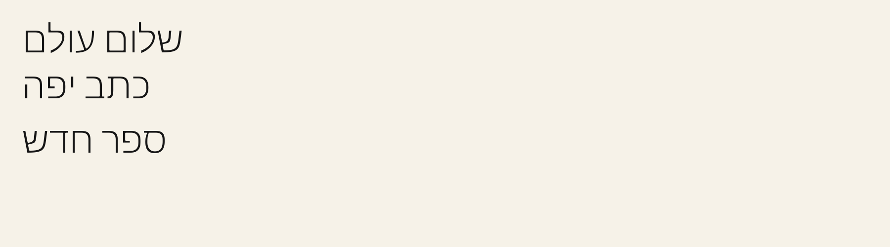
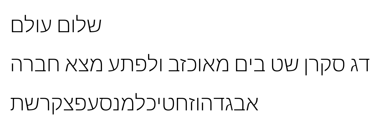
Rendered from the font files, without retouching.
Choose
The OPEN ATRIUM samples use thin strokes with little visible weight contrast.
The repeated O and A forms leave substantial interior space in the rendered line.
The regular file maps 176 characters; the tested full repertoires are English, Italian and Portuguese.
Good for
Use a short heading over a light background when open spacing and a delicate stroke suit the surrounding design.
Check before using
Avoid reversed lettering at small sizes or over busy imagery: this sample has fine strokes, and its measured minimum stroke is 0.052 em, not a guarantee of legibility on every screen.
About
Its x-height is 74.6% of the cap height, near the 74.6% typical of sans serif fonts in the library. Ascenders on b, d, h, k and l rise 4% above the capitals, and descenders on g, j, p, q and y drop 27.8% of the cap height below the baseline. The o is an upright oval, 0.85 times as wide as it is tall, and W is the widest capital, at 1.30 times the width of H. Round letters overshoot: O rises 1.3% of the cap height above H and dips 1.3% below the baseline.
The letters stand upright, leaning less than 2.5° either way. Vertical stems measure 7.4% of the cap height. Strokes keep one thickness in every direction: the sides of o and O measure the same as their tops and bottoms.
Its 175 characters include 105 Latin and 27 Hebrew letters, plus 43 figures, punctuation marks and symbols; 53 of the Latin letters are accented or special forms beyond A to Z. The word space measures 28.7% of the cap height, and the blank space either side of a lowercase letter takes up 15.3% of its width. Spacing is adjusted with 146 kerning pairs, the most of all 1 sans serif fonts. The tightest of them is AY, which closes up by 19.1% of the cap height. Its OpenType tables also hold ligatures (liga, dlig). The figures have different widths, so columns of numbers set in Atrium Sans will not line up exactly.
Measured from the version 0.1.4 font file. Comparisons are with the 1 published library fonts measured on November 4, 2026, 1 of them sans serif fonts.
דג סקרן שט בים מאוכזב ולפתע מצא חברה
Zhvillimi i gjuhës shqipe është një çështje e rëndësishme.
Magandang umaga sa inyong lahat.
Selamat pagi, apa khabar hari ini?
Habari za asubuhi, karibu nyumbani.
Characters
Download
Choose the license that matches your project before downloading.
See plans or browse fonts that are free to download.
Client work, products and redistribution need a commercial license. Library fonts include it with Pro or Studio; fonts you make include it when you make them on Pro or Studio. A Font Pass is for personal projects.
TTF · OTF · WOFF · WOFF2
Tools
Free tools that run in your browser. Images you make with them, such as a signature PNG, can be used for any purpose.
Similar
Sans serif1 style24 languages
Compared with Atrium Sans: 23% wider · heavier strokes
Sans serif1 style5 languages
Compared with Atrium Sans: Heavier strokes · 32% narrower
Sans serif1 style37 languages
Compared with Atrium Sans: Heavier strokes · 40% narrower
Sans serif1 style5 languages
Compared with Atrium Sans: Heavier strokes · 6% wider
Method
The supplied font files were checked for the characters and letter shapes shown here. AI helped describe the visible forms and draft the examples; each sample uses the named font file. Previews are illustrative, and file measurements come from the delivered files.
The current text and font-file specimens received an independent review.
For R, Acorn Birch reserves 0.332 em versus 0.498 em in Atrium Sans. Its narrower advance can help when that capital repeats in a compact heading.
Acorn Vetch gives g a 0.424 em advance; here it is 0.505 em. The alternative sets that character more tightly.
FAQ