
Birthday Candle Caps
Display1 style30 languages
Pro · plan or Pass
a g R S & Aa
Display · 1 style · 197 characters · Version 0.1.2 · Published November 5, 2026
Hull Block is built from broad rectangular capitals with a strong, nearly uniform stroke. Its wide uppercase forms give short display phrases a mechanical, sign-like rhythm; this sample checks how one fixed slogan behaves across three print-zone widths.
Aa
agRS&
Direction
Compare the A counter and the R leg across the three placements, then choose a phrase length that fits the intended zone.
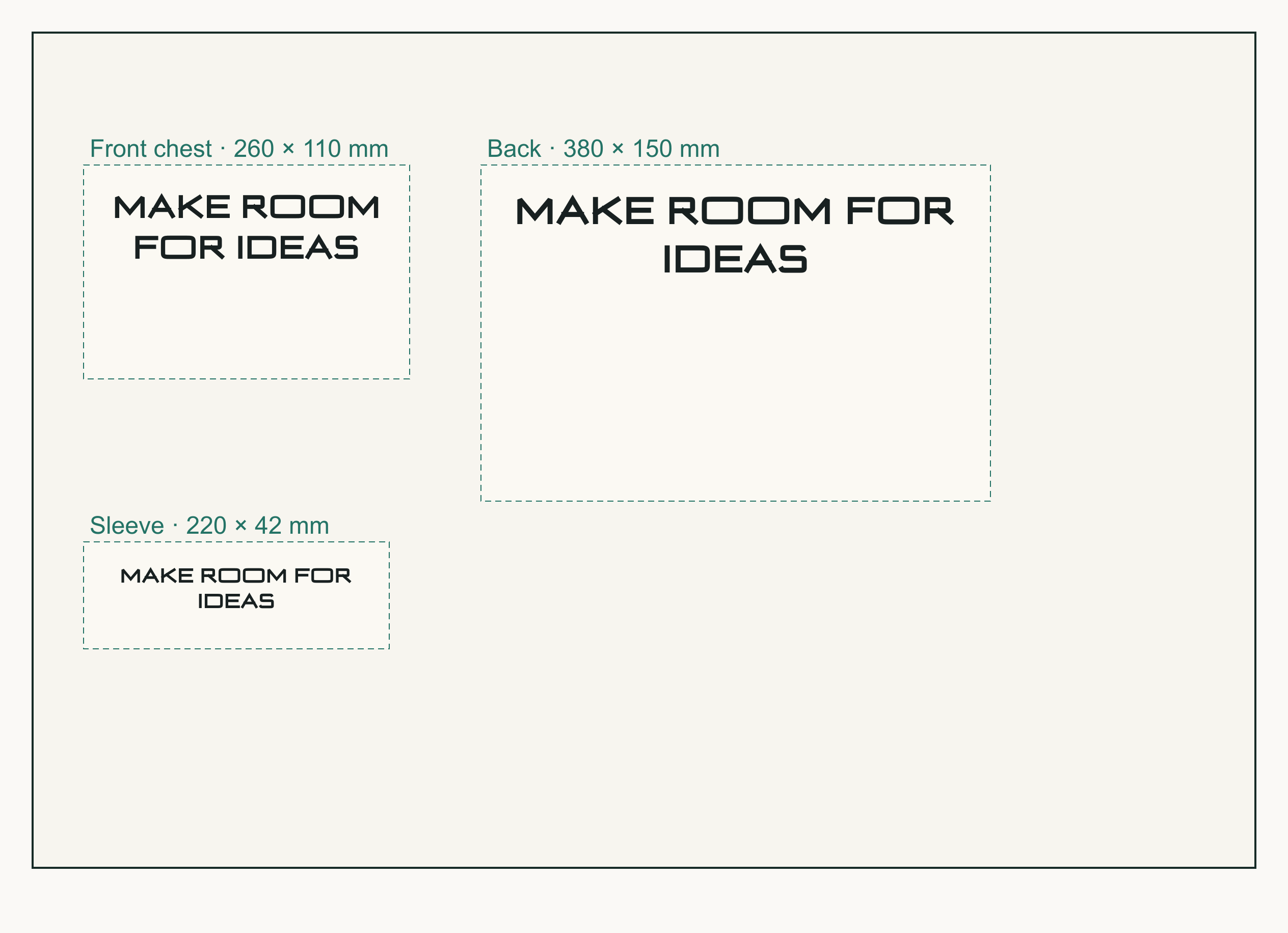
This layout places MAKE ROOM FOR IDEAS in the front, back, and sleeve regions. Each line uses its set type size and area; line breaks follow how much space the words take in Hull Block.
The front area breaks after MAKE ROOM; the back and sleeve break after FOR. The sample therefore keeps all three lines inside their measured regions, with zero ink-boundary overflow, while showing that the narrow sleeve still needs two lines.
The A apex and open counter, broad M, and R bowl and diagonal leg can all be inspected in the task lettering. The break is measured on the complete phrase, not attributed to any one character. All measurements describe this exact 0.1.2 file and these preview settings.
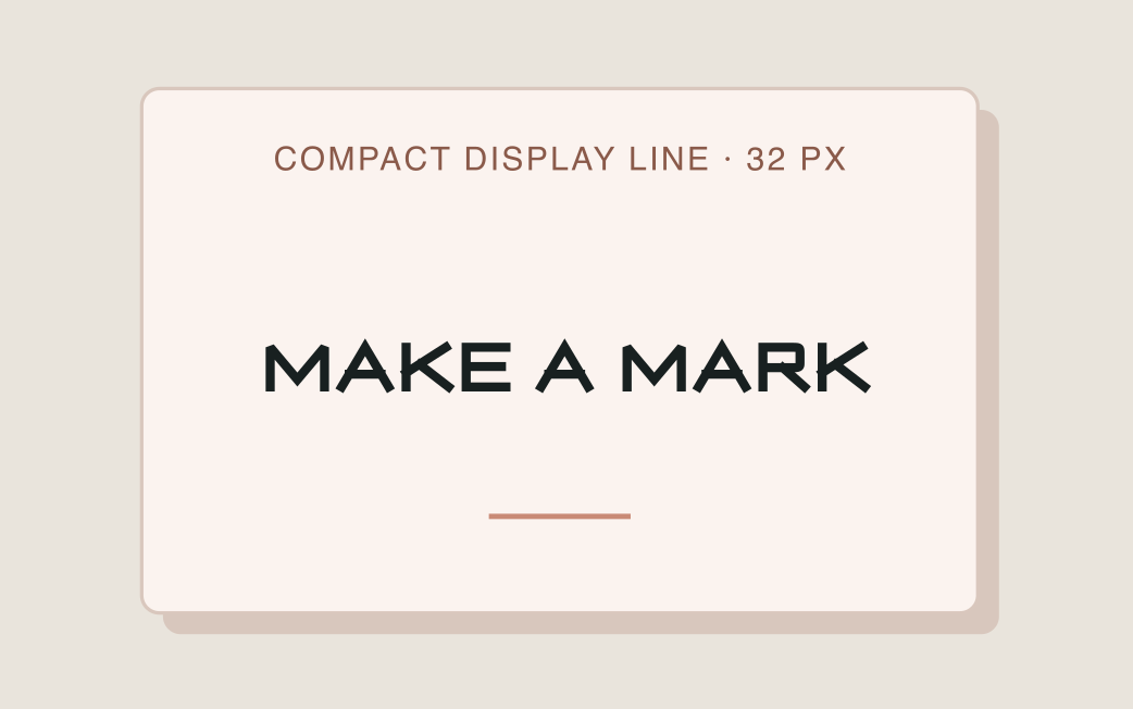
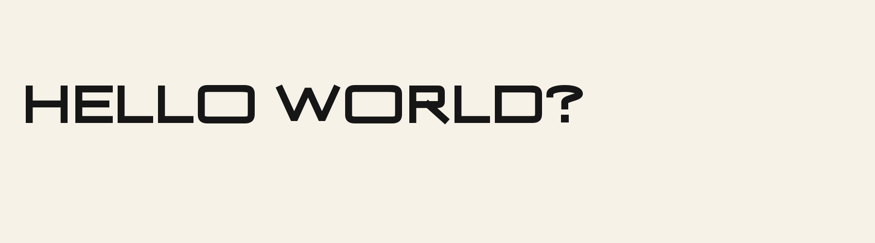
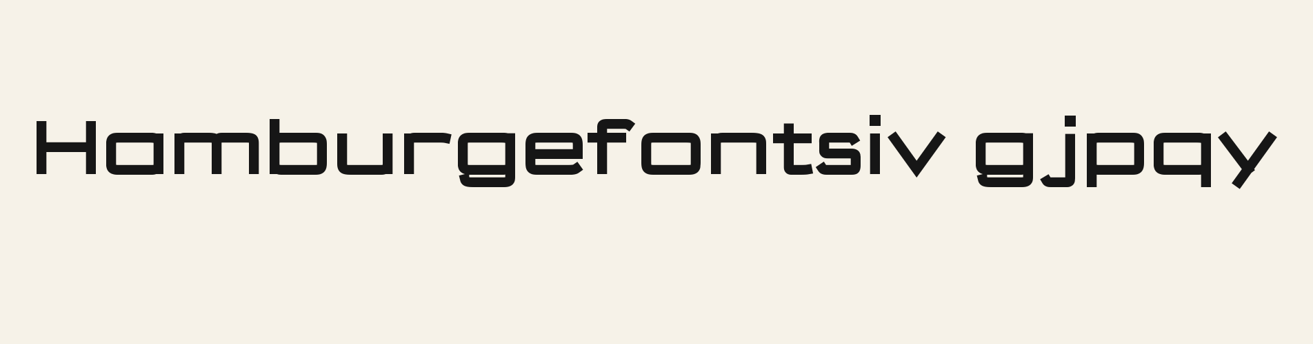
A one-line specimen keeps the wording constant while showing the geometric forms outside the three-zone task. It is an illustrative font preview, not a client or production sample.
At 32 px, the A retains its pointed apex and open counter, while the R's diagonal leg separates clearly from its squared bowl. Compare those forms with the wide M in MAKE before choosing a shorter compact headline.
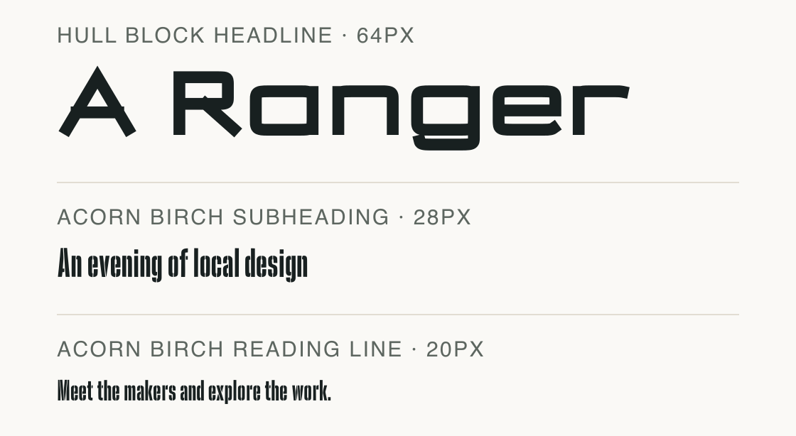
Hull Block takes the title; Acorn Birch sets the explanatory lines. Their different letter structures separate emphasis from reading.
Test
Type the words you plan to use and adjust size, line height, and letter spacing. The preview uses the final font file.
The quick brown fox jumps over the lazy dog
Like how it sets? It comes with Pro or Studio, or as a Font Pass pick for personal projects.
Get this fontSpecimens
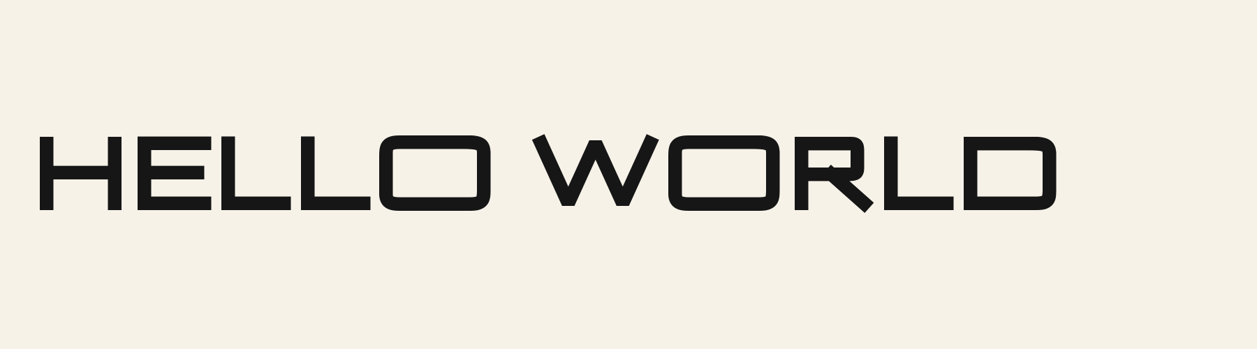
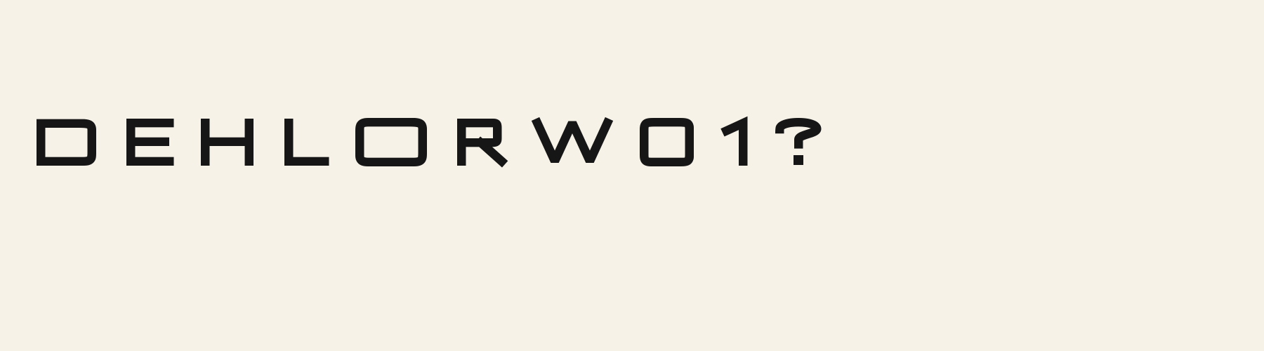
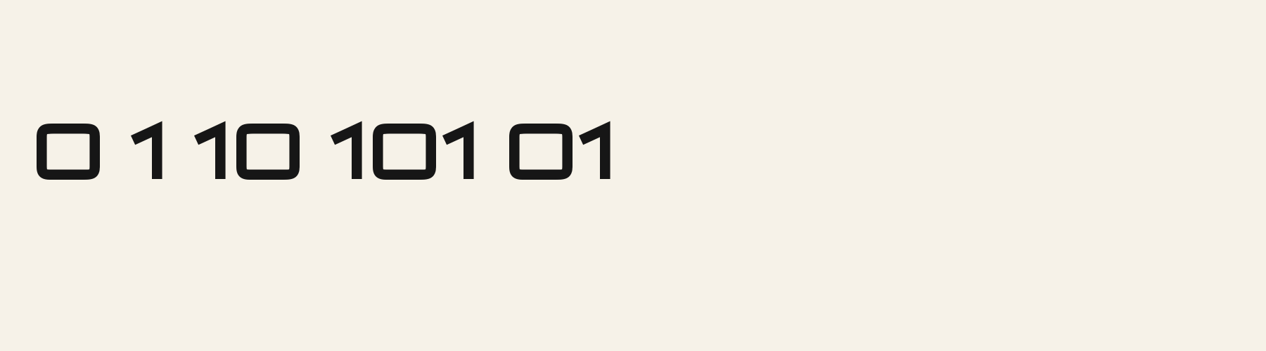
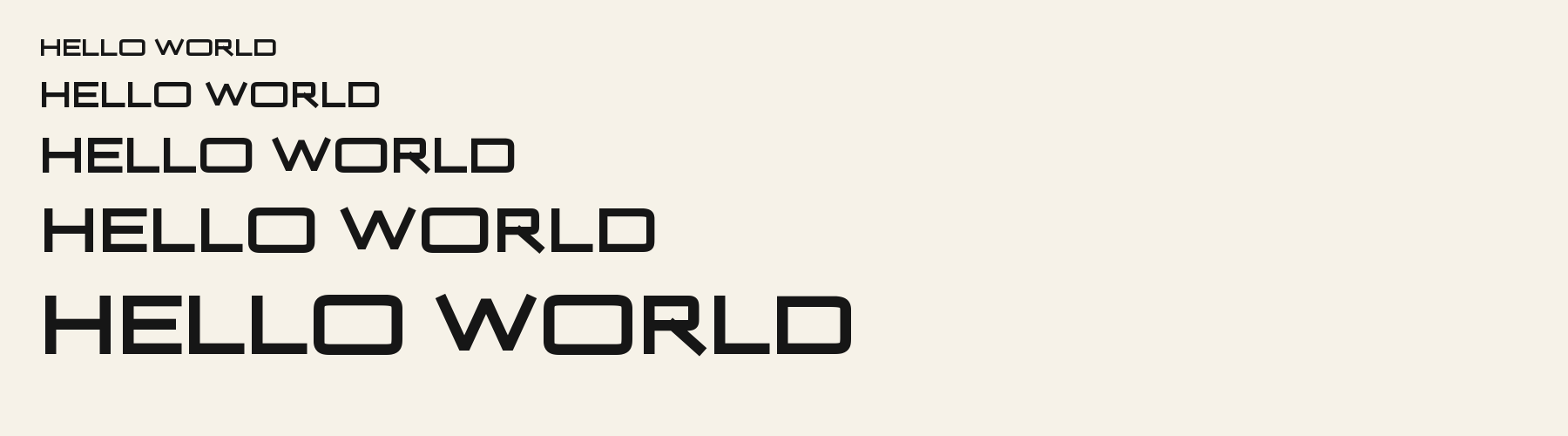
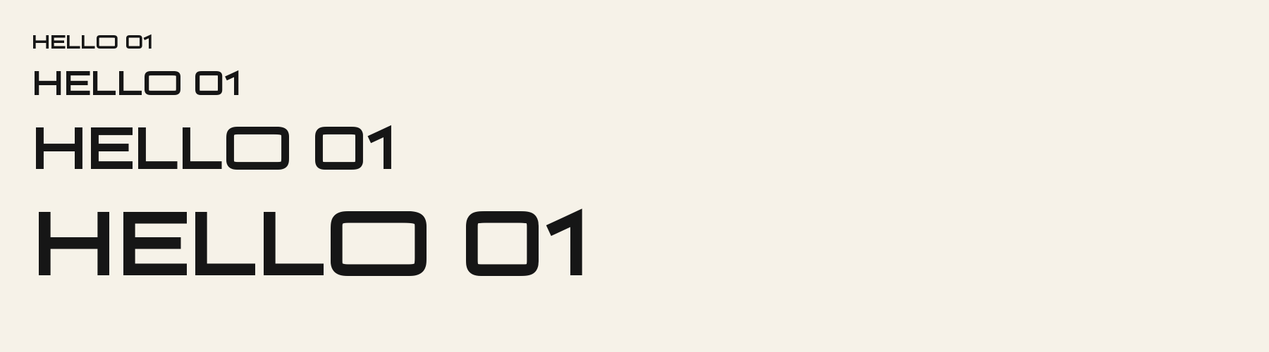
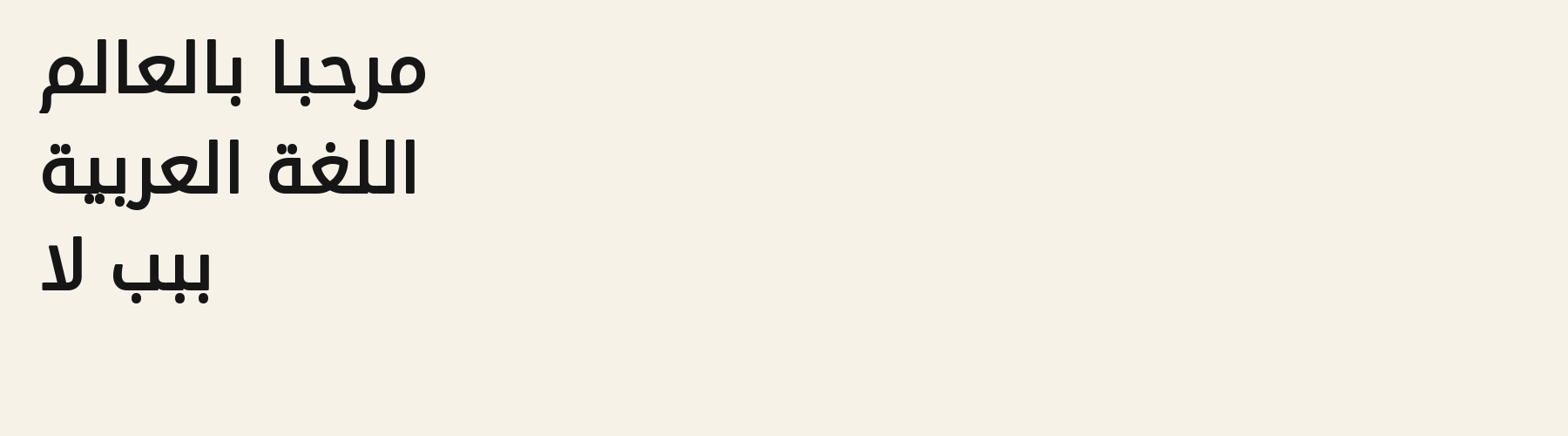
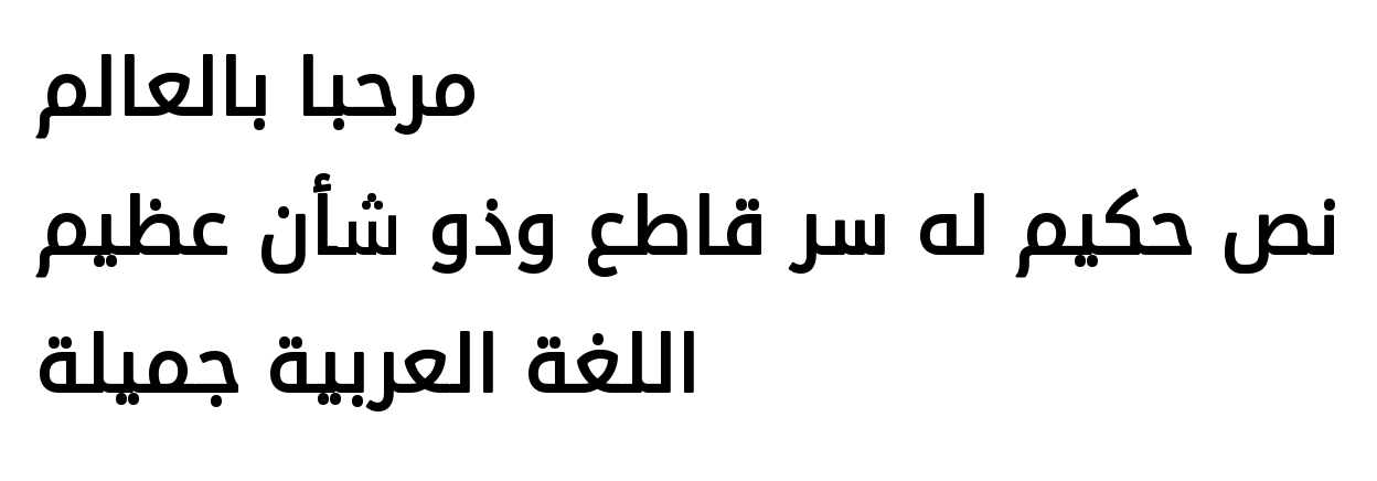
Rendered from the font files, without retouching.
Choose
In MAKE, the M keeps its broad outer stems and deep central notch at the 32 px front setting; the letter does not collapse into a narrow bar.
The A in MAKE and IDEAS has a pointed apex and open triangular counter; the same construction stays legible in the 20 px sleeve line.
The R in ROOM has a squared bowl and a diagonal leg; its own width can be compared with neighboring letters, while the full word’s break depends on the whole shaped run.
Good for
Use Hull Block for brief, high-contrast display phrases where square geometry and broad capitals should carry the message. The three-zone layout makes the phrase length and its breaks visible before anyone adapts the design.
Check before using
The broad capitals take space quickly: the fixed slogan breaks into two lines in all three regions, so a single-line sleeve treatment would need a shorter phrase or a wider area. This is a screen layout preflight, not a garment or print-process guarantee.
About
Hull Block's lowercase x reaches 80.4% of the capital height, close to the 80.4% median for display fonts. Ascenders on b, d, h, k and l rise 3.4% above the capitals, and descenders on g, j, p, q and y drop 24.4% of the cap height below the baseline. The o is wider than it is tall, 1.41 to 1, and W is the widest capital, at 1.34 times the width of H. Round letters overshoot: O rises 1.1% of the cap height above H and dips 1.1% below the baseline.
The letters stand upright, leaning less than 2.5° either way. Vertical stems measure 18.6% of the cap height. Strokes keep one thickness in every direction: the sides of o and O measure the same as their tops and bottoms.
Its 196 characters include 105 Latin and 36 Arabic letters, plus 55 figures, punctuation marks and symbols; 53 of the Latin letters are accented or special forms beyond A to Z. The word space measures 44.7% of the cap height, and the blank space either side of a lowercase letter takes up 14.7% of its width. Spacing is adjusted with 105 kerning pairs, the most of all 1 display fonts. The tightest of them is AY, which closes up by 34.7% of the cap height. Its OpenType tables also hold Arabic joining forms (init, medi, fina), mark positioning for accents and vowel signs (mark, mkmk), ligatures (liga, dlig) and glyph composition (ccmp, locl). The figures have different widths, so columns of numbers set in Hull Block will not line up exactly.
Measured from the version 0.1.2 font file. Comparisons are with the 1 published library fonts measured on November 4, 2026, 1 of them display fonts.
نص حكيم له سر قاطع وذو شأن عظيم مكتوب على ثوب أخضر
Zhvillimi i gjuhës shqipe është një çështje e rëndësishme.
Magandang umaga sa inyong lahat.
Selamat pagi, apa khabar hari ini?
Habari za asubuhi, karibu nyumbani.
Characters
Download
Choose the license that matches your project before downloading.
See plans or browse fonts that are free to download.
Client work, products and redistribution need a commercial license. Library fonts include it with Pro or Studio; fonts you make include it when you make them on Pro or Studio. A Font Pass is for personal projects.
TTF · OTF · WOFF · WOFF2
Tools
Free tools that run in your browser. Images you make with them, such as a signature PNG, can be used for any purpose.
Similar
Display1 style30 languages
Compared with Hull Block: 33% narrower · lower x-height
Display1 style17 languages
Compared with Hull Block: 25% narrower · heavier strokes
Display1 style17 languages
Compared with Hull Block: 26% narrower · heavier strokes
Display1 style17 languages
Compared with Hull Block: 19% narrower · heavier strokes
Method
The supplied font files were checked for the characters and letter shapes shown here. AI helped describe the visible forms and draft the examples; each sample uses the named font file. Previews are illustrative, and file measurements come from the delivered files.
The current text and font-file specimens received an independent review.
Brigade Wide Stencil keeps the wide geometric poster role but rounds the ends and interrupts strokes, unlike Hull Block’s pointed A and M. For “MARK 27,” its advance is 5.407 em versus 5.523 em here.
Acorn Birch gives g a 0.289 em advance; here it is 0.896 em. The alternative sets that character more tightly.
FAQ