
Bubble Heart Sprinkle
Display1 style17 languages
Pro · plan or Pass
H S $ I n s
Display · 1 style · 149 characters · Version 0.1.2 · Published November 5, 2026
Bubble Ribbon Knot has wide rounded bowls with shallow inward waists on selected joins. The letters keep a standard Latin construction; the name does not describe ribbon glyphs, tied loops or separate ornaments.
Aa
HS$Ins
Direction
Use the waist detail as a letterform cue, not as a promise of separate decorative symbols.
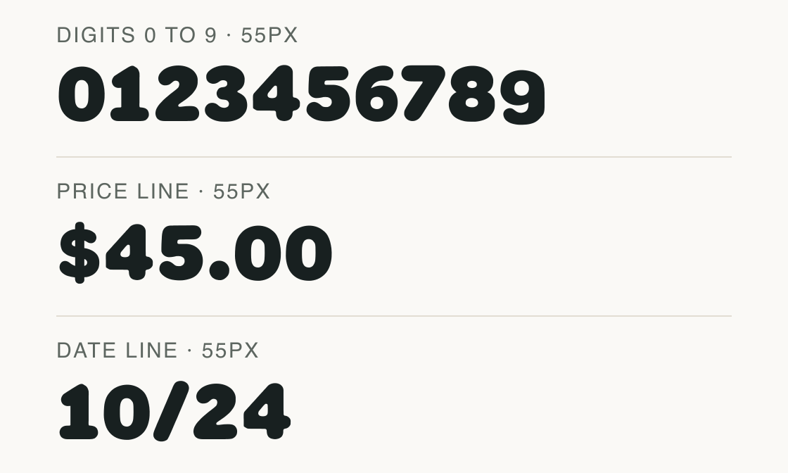
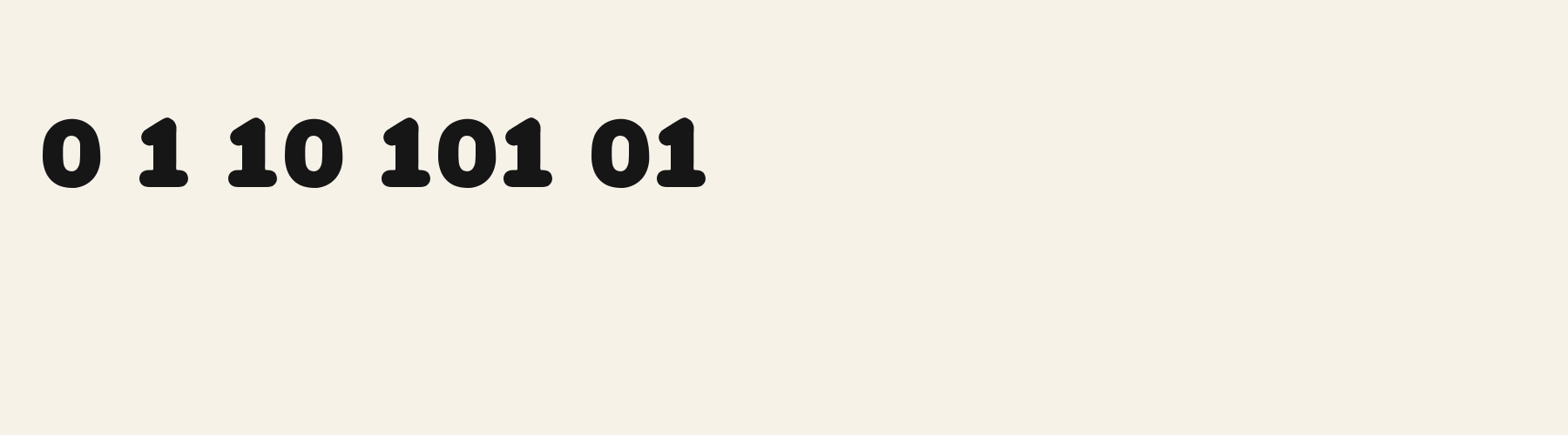
The rows show the digits and punctuation used for a small event price and date. The euro, pound and yen are missing from this common-symbol check.
Advances are proportional: 0 measures 0.657em, 1 measures 0.582em and 8 measures 0.658em. No numeric feature tags are declared, so the file does not expose a tabular-number setting in this inspection.
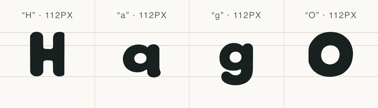
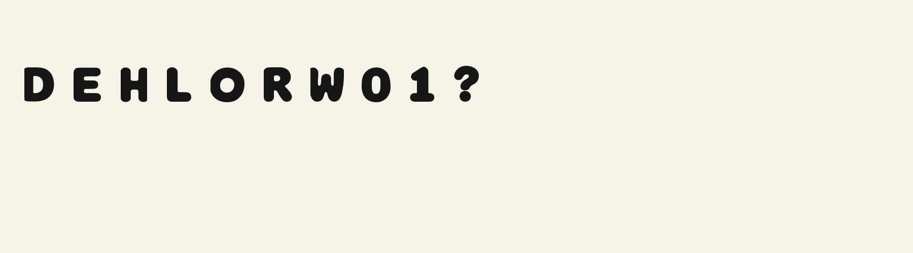
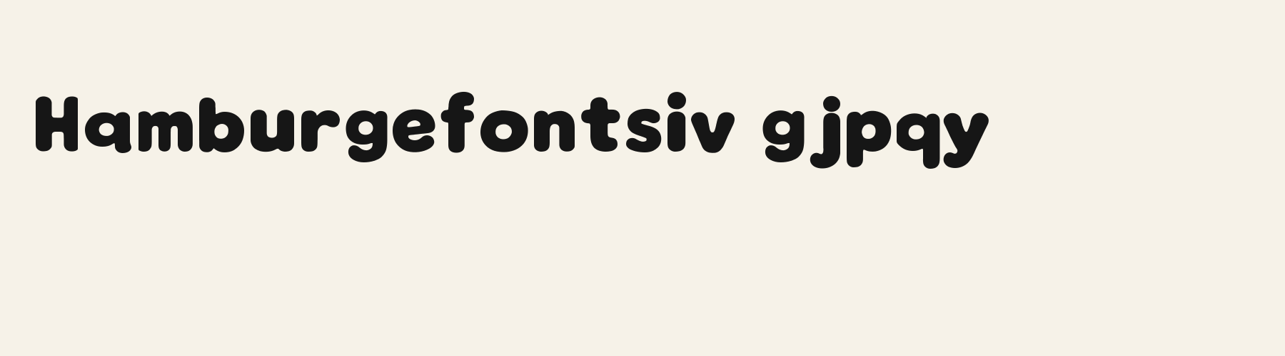
The H, lowercase a and g samples show structural details; capital O is added to inspect the broad counter. The name does not indicate a separate ribbon or knot character.
Test
Type the words you plan to use and adjust size, line height, and letter spacing. The preview uses the final font file.
The quick brown fox jumps over the lazy dog
Like how it sets? It comes with Pro or Studio, or as a Font Pass pick for personal projects.
Get this fontSpecimens
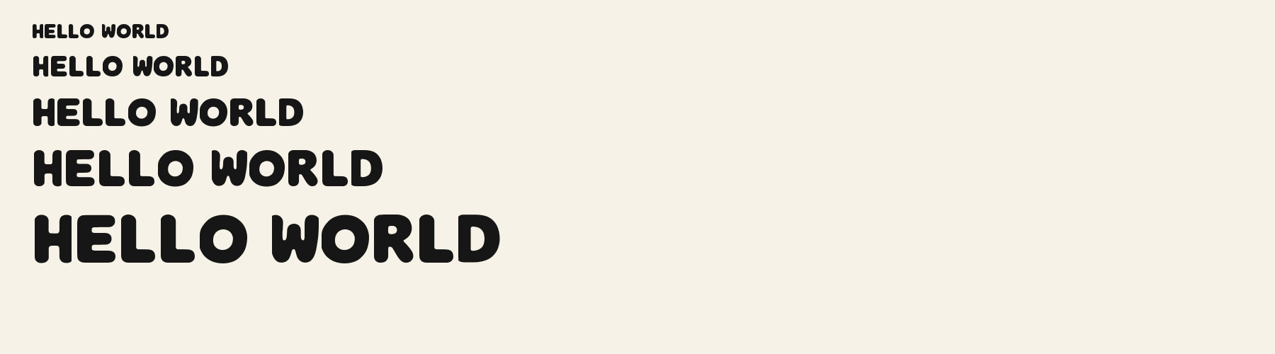
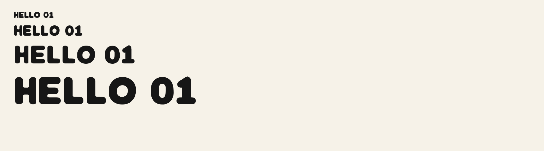
Rendered from the font files, without retouching.
Choose
The capital H keeps a continuous, heavy crossbar between the upright stems.
The lowercase a in the key-glyph plate has a single-storey bowl with a right-hand stem; the name does not imply a ribbon ornament.
The lowercase g is shown as a single-storey bowl with an open descending hook, while H retains a continuous crossbar.
Good for
Choose it for a short party label where a small amount of inward movement can distinguish the lettering from a smooth bubble face.
Check before using
The file contains no ribbon symbols or tied-knot drawings; use ordinary graphic assets if the design needs those objects.
About
Its x-height is 72% of the cap height, near the 72% typical of display fonts in the library. Ascenders on b, d, h, k and l line up with the capitals (100.3% of their height), and descenders on g, j, p, q and y drop 30.1% of the cap height below the baseline. The o is close to a circle, 1.13 times as wide as it is tall, and O is the widest capital, at 1.22 times the width of H. The O tops out level with H and dips 1.1% below the baseline.
The letters stand upright, leaning less than 2.5° either way. Vertical stems measure 27.5% of the cap height. Strokes keep nearly one thickness in every direction: the sides and the tops of o and O differ by 8%.
Its 148 characters include 105 Latin letters, plus 43 figures, punctuation marks and symbols; 53 of the Latin letters are accented or special forms beyond A to Z. The word space measures 45.9% of the cap height, and the blank space either side of a lowercase letter takes up 12% of its width. The font carries no kerning, so spacing comes from each letter’s own side bearings. The figures have different widths, so columns of numbers set in Bubble Ribbon Knot will not line up exactly.
Measured from the version 0.1.2 font file. Comparisons are with the 1 published library fonts measured on November 4, 2026, 1 of them display fonts.
Characters
Download
Choose the license that matches your project before downloading.
See plans or browse fonts that are free to download.
Client work, products and redistribution need a commercial license. Library fonts include it with Pro or Studio; fonts you make include it when you make them on Pro or Studio. A Font Pass is for personal projects.
TTF · OTF · WOFF · WOFF2
Tools
Free tools that run in your browser. Images you make with them, such as a signature PNG, can be used for any purpose.
Similar
Display1 style17 languages
Display1 style17 languages
Display1 style17 languages
Display1 style17 languages
Compared with Bubble Ribbon Knot: 12% narrower · lighter strokes
Method
AI assisted the observations and sample compositions. The examples use the named font files; measurements describe the supplied font files, and preview settings are illustrative.
The current text and font-file specimens received an independent review.
Bubble Confetti Round introduces a scooped notch into H and O where Bubble Ribbon Knot keeps smooth rounded contours. Their R widths are close: 0.673 em for the alternative and 0.662 em here.
Bubble Pebble Sans preserves the friendly solid roundcap appearance seen in a party heading. Its g advance is 0.600 em versus 0.591 em here, a small spacing change rather than an outline or shadow treatment.
FAQ