Marker Quick
Handwriting1 style6 languages
Pro · plan or Pass
A g R 2 & Aa
Handwriting · 1 style · 96 characters · Version 0.3.2 · Published November 19, 2026
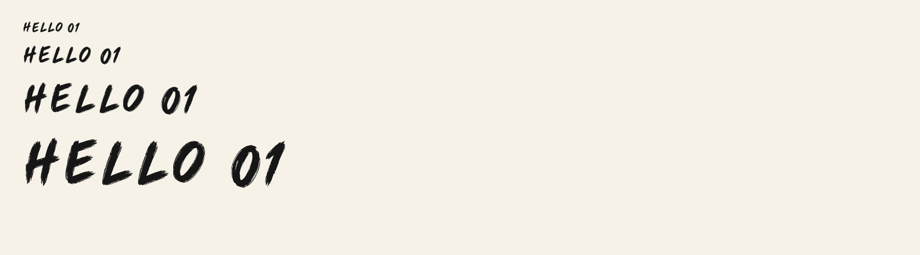
Brush Note Casual has torn edges and small unpainted channels within otherwise broad strokes. Its leaning A, blunt r shoulder and open g counter keep the word recognizable while the rough edges add a distinctly dry mark.
Aa
AgR2&
Direction
Judge the rough edge at final display size. Enlarging the preview reveals the texture but cannot prove that a tiny caption will retain it.
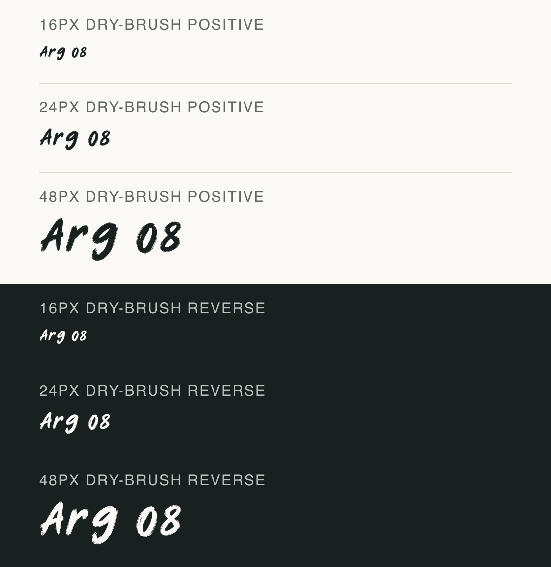
The six rows repeat Arg 08 at 16, 24 and 48px on matching light and dark grounds. This separates the broad g hook from the fine ragged channels along its outline.
At 16px the word reads as a compact dark gesture; the individual edge fragments are difficult to distinguish. At 24px the tails begin to look uneven, while 48px reveals cuts in the 0 outline and fraying around the A diagonal.
On the reversed 48px row, dark cuts interrupt the white bodies and the rough g tip remains visible. The smaller white sample retains the gesture more clearly than the individual scratches. The 2× PNG uses #182020 and #faf9f6 and makes no claim about ink, fabric or skin.
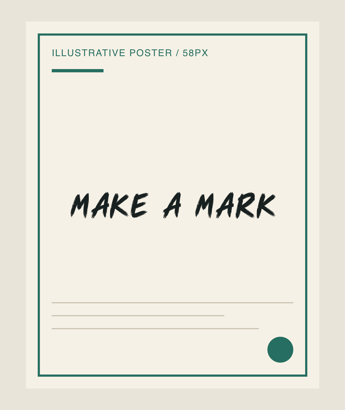
The short MAKE A MARK composition gives the dry contours room at 58px with default tracking. The broad strokes work as a single emphatic note against a quiet poster ground.
Test
Type the words you plan to use and adjust size, line height, and letter spacing. The preview uses the final font file.
The quick brown fox jumps over the lazy dog
Like how it sets? It comes with Pro or Studio, or as a Font Pass pick for personal projects.
Get this fontSpecimens
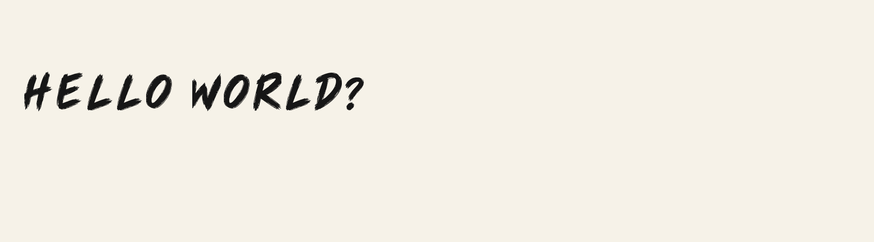
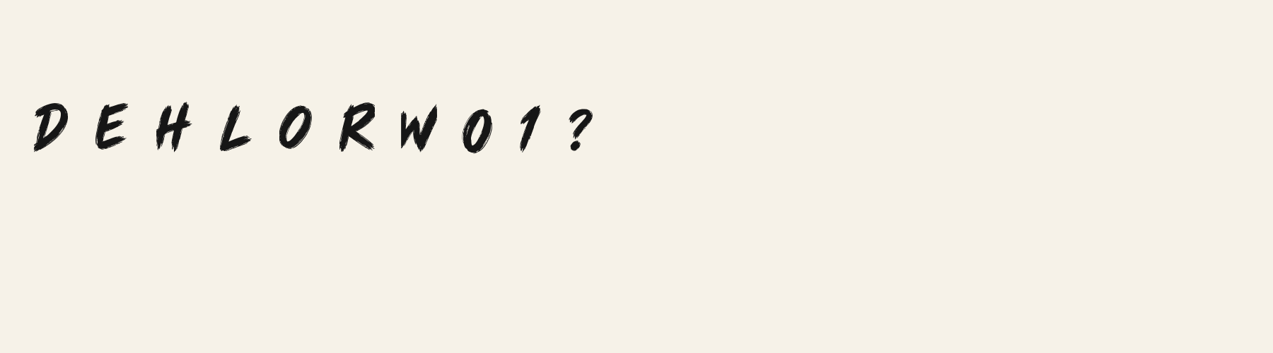
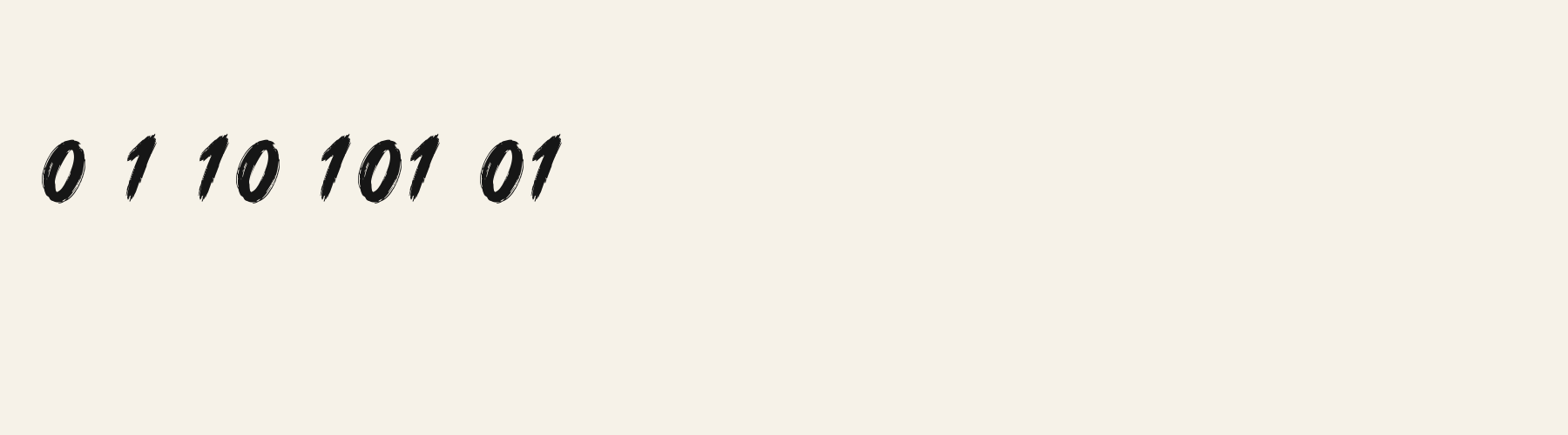
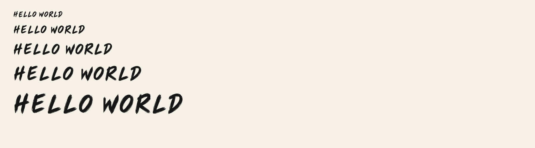
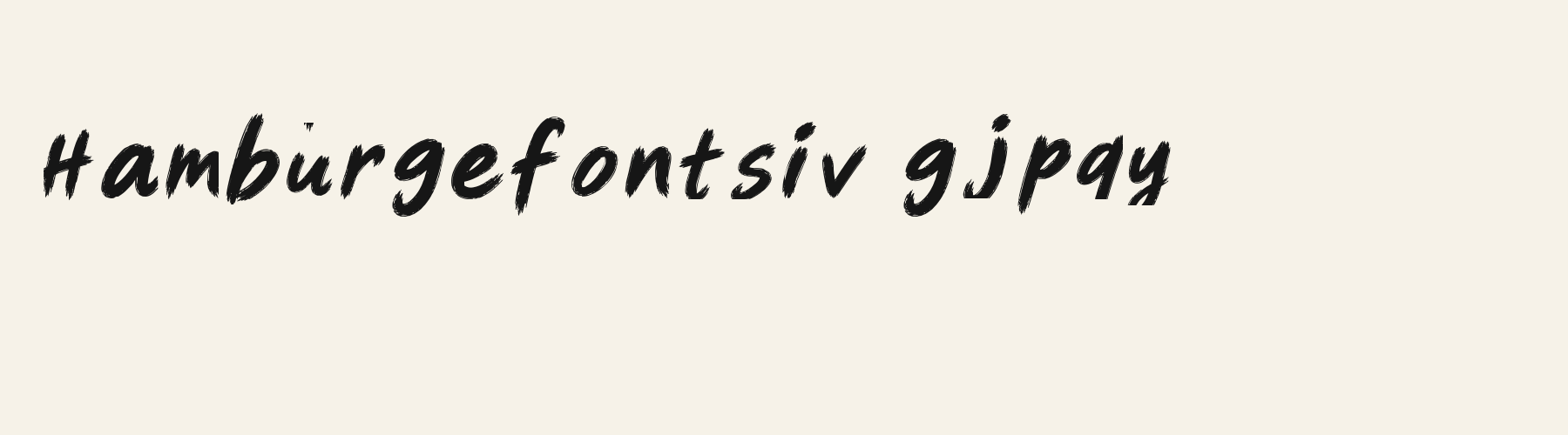
Rendered from the font files, without retouching.
Choose
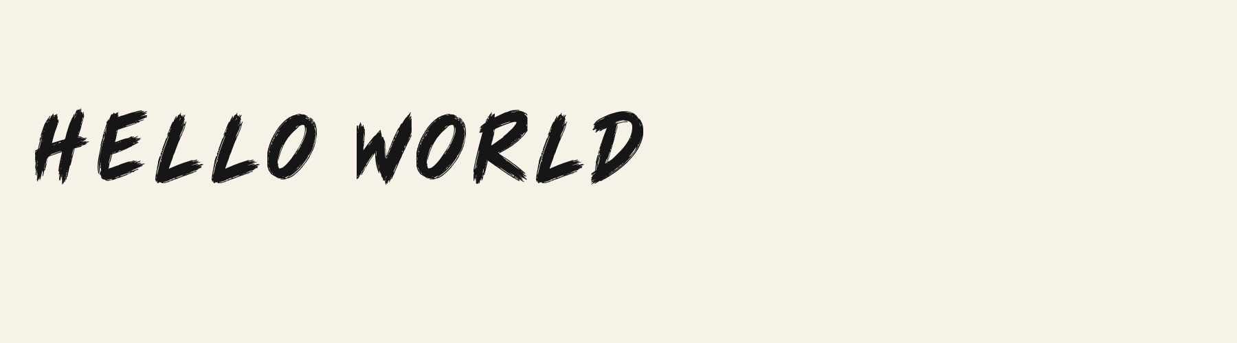
A has a frayed left diagonal and a short crossbar crossing the dark centre.
The r rises to a thick rounded shoulder with a ragged outer tip.
The g descends in a broad hooked stroke whose edge breaks into fine bristle-like fragments.
Good for
Try a brief annotation or energetic heading where the dry edge is part of the message rather than background noise.
Check before using
Avoid squeezing brush texture into dense instructions: the fine breaks mostly merge at the smaller settings, and this file does not cover the tested accented repertoire.
About
Brush Note Casual's lowercase x reaches 72.4% of the capital height, close to the 72.4% median for handwriting fonts. Ascenders on b, d, h, k and l rise 20.5% above the capitals, and descenders on g, j, p, q and y drop 10.2% of the cap height below the baseline. The o is close to a circle, 0.93 times as wide as it is tall, and T is the widest capital, at 1.02 times the width of H. The O stops 6.4% of the cap height short of H and stands 4.9% above the baseline.
Its 95 characters include 52 Latin letters, plus 43 figures, punctuation marks and symbols; there are no accented Latin letters beyond A to Z. The word space measures 47.1% of the cap height, and the blank space either side of a lowercase letter takes up 11.8% of its width. The font carries no kerning, so spacing comes from each letter’s own side bearings. The figures have different widths, so columns of numbers set in Brush Note Casual will not line up exactly.
Measured from the version 0.3.2 font file. Comparisons are with the 1 published library fonts measured on November 17, 2026, 1 of them handwriting fonts.
Selamat pagi, apa khabar hari ini?
Habari za asubuhi, karibu nyumbani.
Characters
Download
Choose the license that matches your project before downloading.
See plans or browse fonts that are free to download.
Client work, products and redistribution need a commercial license. Library fonts include it with Pro or Studio; fonts you make include it when you make them on Pro or Studio. A Font Pass is for personal projects.
TTF · OTF · WOFF · WOFF2
Tools
Free tools that run in your browser. Images you make with them, such as a signature PNG, can be used for any purpose.
Similar
Handwriting1 style6 languages
Compared with Brush Note Casual: 9% wider · heavier strokes
Handwriting1 style5 languages
Compared with Brush Note Casual: Heavier strokes
Method
Local font files were read to check character mappings and shaped outlines. AI assisted the observations and example compositions. The images use the named font files without substituted specimen glyphs; their hashes and versions are recorded for an independent check. Preview settings are illustrative, and file measurements come from the delivered bytes.
The current text and font-file specimens received an independent review.
For R, Marker Quick reserves 0.552 em versus 0.607 em in Brush Note Casual. Its narrower advance can help when that capital repeats in a compact heading.
Acorn Birch gives g a 0.289 em advance; here it is 0.612 em. The alternative sets that character more tightly.
FAQ