
Marker Broad Flat
Handwriting1 style5 languages
Pro · plan or Pass
H O R a g i
Handwriting · 1 style · 274 characters · Version 0.3.2 · Published November 5, 2026
Marker Quick places a fast, brush-like stroke rhythm into its numerals as well as its letters. The sample checks the mapped digits and signs used in short labels, then contrasts the energy of its lettering with a quieter companion face.
Aa
HORagi
Direction
Check the exact copy and currency marks before setting the final layout.
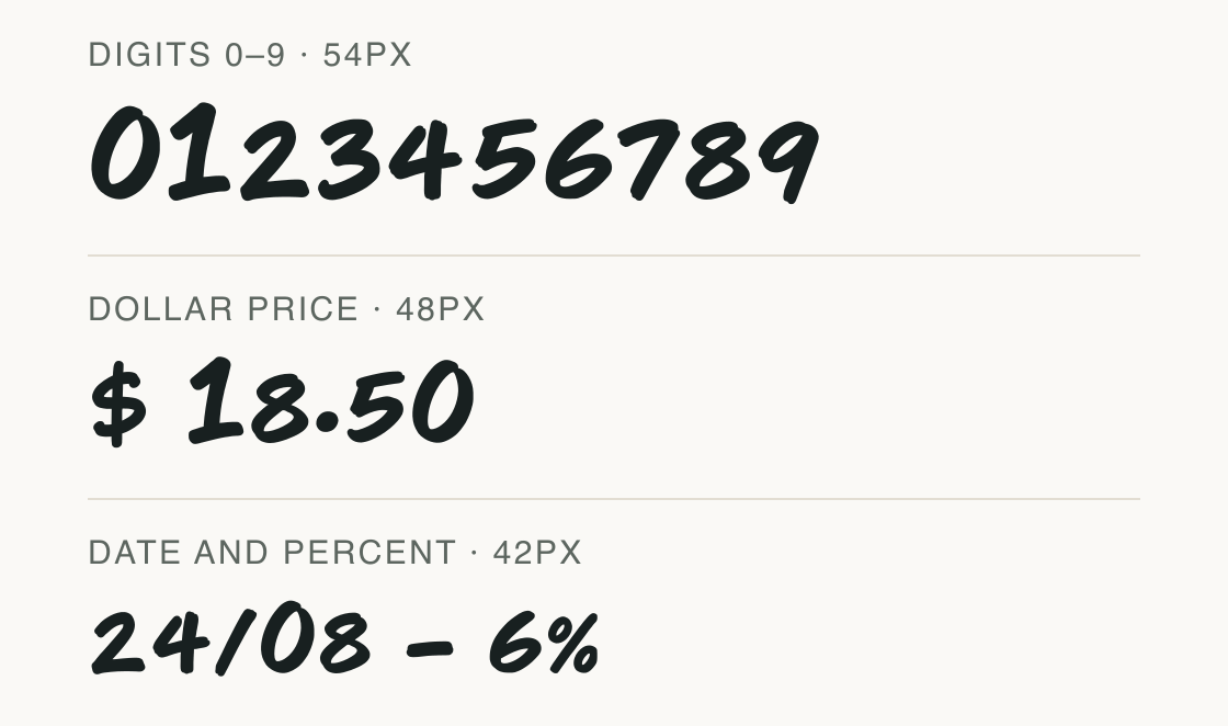
This sample uses only characters present in the current font file. The three rows show its number shapes in a price, a date and a percentage example.
The row geometry is a visual comparison, not a claim of tabular numerals or tested application alignment. Euro, pound, and yen signs are not in this file.
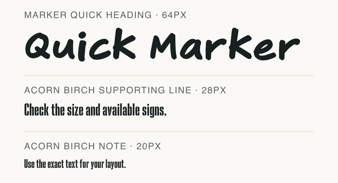
Marker Quick handles the short heading while Acorn Birch carries the plain explanation. The composition is an illustrative font pairing, not a customer or product example.
Test
Type the words you plan to use and adjust size, line height, and letter spacing. The preview uses the final font file.
The quick brown fox jumps over the lazy dog
Like how it sets? It comes with Pro or Studio, or as a Font Pass pick for personal projects.
Get this fontSpecimens
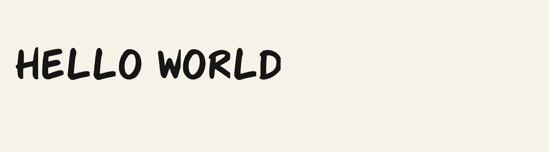
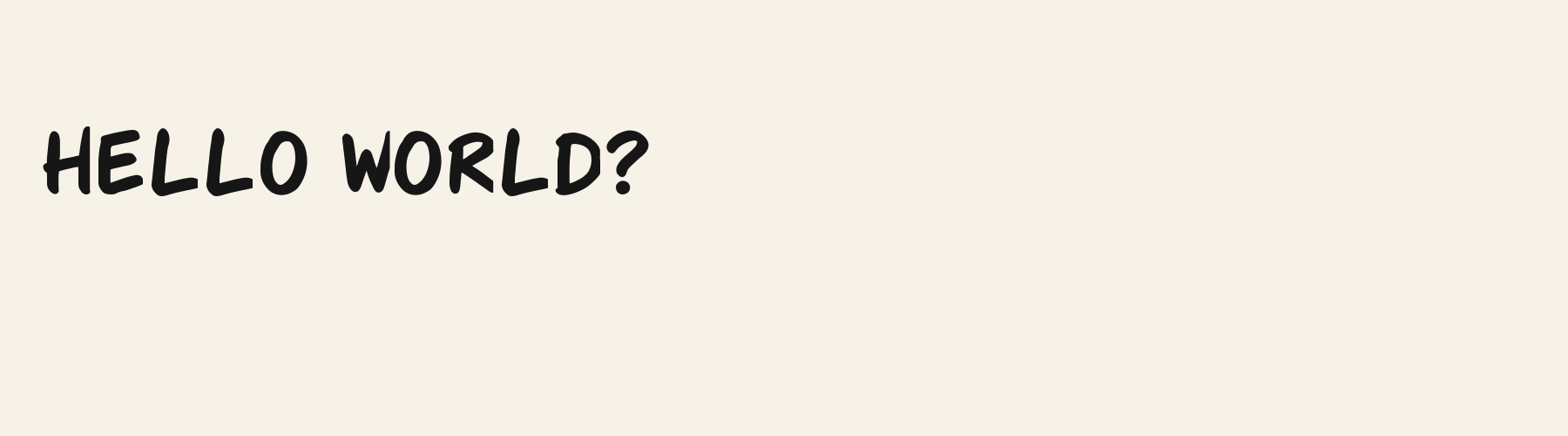
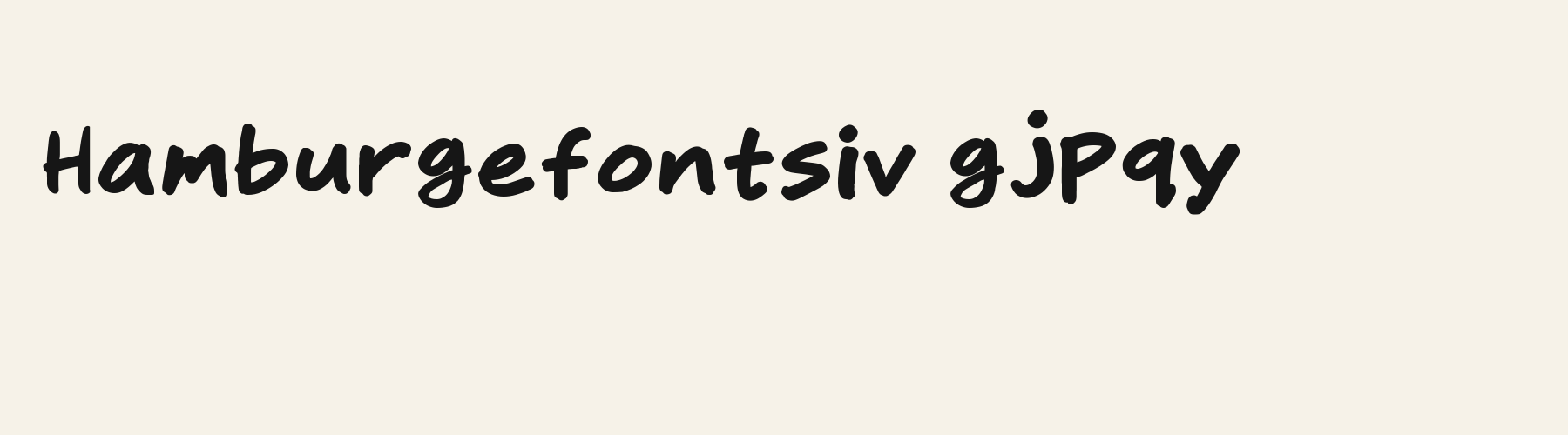
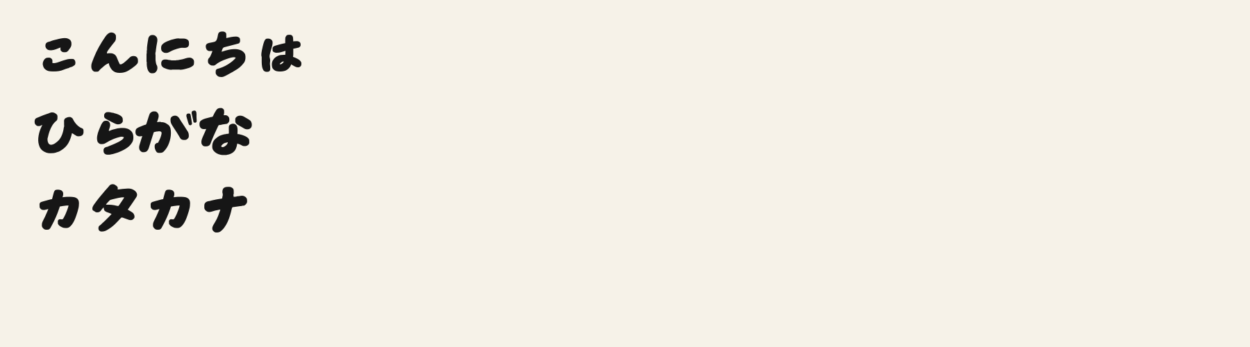
Rendered from the font files, without retouching.
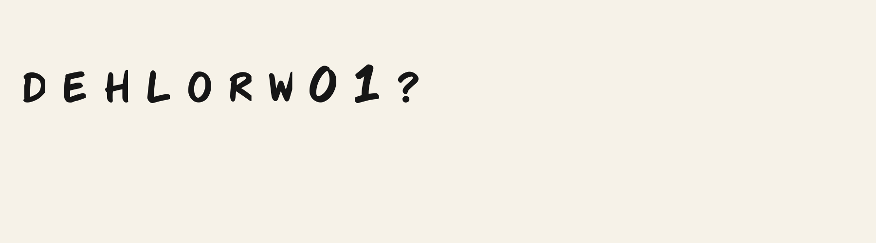
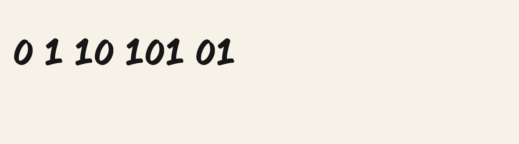
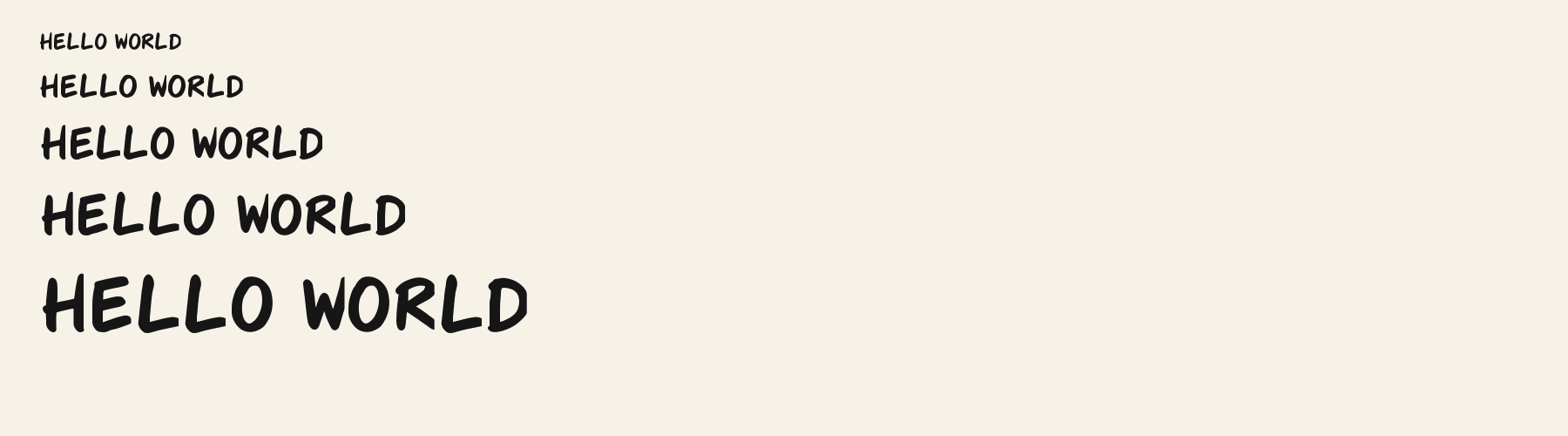
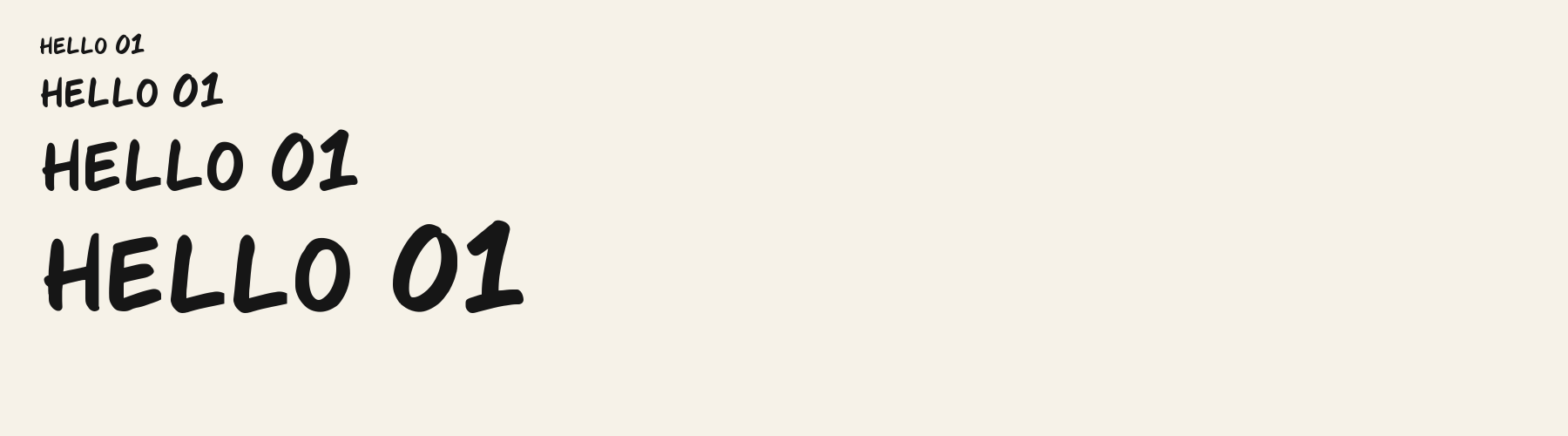
Choose
The 0 is a broad forward-leaning oval, visibly wider than the neighboring 1.
The 4 has an open top and a low crossbar in the numeral row.
The 8 joins two tilted, unequal loops at a narrow waist.
Good for
Use it for brief energetic headings, numbered labels, or dollar and percent callouts when the needed symbols are present. A calmer companion can carry longer instructions.
Check before using
Do not choose it for euro, pound, or yen prices. Do not treat the decorative numerals as tabular figures or as verified application output.
About
Its x-height is 74% of the cap height, near the 74% typical of handwriting fonts in the library. Ascenders on b, d, h, k and l rise 17.5% above the capitals, and descenders on g, j, p, q and y drop 19.3% of the cap height below the baseline. The o is close to a circle, 1.13 times as wide as it is tall, and M is the widest capital, at 1.32 times the width of H. The O stops 5.4% of the cap height short of H and stands 0.4% above the baseline.
The letters lean about 4° to the right, where most handwriting fonts in the library stand upright. Strokes keep nearly one thickness in every direction: the sides and the tops of o and O differ by 10%.
Its 273 characters include 170 Japanese kana and 52 Latin letters, plus 51 figures, punctuation marks and symbols; there are no accented Latin letters beyond A to Z. The word space measures 45.7% of the cap height, and the blank space either side of a lowercase letter takes up 11.6% of its width. The font carries no kerning, so spacing comes from each letter’s own side bearings. The figures have different widths, so columns of numbers set in Marker Quick will not line up exactly.
Measured from the version 0.3.2 font file. Comparisons are with the 1 published library fonts measured on November 4, 2026, 1 of them handwriting fonts.
いろはにほへと ちりぬるを
Selamat pagi, apa khabar hari ini?
Habari za asubuhi, karibu nyumbani.
Characters
Download
Choose the license that matches your project before downloading.
See plans or browse fonts that are free to download.
Client work, products and redistribution need a commercial license. Library fonts include it with Pro or Studio; fonts you make include it when you make them on Pro or Studio. A Font Pass is for personal projects.
TTF · OTF · WOFF · WOFF2
Tools
Free tools that run in your browser. Images you make with them, such as a signature PNG, can be used for any purpose.
Similar
Handwriting1 style5 languages
Compared with Marker Quick: Upright · lower x-height
Method
We use the local font files to check which characters they contain and how each sample looks. AI helped prepare these observations and example wording. The images use the named font files without replacement letters; measurements describe those supplied files. Previews are examples, and display can vary between apps.
The current text and font-file specimens received an independent review.
Marker Broad Flat retains the informal hand-lettered headline role but shows flatter, denser strokes in its cue samples than the slanted “Quick Marker” line. Its R advances 0.683 em compared with 0.552 em here; check uppercase title width separately.
Acorn Birch gives g a 0.289 em advance; here it is 0.623 em. The alternative sets that character more tightly.
FAQ