
Marker Quick
Handwriting1 style6 languages
Pro · plan or Pass
A M R S g Aa
Handwriting · 1 style · 96 characters · Version 0.3.2 · Published November 5, 2026
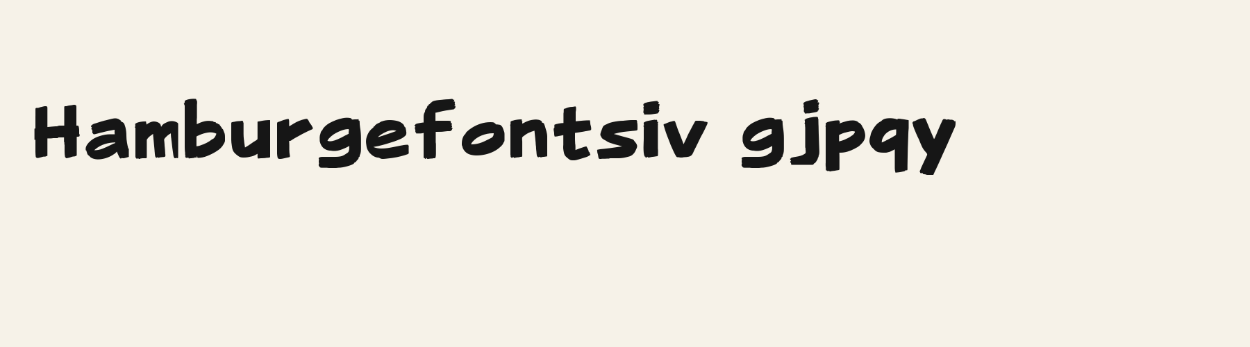
Marker Broad Flat draws heavy, rounded strokes with a broad, nearly level top on the capital A and a blunt end on the lowercase r. The centered captions make the compact first cue easy to place, while the longer second cue tests whether a two-line box remains enough at the fixed 36 px preview size.
Aa
AMRSg
Direction
Check the longest actual caption in the target frame and software, then shorten or reflow it if the line exceeds the available width.
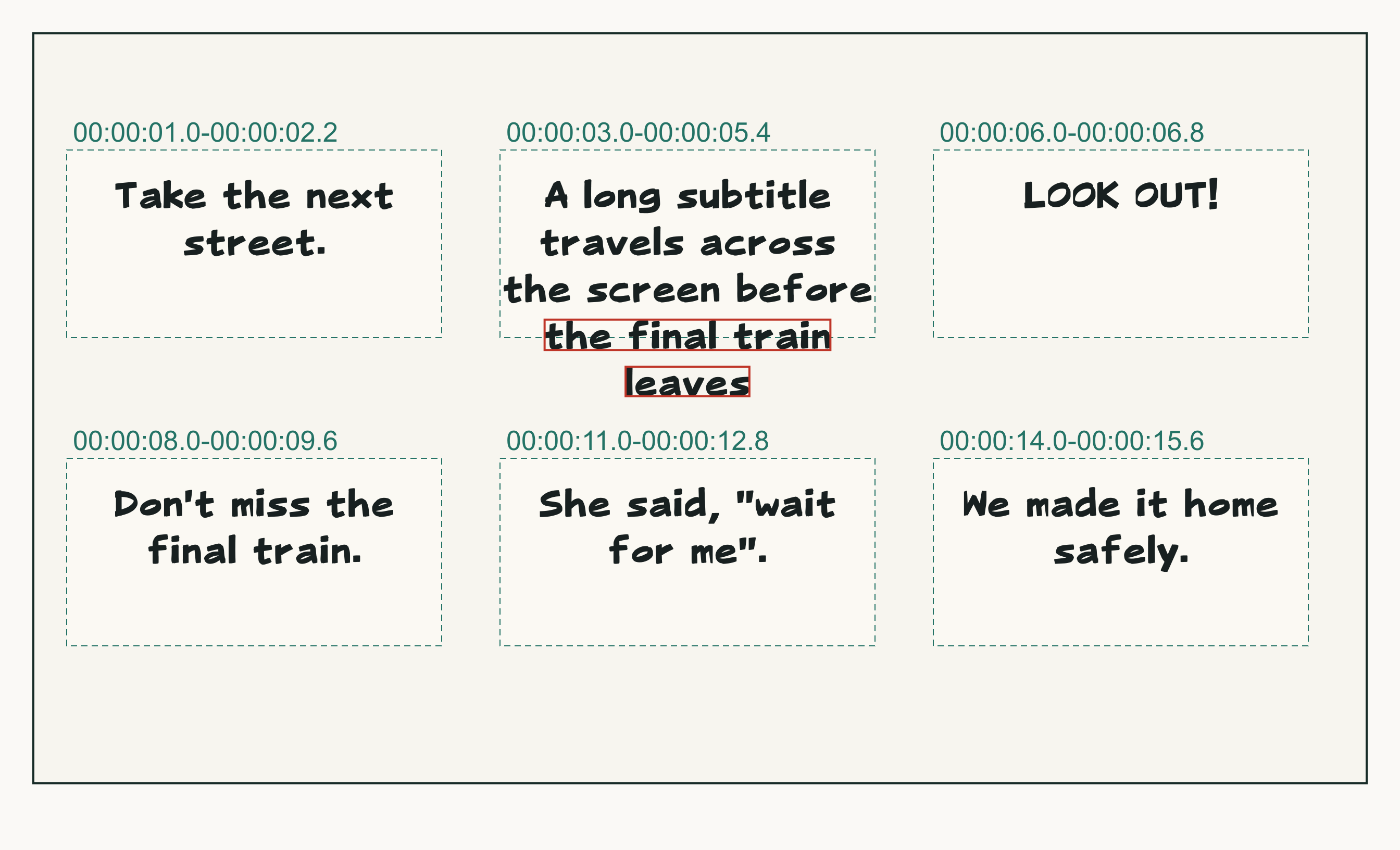
This preview places six subtitle cues in separate 360 × 180 px boxes on a 1280 × 720 px canvas. Every cue uses 36 px type and centered alignment; timecodes identify the examples only. It does not test subtitle software or exported video.
The first cue uses two lines even though its measured text width is below the 360 px box width. The longer second cue uses five lines; its final two extend past the bottom of the box by 12.060 px and 56.324 px. The other four cues fit. Across all six cues, the examples use eight more lines than one line per cue. Shorten the long text or make its box taller to test a different layout. These measurements describe the preview only; they do not test a subtitle editor or exported video.
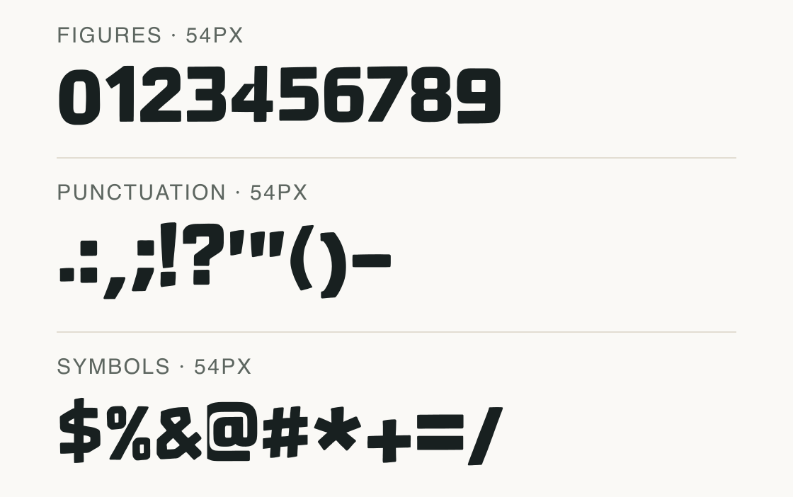
This sample groups the digits, punctuation and symbols present in the file. Characters not shown in these rows are not implied by the illustration.
Test
Type the words you plan to use and adjust size, line height, and letter spacing. The preview uses the final font file.
The quick brown fox jumps over the lazy dog
Like how it sets? It comes with Pro or Studio, or as a Font Pass pick for personal projects.
Get this fontSpecimens
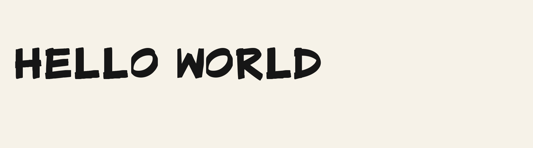
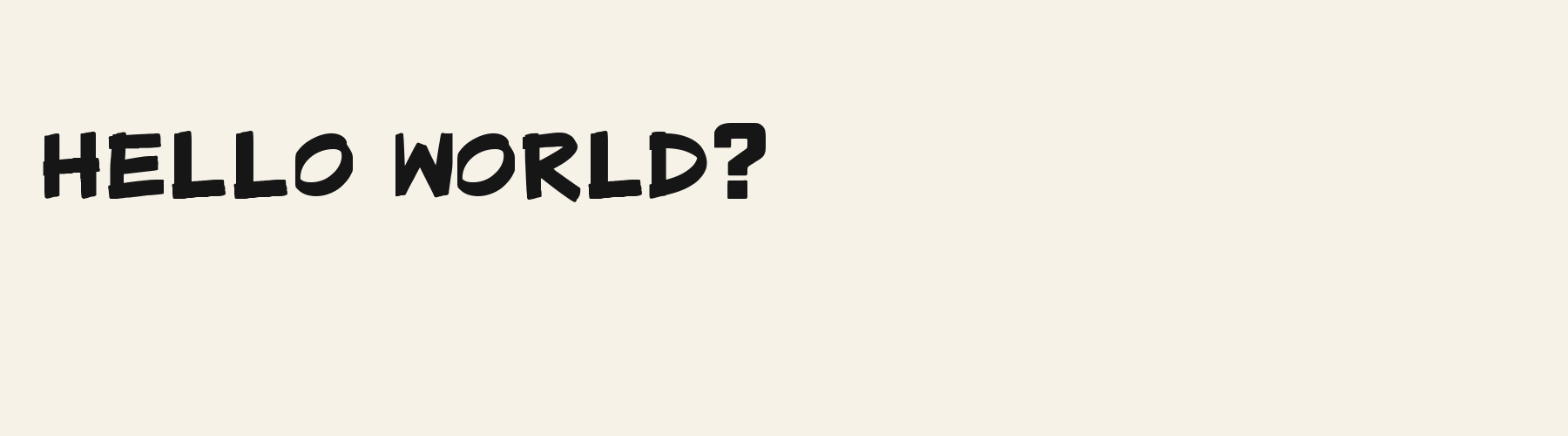
Rendered from the font files, without retouching.
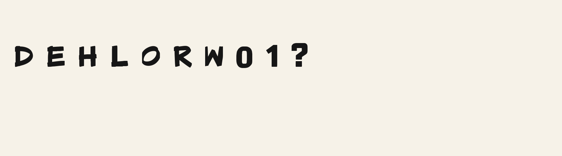
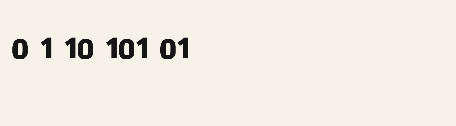
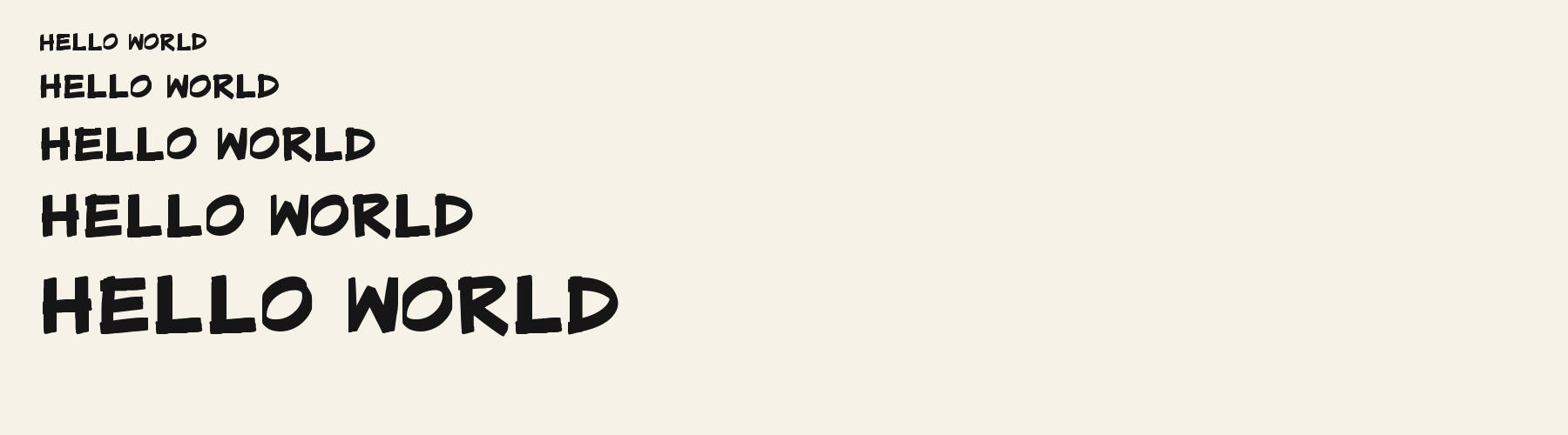
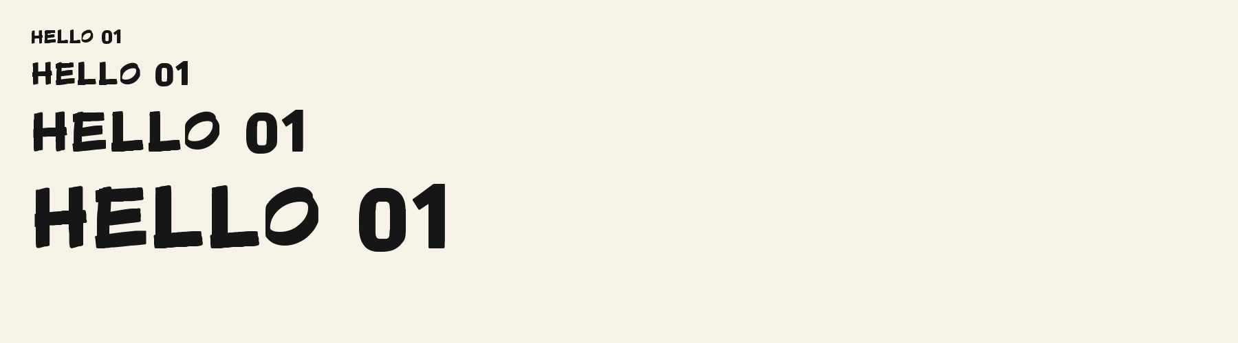
Choose
The capital A has a broad, flattened top rather than a sharp apex in the rendered title.
The lowercase r ends in a short blunt shoulder, visible in “street” and “before”.
The lowercase a uses a single-storey bowl in “safely”, unlike the double-storey forms in neutral UI fonts.
Good for
Use its sturdy, informal lettering for short, high-contrast captions or brief title cards where the broad strokes are part of the tone.
Check before using
The fixed frame test shows that a long line can extend beyond its caption region. This is a display face, so the illustration does not establish comfortable reading across a full programme or compatibility with an editor.
About
Marker Broad Flat's lowercase x reaches 69.9% of the capital height, close to the 69.9% median for handwriting fonts. Ascenders on b, d, h, k and l rise 10.8% above the capitals, and descenders on g, j, p, q and y drop 24.4% of the cap height below the baseline. The o is wider than it is tall, 1.29 to 1, and B is the widest capital, at 1.04 times the width of H. The O stops 1.2% of the cap height short of H and stands 4.3% above the baseline.
The letters stand upright, leaning less than 2.5° either way. Vertical stems measure 25.5% of the cap height.
Its 95 characters include 52 Latin letters, plus 43 figures, punctuation marks and symbols; there are no accented Latin letters beyond A to Z. The word space measures 56.4% of the cap height, and the blank space either side of a lowercase letter takes up 12.4% of its width. The font carries no kerning, so spacing comes from each letter’s own side bearings. The figures have different widths, so columns of numbers set in Marker Broad Flat will not line up exactly.
Measured from the version 0.3.2 font file. Comparisons are with the 1 published library fonts measured on November 4, 2026, 1 of them handwriting fonts.
Characters
Download
Choose the license that matches your project before downloading.
See plans or browse fonts that are free to download.
Client work, products and redistribution need a commercial license. Library fonts include it with Pro or Studio; fonts you make include it when you make them on Pro or Studio. A Font Pass is for personal projects.
TTF · OTF · WOFF · WOFF2
Tools
Free tools that run in your browser. Images you make with them, such as a signature PNG, can be used for any purpose.
Similar
Handwriting1 style6 languages
Compared with Marker Broad Flat: Leans about 4° · taller x-height
Method
We use the local font files to check which characters they contain and how each sample looks. AI helped prepare these observations and example wording. The images use the named font files without replacement letters; measurements describe those supplied files. Previews are examples, and display can vary between apps.
The current text and font-file specimens received an independent review.
Marker Quick offers a looser, visibly slanted handwritten heading in place of the dense flat strokes shown in these cue samples. Its R uses 0.552 em rather than 0.683 em here, giving that capital a more compact advance.
Acorn Birch gives g a 0.289 em advance; here it is 0.624 em. The alternative sets that character more tightly.
FAQ