
Candy Heart Slab
Serif1 style38 languages
Pro · plan or Pass
a g f k Q R
Serif · 1 style · 292 characters · Version 0.1.1 · Published November 5, 2026
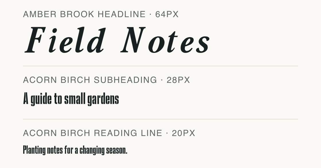
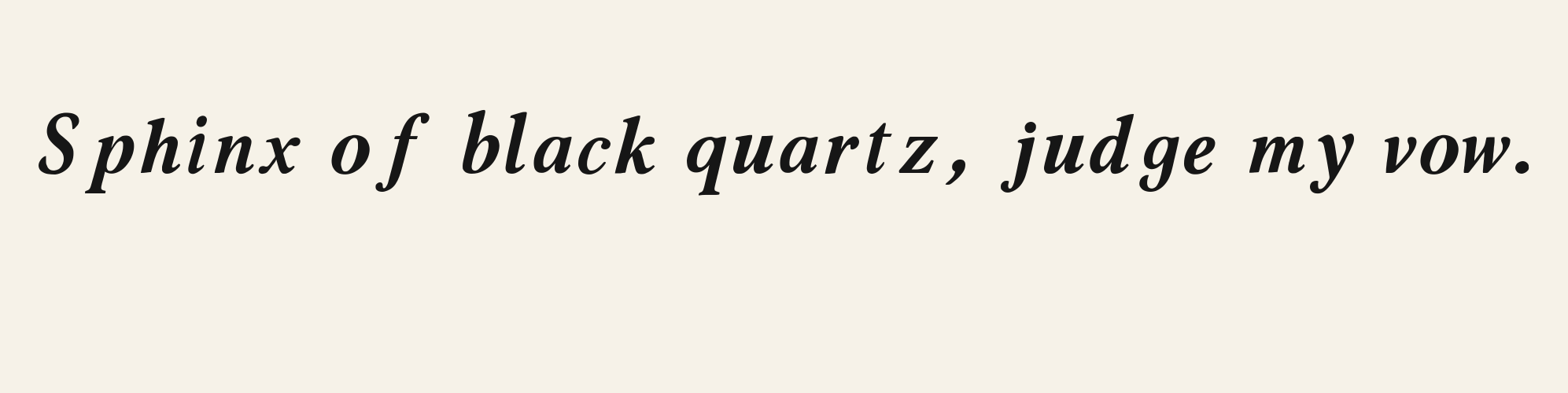
Amber Brook draws bracketed serifs with a compact, slightly pinched rhythm. The checked German line shows the close-set dots over ü, while AVATAR Type provides the uppercase A and R for inspection. In the paired layout, its large Field Notes title sits above Acorn Birch’s tall, condensed letter proportions in the smaller support lines, creating a clear size and width contrast.
Aa
agfkQR
Direction
A mapped accent is a useful first check. Review the whole line at the size and width of your actual layout before choosing this serif.
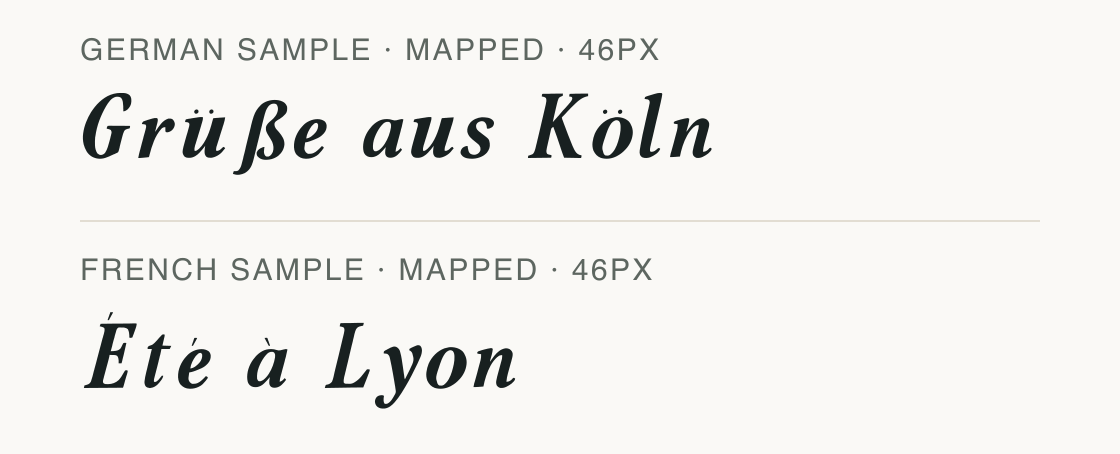
The specimen uses a fixed German name line and a French phrase to show which accented characters this version maps. Both are public test strings; no customer text is involved.
A passing sample means the displayed characters are present and render without missing letters. It does not prove support for every spelling, accent combination, or application fallback.
If a private name contains a different accent or punctuation mark, check that exact text locally and keep only the pass or missing-character result.
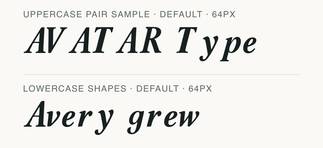
The file has no optional spacing feature to switch on or off. These two phrases show its uppercase pairs alongside lowercase forms in the same font.
Compare the A/V and T/y joins in “AVATAR Type” with the lowercase letters in “Avery grew”. This is a look at the font’s default spacing and letter shapes, not a feature-on versus feature-off test.
Other applications may space the same letters differently, so check the final phrase in the software where you plan to use it.
Amber Brook carries “Field Notes” as the large title; the actual Acorn Birch file sets the smaller subheading and reading line. The contrast is visible in their different sizes and in Acorn Birch’s tall, condensed forms.
Test
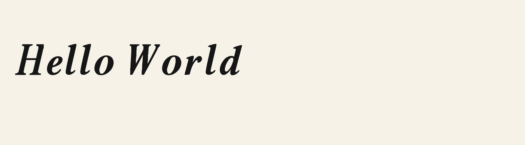
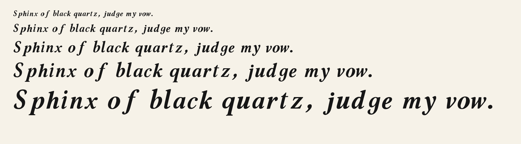
Type the words you plan to use and adjust size, line height, and letter spacing. The preview uses the final font file.
The quick brown fox jumps over the lazy dog
Like how it sets? It comes with Pro or Studio, or as a Font Pass pick for personal projects.
Get this fontSpecimens
Rendered from the font files, without retouching.
Choose
The German specimen maps ü and ß in “Grüße aus Köln”.
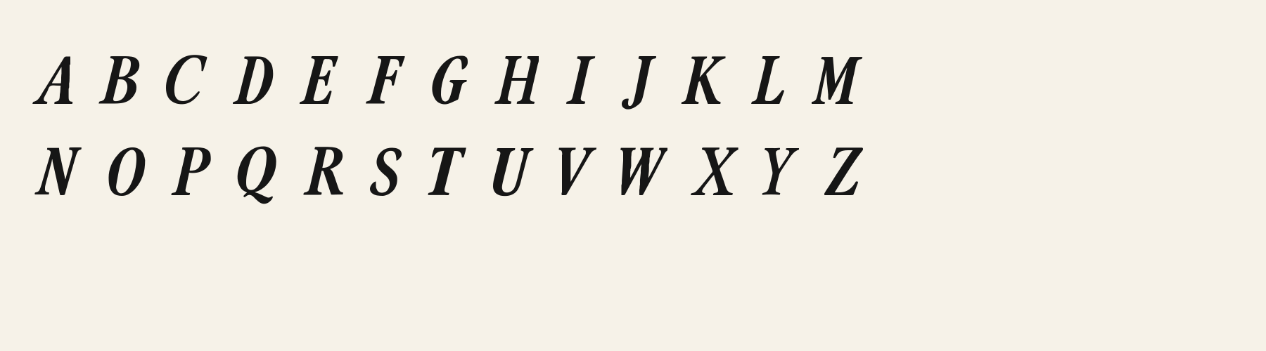
The uppercase A in “AVATAR Type” has a narrow apex and bracketed feet.
The capital R in “AVATAR” has an outward-angled leg from its rounded bowl.
Good for
Use the checked German sample when setting a short name or heading. In the displayed pairing, Amber Brook carries the large title and the narrow Acorn Birch file carries shorter supporting lines; check both at the intended width.
Check before using
The fixed German and French test alphabets do not prove every European language or combining-mark sequence; check the exact spelling you need.
About
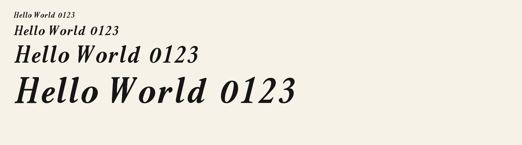
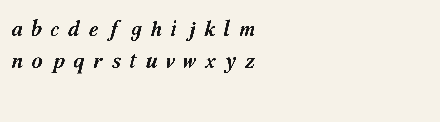
Amber Brook's lowercase x reaches 60.5% of the capital height, close to the 60.5% median for serif fonts. Ascenders on b, d, h, k and l stop at 97% of the capital height, and descenders on g, j, p, q and y drop 31.9% of the cap height below the baseline. The o is close to a circle, 0.97 times as wide as it is tall, and M is the widest capital, at 1.13 times the width of H. Round letters overshoot: O rises 0.9% of the cap height above H and dips 1.1% below the baseline.
The letters lean about 13° to the right, where most serif fonts in the library stand upright. Vertical stems measure 16.1% of the cap height. Strokes change thickness with direction: the sides of o and O are 2.3 times as thick as their tops and bottoms.
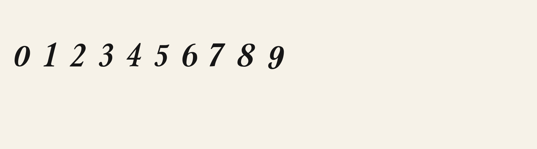
Its 291 characters include 248 Latin letters, plus 43 figures, punctuation marks and symbols; 196 of the Latin letters are accented or special forms beyond A to Z. The word space measures 45.9% of the cap height, and the blank space either side of a lowercase letter takes up 13.8% of its width. The font carries no kerning, so spacing comes from each letter’s own side bearings. The figures have different widths, so columns of numbers set in Amber Brook will not line up exactly.
Measured from the version 0.1.1 font file. Comparisons are with the 1 published library fonts measured on November 4, 2026, 1 of them serif fonts.
Characters
Download
Choose the license that matches your project before downloading.
See plans or browse fonts that are free to download.
Client work, products and redistribution need a commercial license. Library fonts include it with Pro or Studio; fonts you make include it when you make them on Pro or Studio. A Font Pass is for personal projects.
TTF · OTF · WOFF · WOFF2
Tools
Free tools that run in your browser. Images you make with them, such as a signature PNG, can be used for any purpose.
Similar
Serif1 style38 languages
Compared with Amber Brook: Heavier strokes · 19% wider
Serif1 style26 languages
Compared with Amber Brook: Upright · heavier strokes
Serif1 style21 languages
Compared with Amber Brook: 33% wider · heavier strokes
Serif1 style17 languages
Compared with Amber Brook: 40% wider · heavier strokes
Method
The font files were checked locally for the characters shown, and the samples were rendered with the named fonts. AI helped describe the observed letterforms and draft sample compositions. These are specimen examples, not customer work; preview settings are illustrative.
The current text and font-file specimens received an independent review.
For R, Acorn Vetch reserves 0.634 em versus 0.673 em in Amber Brook. Its narrower advance can help when that capital repeats in a compact heading.
Acorn Birch gives g a 0.289 em advance; here it is 0.521 em. The alternative sets that character more tightly.
FAQ