
Bellbottom Serif
Serif1 style21 languages
Pro · plan or Pass
a g R S & Aa
Serif · 1 style · 149 characters · Version 0.1.3 · Published November 5, 2026
Beacon Slab combines a blunt slab-serif frame with compact joins. The uppercase AVATAR OFFICE specimen lets you compare capital spacing with kerning off and on, while the separate letter row isolates B, f, and i for closer inspection. A real related file appears as a separate family option.
Aa
agRS&
Direction
Use the feature setting only after checking the same words in the software that will produce the final layout.
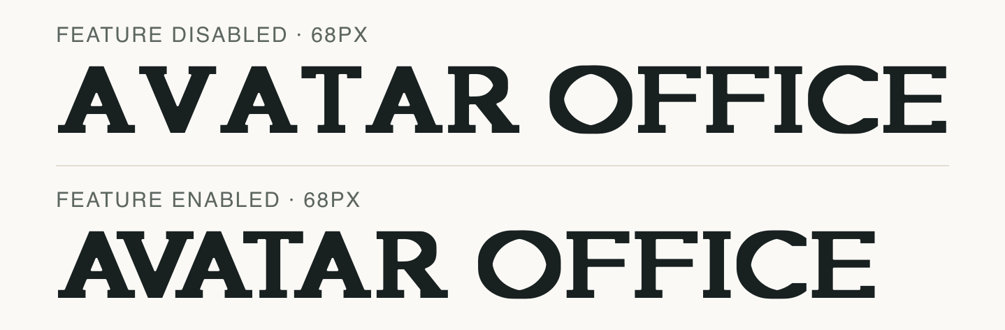
The all-caps strings AVATAR and OFFICE put capital pairs under a magnifying glass. The two rendered rows differ only in the kerning feature setting.
Compare the gaps around A/V and the capital pairs in OFFICE at the same scale. This preview does not show a ligature unless the font actually substitutes one.
Other applications can choose different shaping defaults; treat the image as a reproducible file check.
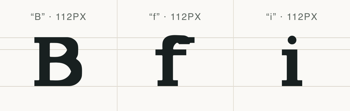
The same-size row isolates B, f and i from Beacon Slab so their stems, crossbar, and serif endings can be seen without neighboring letters.
These details describe the displayed outlines; they do not establish a universal readability result.
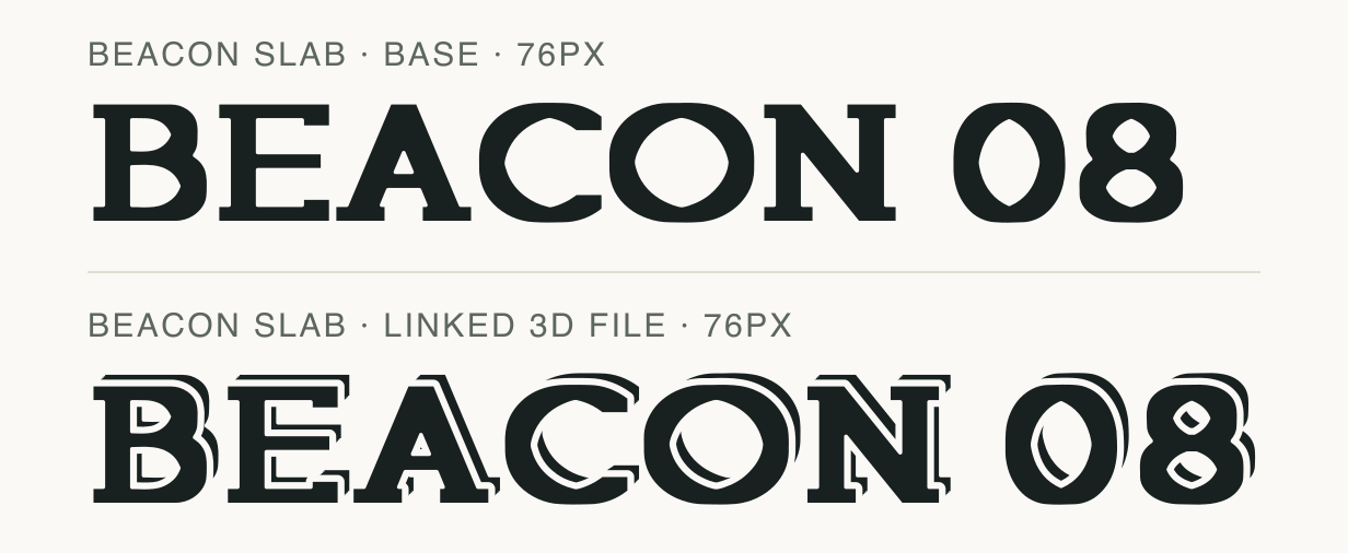
This paired “BEACON 08” sample uses the base face and the linked Beacon Slab 3D file at one preview size. The second line is a real font file, not a CSS stroke effect.
Test
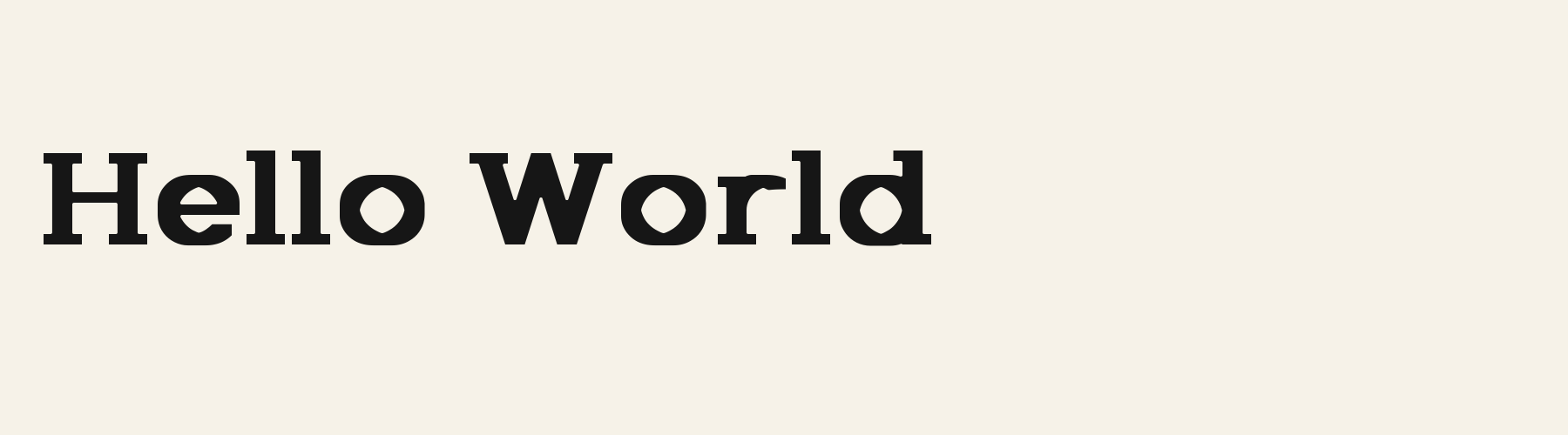
Type the words you plan to use and adjust size, line height, and letter spacing. The preview uses the final font file.
The quick brown fox jumps over the lazy dog
Like how it sets? The TTF is free for personal projects with an account; every format and commercial use come with Pro.
Download free TTFSpecimens
Rendered from the font files, without retouching.

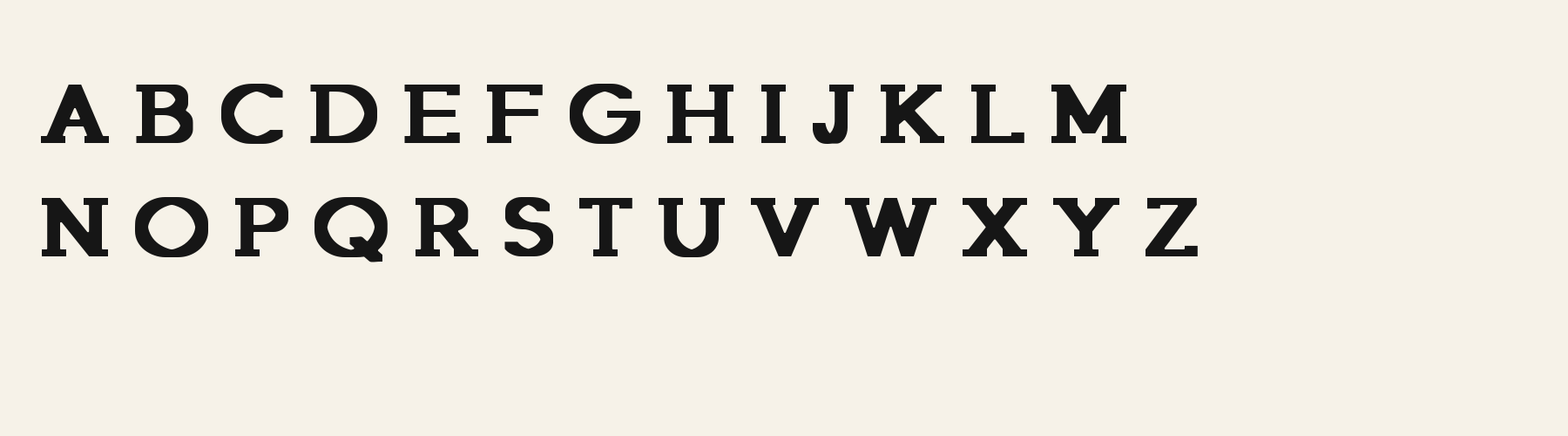
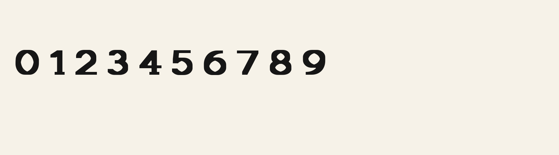
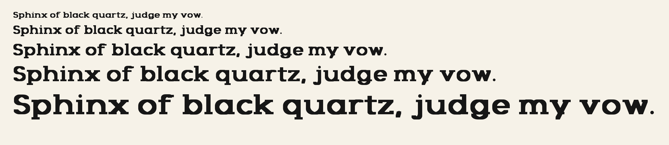
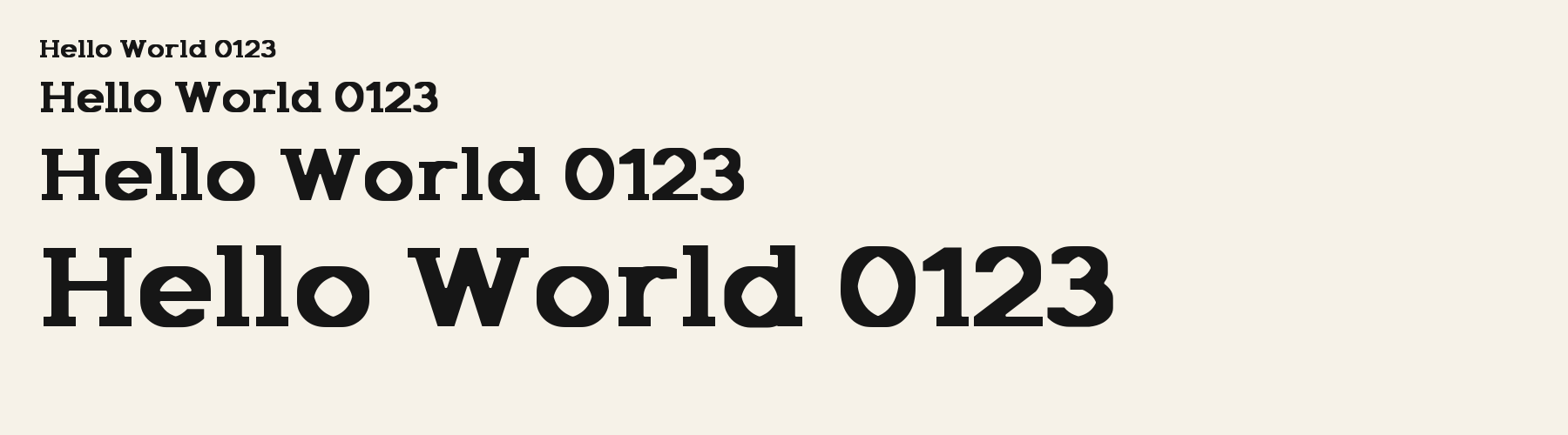
Choose
The uppercase B has two compact bowls on a heavy stem.
The isolated lowercase f has a short horizontal crossbar high on its stem.
In the AVATAR comparison, the kerning-enabled row tightens several capital pairs.
Good for
Inspect the exact letter joins in short display copy and compare a related family file when choosing between available weights or treatments.
Check before using
A declared OpenType feature does not guarantee a visible change for every string or application; this comparison is limited to the shown text.
About
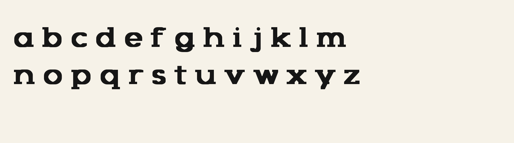
Beacon Slab's lowercase x reaches 74.9% of the capital height, close to the 74.9% median for serif fonts. Ascenders on b, d, h, k and l rise 3.7% above the capitals, and descenders on g, j, p, q and y drop 26.4% of the cap height below the baseline. The o is wider than it is tall, 1.20 to 1, and W is the widest capital, at 1.32 times the width of H. Round letters overshoot: O rises 1.5% of the cap height above H and dips 1.5% below the baseline.
The letters stand upright, leaning less than 2.5° either way. Vertical stems measure 21.4% of the cap height. Strokes change thickness with direction: the sides of o and O are 1.7 times as thick as their tops and bottoms.
Its 148 characters include 105 Latin letters, plus 43 figures, punctuation marks and symbols; 53 of the Latin letters are accented or special forms beyond A to Z. The word space measures 38.6% of the cap height, and the blank space either side of a lowercase letter takes up 9.8% of its width. Spacing is adjusted with 272 kerning pairs, the most of all 1 serif fonts. The tightest of them is VA, which closes up by 33.9% of the cap height. The figures have different widths, so columns of numbers set in Beacon Slab will not line up exactly.
Measured from the version 0.1.3 font file. Comparisons are with the 1 published library fonts measured on November 4, 2026, 1 of them serif fonts.
Characters
Download
Choose the license that matches your project before downloading.
Client work, products and redistribution need a commercial license. Library fonts include it with Pro or Studio; fonts you make include it when you make them on Pro or Studio. A Font Pass is for personal projects.
TTF · OTF · WOFF · WOFF2
Tools
Free tools that run in your browser. Images you make with them, such as a signature PNG, can be used for any purpose.
Similar
Serif1 style21 languages
Compared with Beacon Slab: 5% narrower
Serif1 style37 languages
Compared with Beacon Slab: 15% narrower · lighter strokes
Serif1 style18 languages
Compared with Beacon Slab: 17% narrower
Serif1 style18 languages
Compared with Beacon Slab: Lighter strokes · lower x-height
Method
The font files were checked locally for the characters shown, and the samples were rendered with the named fonts. AI helped describe the observed letterforms and draft sample compositions. These are specimen examples, not customer work; preview settings are illustrative.
The current text and font-file specimens received an independent review.
For R, Acorn Vetch reserves 0.634 em versus 0.808 em in Beacon Slab. Its narrower advance can help when that capital repeats in a compact heading.
Acorn Birch gives g a 0.289 em advance; here it is 0.784 em. The alternative sets that character more tightly.
FAQ