Atelier Light
Serif1 style19 languages
Pro · plan or Pass
a g R S & Aa
Serif · 1 style · 188 characters · Version 0.1.1 · Published November 10, 2026
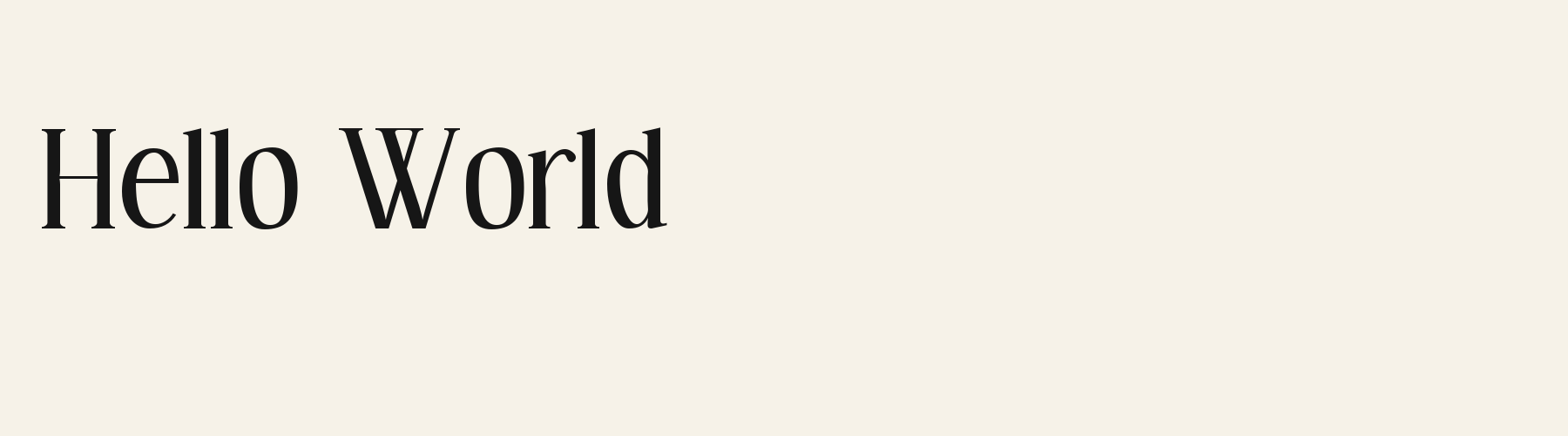
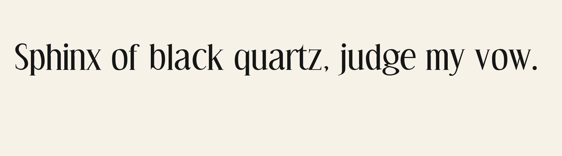
Spinney Ferrule draws tall serif letters with strong thick-to-thin contrast. The narrow bowl of o, fine crossbar of A and double-storey g give its names and short phrases a crisp vertical rhythm. The input checks below separate mapped accented letters from missing combining marks instead of relying on whatever a browser substitutes.
Aa
agRS&
Direction
Check the encoded characters you will actually publish, especially names pasted from a different source; visual similarity is no proof that the underlying input is the same.
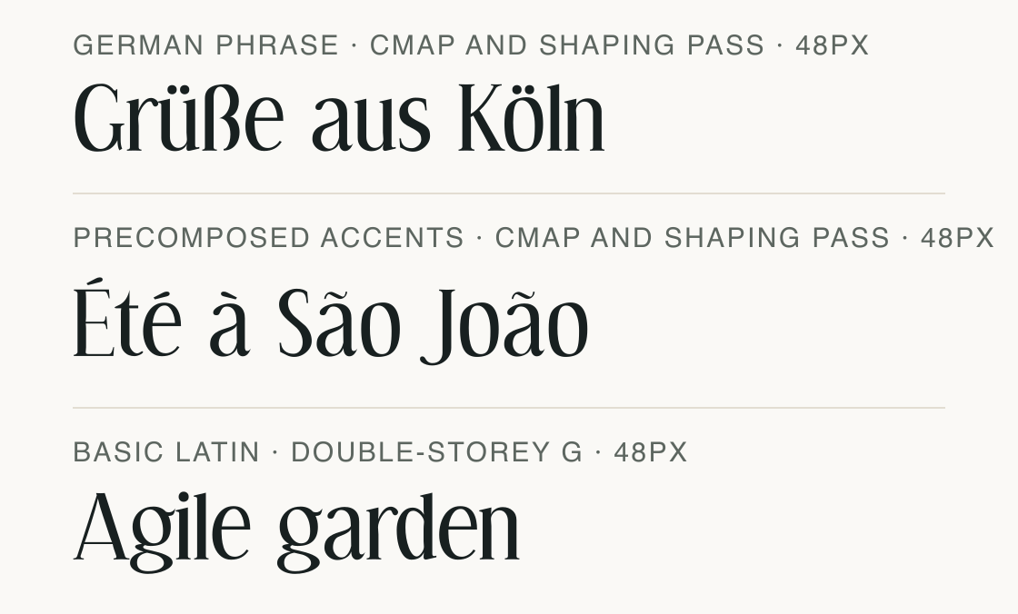
Grüße aus Köln and Été à São João both pass direct cmap mapping and shaped-run checks in Spinney Ferrule.
The fixed repertoire checks cover English, German, French, Spanish, Italian and Portuguese. That describes the tested letter sets, not every character used by those languages or an arbitrary personal name.
The decomposed sample E + U+0301, t, e + U+0301 fails because U+0301 is not mapped. The matching precomposed É and é are present. No missing-mark run is included in the image, and no fallback is substituted.
These are invented/public specimen phrases checked locally. Check private copy on the same local boundary and discard it afterwards; this page does not store user names.
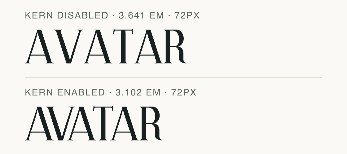
AVATAR keeps the same mapped capital letters when kern is disabled or enabled.
The default shaped advance is 3.102 em with kern enabled; disabling it gives 3.641 em in this file. At 72 px that is 223.344 px versus 262.152 px. These are advances, not the visible ink bounds.
This feature path tightens the A/V and A/T sequence in the renderer. It supplies no missing combining mark and creates no encoded alternate letter; application behavior still needs its own check.
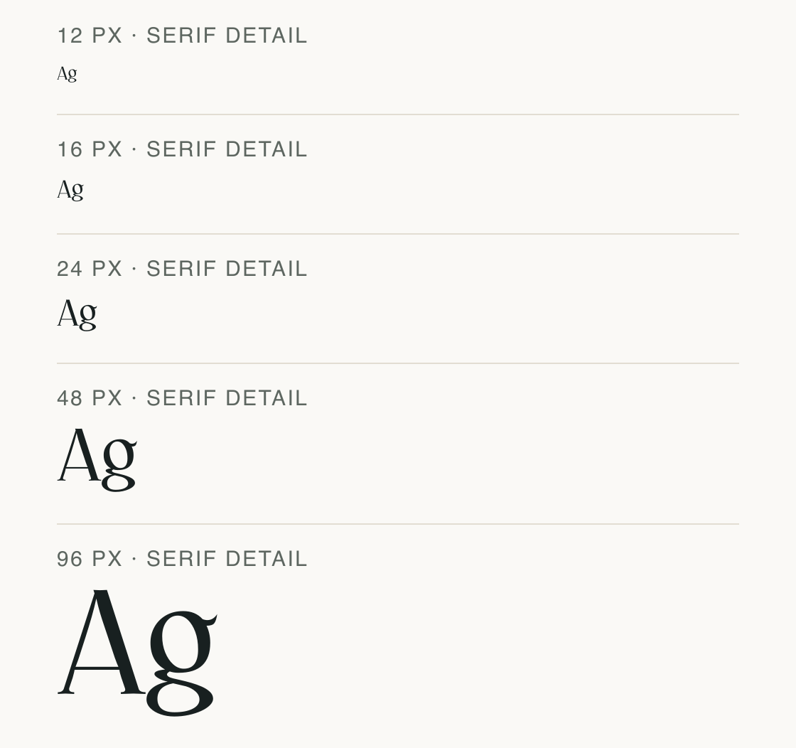
“Ag” is shown at five fixed pixel sizes so the serif details can be judged apart from the accent checks.
Test
Type the words you plan to use and adjust size, line height, and letter spacing. The preview uses the final font file.
The quick brown fox jumps over the lazy dog
Like how it sets? The TTF is free for personal projects with an account; every format and commercial use come with Pro.
Download free TTFSpecimens
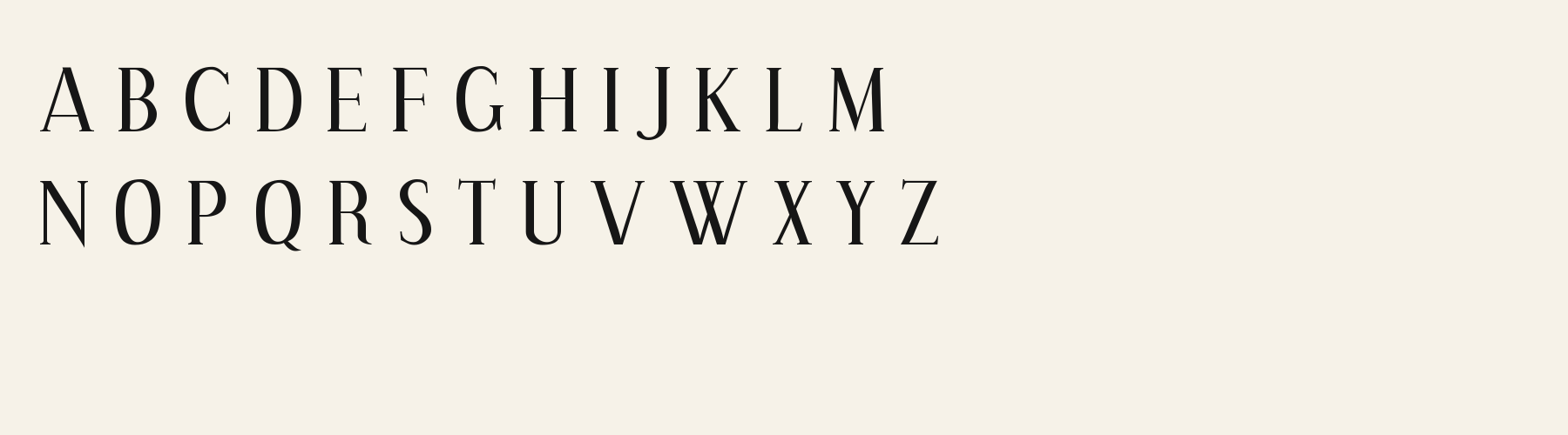
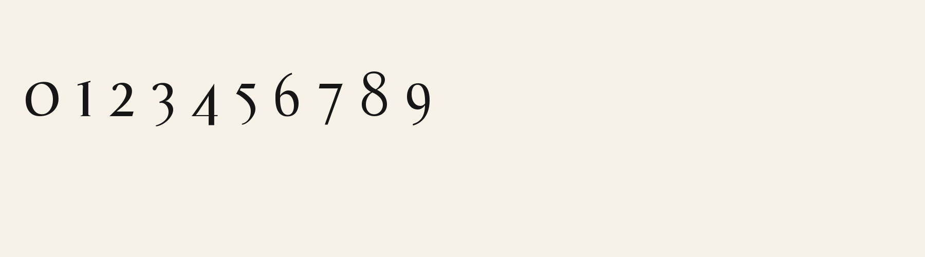
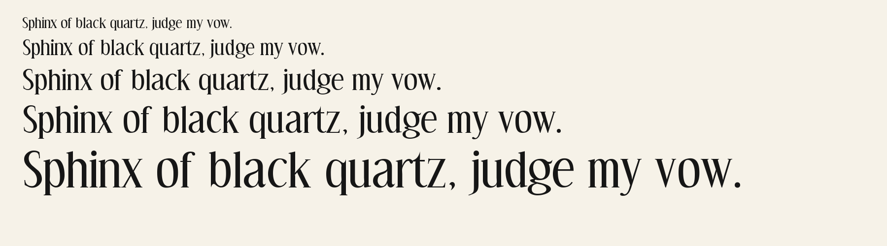
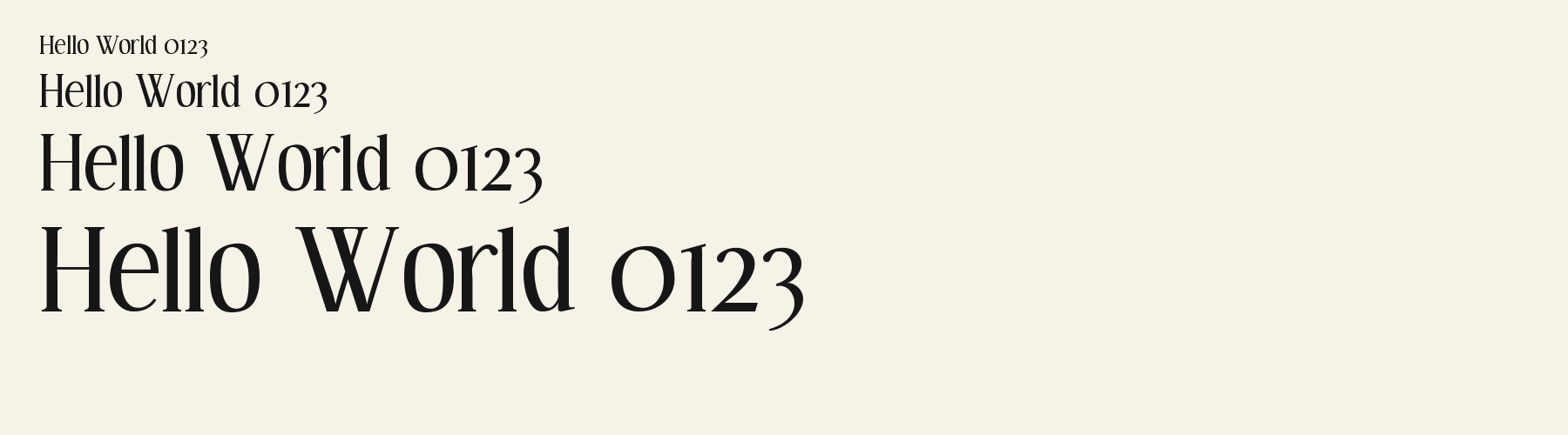
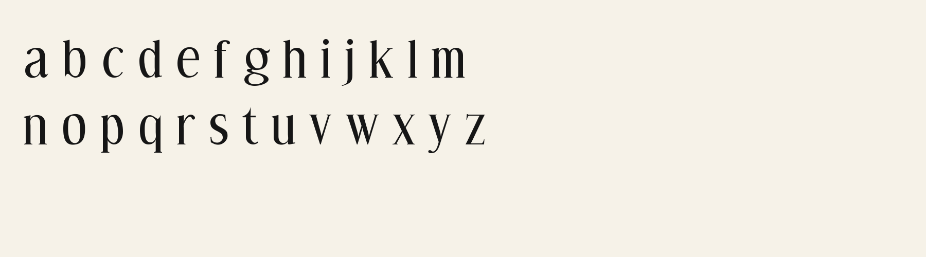
Rendered from the font files, without retouching.
Choose
A joins thin diagonals to a heavier stem above a fine horizontal crossbar.
The lowercase g has two enclosed levels and a small right-facing ear.
Long vertical stems finish in slim horizontal serifs, while lowercase o keeps a tall oval counter.
Good for
Use the bounded text checks before setting an accented name or a short multilingual serif heading.
Check before using
An available precomposed letter does not mean its decomposed input will work. U+0301 is absent, and the pound sign is also missing; do not count system fallback as coverage by Spinney Ferrule.
About
Its x-height is 78.6% of the cap height, near the 78.6% typical of serif fonts in the library. Ascenders on b, d, h, k and l line up with the capitals (100.4% of their height), and descenders on g, j, p, q and y drop 21.5% of the cap height below the baseline. The o is an upright oval, 0.71 times as wide as it is tall, and W is the widest capital, at 1.56 times the width of H. Round letters overshoot: O rises 1% of the cap height above H and dips 1.2% below the baseline.
The letters stand upright, leaning less than 2.5° either way. Vertical stems measure 13% of the cap height.
Its 187 characters include 120 Latin letters, plus 67 figures, punctuation marks and symbols; 68 of the Latin letters are accented or special forms beyond A to Z. The word space measures 37.1% of the cap height, and the blank space either side of a lowercase letter takes up 5.1% of its width. Spacing is adjusted with 1,596 kerning pairs, the most of all 1 serif fonts. The tightest of them is VA, which closes up by 24.1% of the cap height. The figures have different widths, so columns of numbers set in Spinney Ferrule will not line up exactly.
Measured from the version 0.1.1 font file. Comparisons are with the 1 published library fonts measured on November 17, 2026, 1 of them serif fonts.
Ons sê dankie vir die mooi weer en die rooi wyn.
Zhvillimi i gjuhës shqipe është një çështje e rëndësishme.
Høj bly gom vandt fræk sexquiz på wc.
Pa’s wijze lynx bezag vroom het fikse aquaduct.
Magandang umaga sa inyong lahat.
Victor jagt zwölf Boxkämpfer quer über den großen Sylter Deich.
Quel vituperabile xenofobo zelante assaggia il whisky ed esclama: alleluja!
Selamat pagi, apa khabar hari ini?
À noite, vovô Kowalsky vê o ímã cair no pé do pinguim queixoso.
El veloz murciélago hindú comía feliz cardillo y kiwi.
Habari za asubuhi, karibu nyumbani.
Flygande bäckasiner söka hwila på mjuka tuvor.
Characters
Download
Choose the license that matches your project before downloading.
Client work, products and redistribution need a commercial license. Library fonts include it with Pro or Studio; fonts you make include it when you make them on Pro or Studio. A Font Pass is for personal projects.
TTF · OTF · WOFF · WOFF2
Tools
Free tools that run in your browser. Images you make with them, such as a signature PNG, can be used for any purpose.
Similar
Serif1 style19 languages
Compared with Spinney Ferrule: 40% wider · lower x-height
Serif1 style24 languages
Compared with Spinney Ferrule: 23% wider · lower x-height
Serif1 style37 languages
Compared with Spinney Ferrule: Lower x-height · 12% wider
Serif1 style21 languages
Compared with Spinney Ferrule: 64% wider · heavier strokes
Method
Local font files were read to check character mappings and shaped outlines. AI assisted the observations and example compositions. The images use the named font files without substituted specimen glyphs; their hashes and versions are recorded for an independent check. Preview settings are illustrative, and file measurements come from the delivered bytes.
The current text and font-file specimens received an independent review.
For R, Acorn Vetch reserves 0.634 em versus 0.548 em in Spinney Ferrule. Its wider layout space can change a short title’s line break.
Acorn Birch gives g a 0.289 em advance; here it is 0.517 em. The alternative sets that character more tightly.
FAQ