
Abbey Textura
Decorative1 style17 languages
Pro · plan or Pass
B R S g 8 Aa
Decorative · 1 style · 96 characters · Version 0.3.2 · Published November 5, 2026
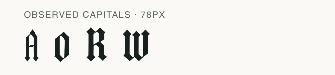
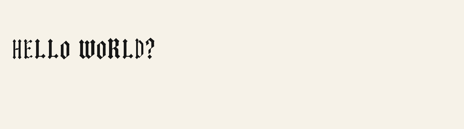
Gothic Blackline’s A has a small angular counter; its O is a narrow angular loop. The R’s lower stroke descends nearly upright and ends with an angled terminal.
Aa
BRSg8
Direction
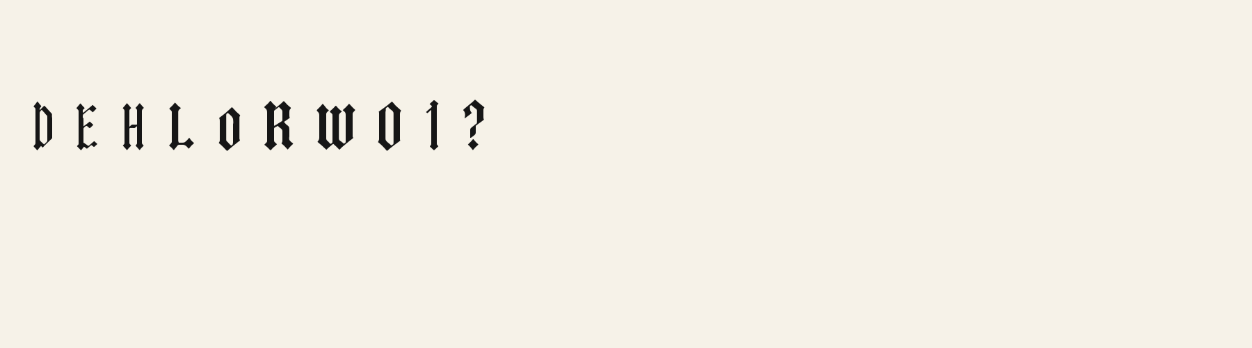
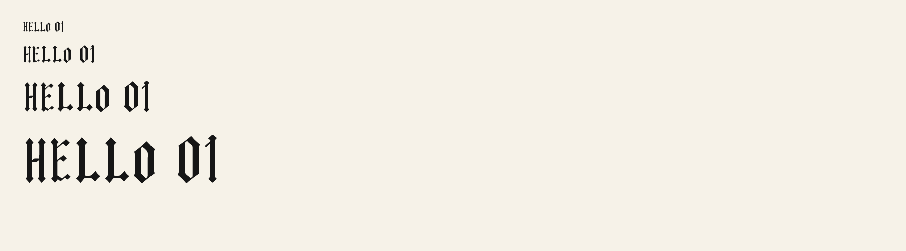
The specimen and same-size comparison show its tall, narrow construction and near-vertical R stroke.
Inspect the A’s small angular counter, the O’s narrow upright loop and the diamond-like cuts at the tall stems.
Cambridge’s historical label is context for the word gothic; this image documents the visible contours of Gothic Blackline itself.
Gonville & Caius, University of Cambridge: Typography — The University of Cambridge library exhibition groups angular, dense gothic, blackletter and textura as related historical terminology for early type. Source excerpt: “the angular, dense gothic (also called black letter or textura).”
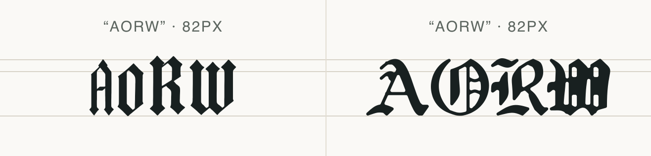
The two rows use the same four capitals and 82px setting. Compare Blackline’s narrow O and terminal cuts with Abbey Textura’s more compartmented O.
Blackline’s R descends nearly upright and ends at an angle. The side-by-side view compares these files at one setting, not their historical sources.
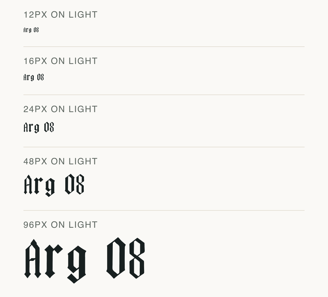
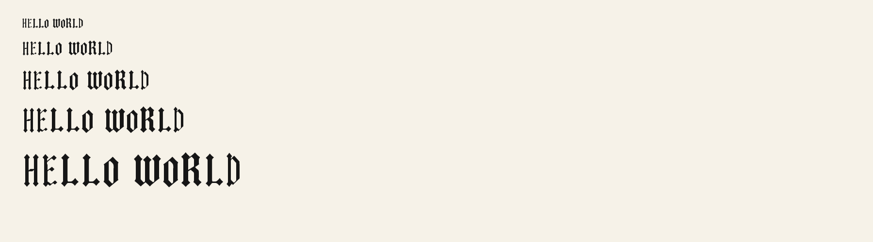
Gothic Blackline is repeated at identical tracking so you can compare the spaces within the letters as the type grows.
Test
Type the words you plan to use and adjust size, line height, and letter spacing. The preview uses the final font file.
The quick brown fox jumps over the lazy dog
Like how it sets? It comes with Pro or Studio, or as a Font Pass pick for personal projects.
Get this fontSpecimens
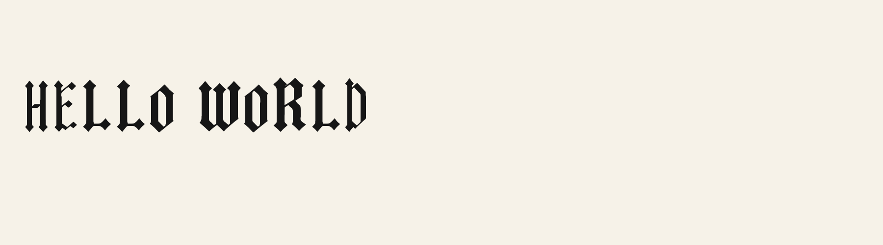
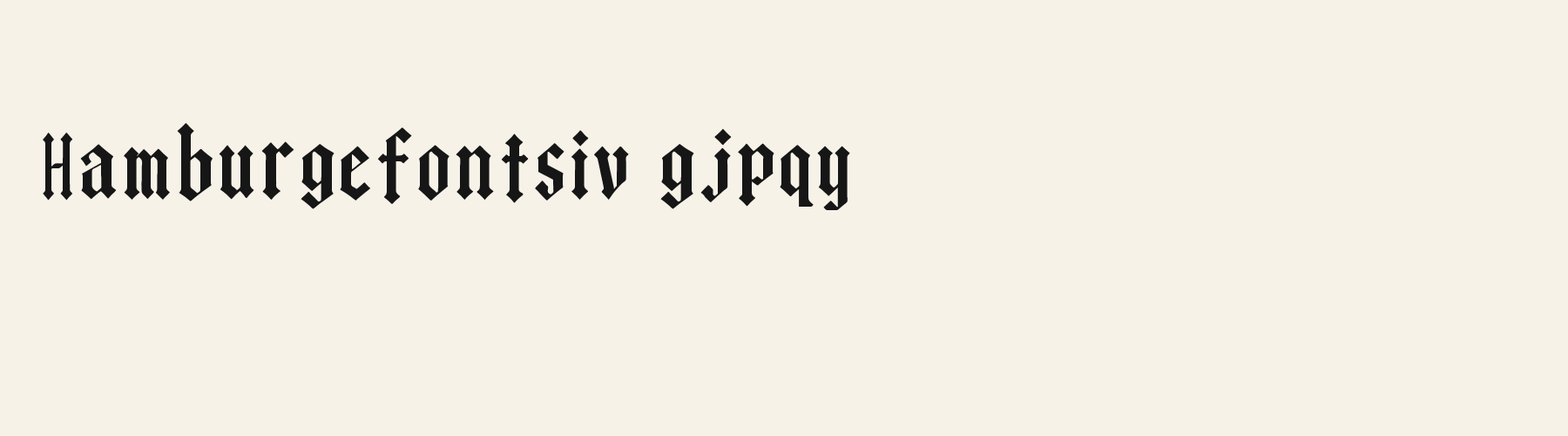
Rendered from the font files, without retouching.
Choose
Tall uprights carry diamond-like terminal cuts.
The A’s counter is small and angular; the O is a narrow upright loop.
The R’s lower stroke is near-vertical with an angled end, rather than a long diagonal sweep.
Good for
A brief display word where tall stems and terminal cuts have room to show.
Check before using
Long paragraphs or small labels where repeated dense capitals would dominate the text.
About
Its x-height is 78.6% of the cap height, near the 78.6% typical of decorative fonts in the library. Ascenders on b, d, h, k and l rise 6.3% above the capitals, and descenders on g, j, p, q and y drop 10% of the cap height below the baseline. The o is an upright oval, 0.57 times as wide as it is tall, and W is the widest capital, at 1.53 times the width of H. The O stops 7.9% of the cap height short of H and dips 1.1% below the baseline.
The letters stand upright, leaning less than 2.5° either way. The contrast is mild: the sides of o and O are 1.24 times as thick as their tops and bottoms.
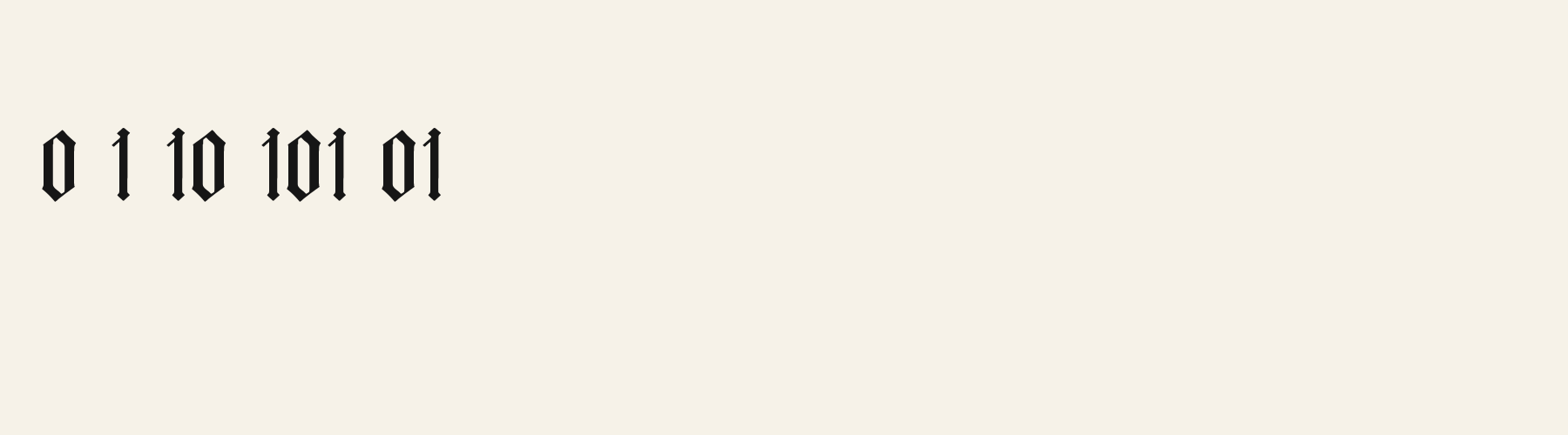
Its 95 characters include 52 Latin letters, plus 43 figures, punctuation marks and symbols; there are no accented Latin letters beyond A to Z. The word space measures 41.6% of the cap height, and the blank space either side of a lowercase letter takes up 16.8% of its width. The font carries no kerning, so spacing comes from each letter’s own side bearings. The figures have different widths, so columns of numbers set in Gothic Blackline will not line up exactly.
Measured from the version 0.3.2 font file. Comparisons are with the 1 published library fonts measured on November 4, 2026, 1 of them decorative fonts.
Characters
Download
Choose the license that matches your project before downloading.
See plans or browse fonts that are free to download.
Client work, products and redistribution need a commercial license. Library fonts include it with Pro or Studio; fonts you make include it when you make them on Pro or Studio. A Font Pass is for personal projects.
TTF · OTF · WOFF · WOFF2
Tools
Free tools that run in your browser. Images you make with them, such as a signature PNG, can be used for any purpose.
Similar
Decorative1 style17 languages
Compared with Gothic Blackline: 18% wider · lower x-height
Decorative1 style17 languages
Compared with Gothic Blackline: 8% narrower
Decorative1 style17 languages
Compared with Gothic Blackline: Shadow effect · lower x-height
Decorative1 style17 languages
Compared with Gothic Blackline: 13% wider · lower x-height
Method
The font files were checked for supported characters and visible letter shapes. AI helped describe the forms and prepare the sample compositions. The images use the named font files; samples are illustrative, and measurements come from the supplied files.
The current text and font-file specimens received an independent review.
For R, Abbey Textura reserves 0.730 em versus 0.522 em in Gothic Blackline. Its wider layout space can change a short title’s line break.
Acorn Birch gives g a 0.289 em advance; here it is 0.407 em. The alternative sets that character more tightly.
FAQ