
Gothic Tattoo Spire
Decorative1 style17 languages
Pro · plan or Pass
a g R S & Aa
Decorative · 1 style · 149 characters · Version 0.1.2 · Published November 5, 2026
Margrave Fraktur carries blackletter structure into a compact numeric line. This page checks the actual digit and punctuation set in its current WOFF2; it does not infer currency coverage from the style name.
Aa
agRS&
Direction
Check the currency marks required by the final copy, then verify the complete layout in the target application.
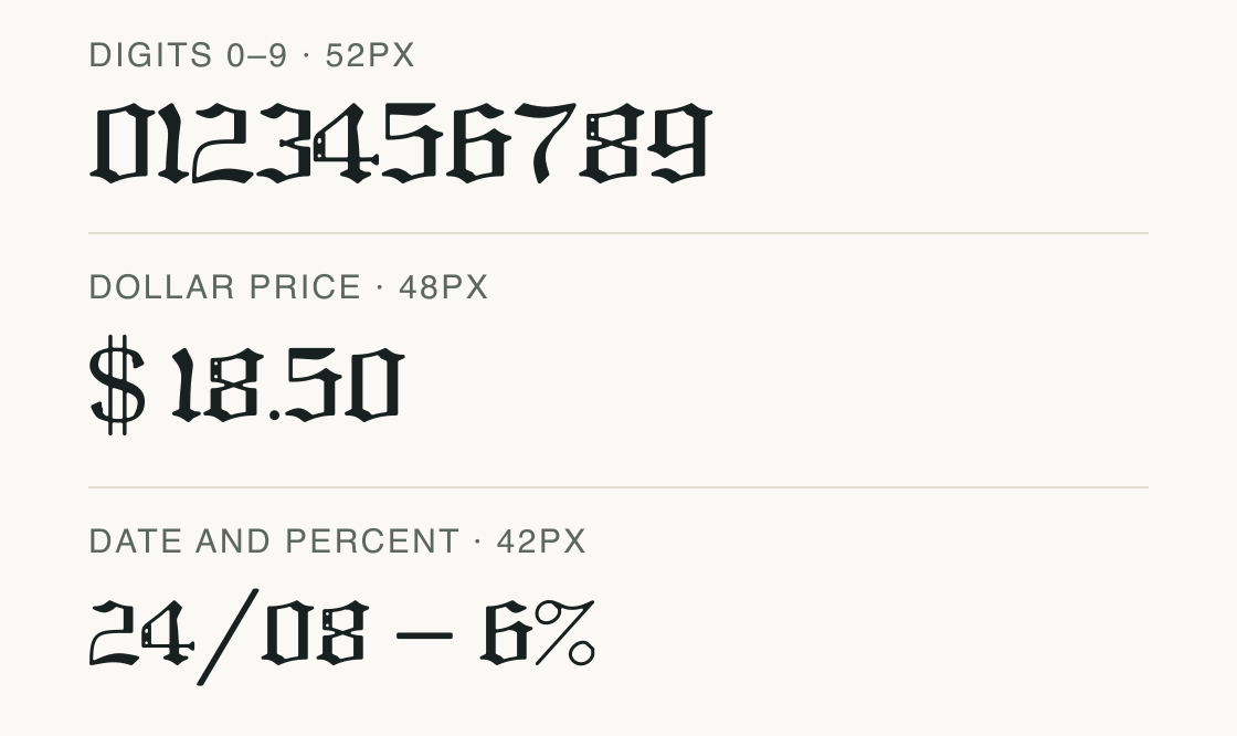
This specimen uses the exact current file. The visible sequence covers its mapped digits and usable common price marks; the missing euro, pound, and yen signs are disclosed below.
Each row is a static font specimen. Alignment is measured from advances in the local file and does not claim that the face has tabular numerals.
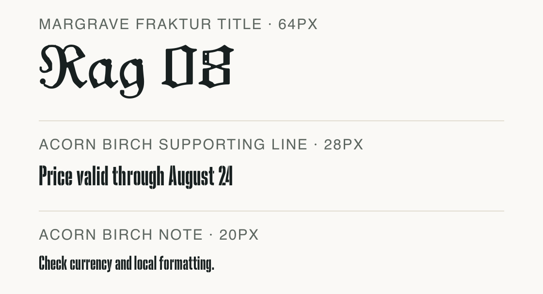
Margrave Fraktur carries the short label; Acorn Birch carries the explanatory line. This is a neutral font pairing sketch, not a printed customer example.
Test
Type the words you plan to use and adjust size, line height, and letter spacing. The preview uses the final font file.
The quick brown fox jumps over the lazy dog
Like how it sets? It comes with Pro or Studio, or as a Font Pass pick for personal projects.
Get this fontSpecimens
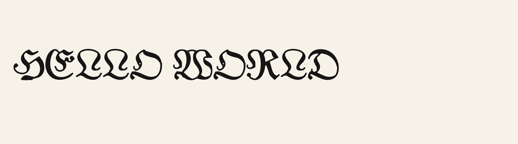
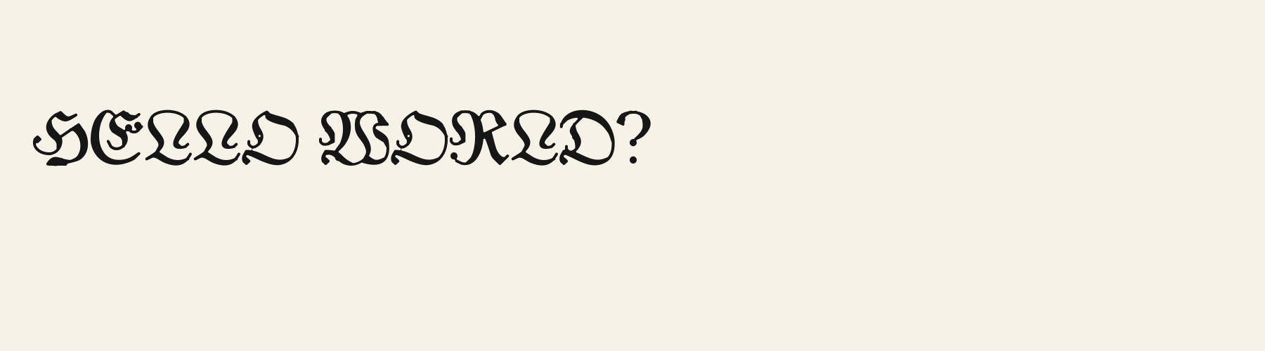
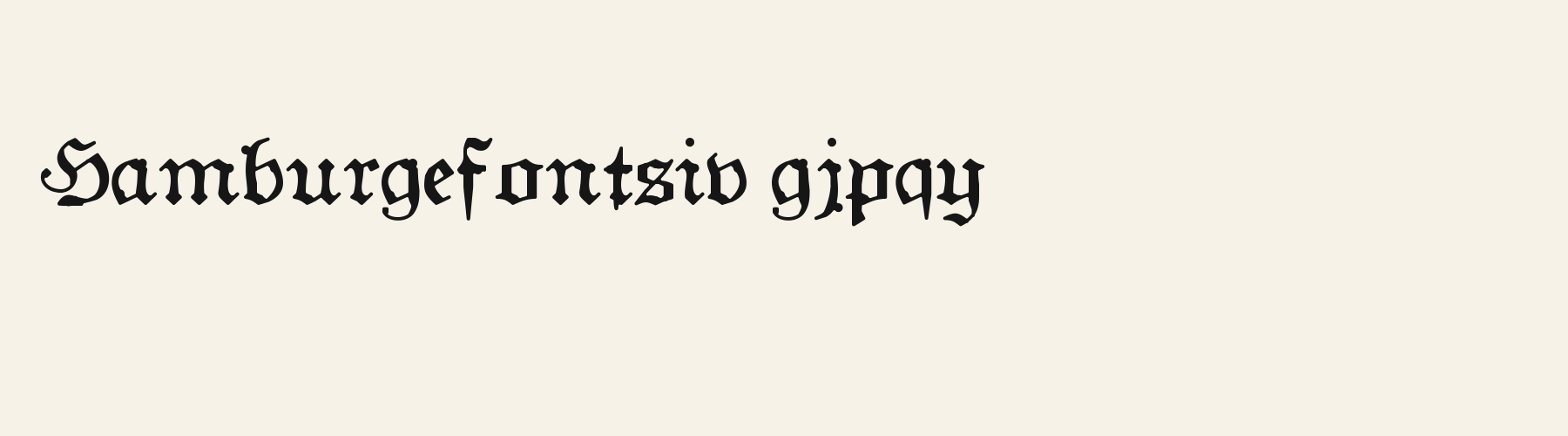
Rendered from the font files, without retouching.
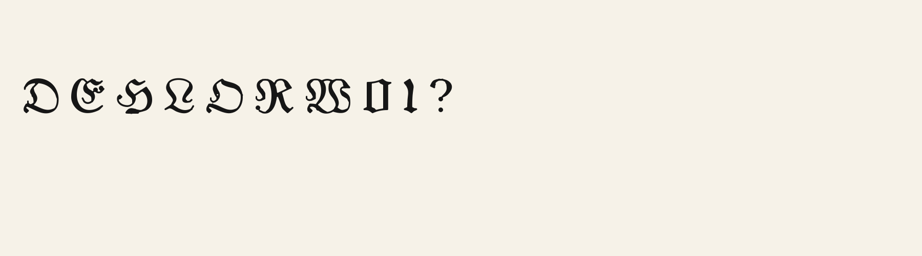
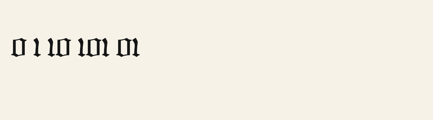
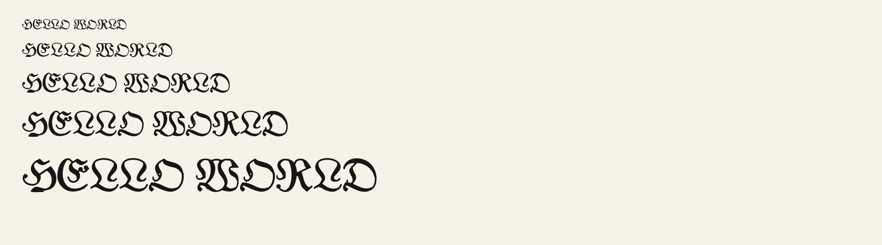
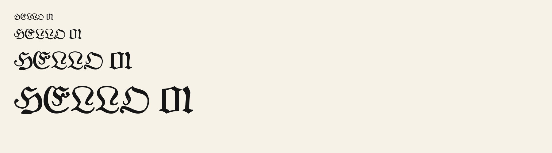
Choose
The 0 has a narrow upright counter with clipped shoulders and feet, visible in the 0–9 row.
The 4 uses an open top and a separate crossbar, so the diagonal remains distinct at the same size.
The 8 is divided into two compact counters by a tight waist; its upper and lower bowls are not circular.
Good for
Use the digits for short display prices, dates, and numbered labels when the available symbols match the copy. Pair it with a plainer face for longer explanations.
Check before using
Do not use it for amounts requiring euro, pound, or yen signs, and do not treat a decorative number sample as proof of tabular alignment in every application.
About
Margrave Fraktur's lowercase x reaches 72.6% of the capital height, close to the 72.6% median for decorative fonts. Ascenders on b, d, h, k and l line up with the capitals (99.3% of their height), and descenders on g, j, p, q and y drop 22.4% of the cap height below the baseline. The o is close to a circle, 1.05 times as wide as it is tall, and M is the widest capital, at 1.30 times the width of H. The O stops 0.7% of the cap height short of H and stands 0.4% above the baseline.
The letters stand upright, leaning less than 2.5° either way.
Its 148 characters include 105 Latin letters, plus 43 figures, punctuation marks and symbols; 53 of the Latin letters are accented or special forms beyond A to Z. The word space measures 32.9% of the cap height, and the blank space either side of a lowercase letter takes up 6.5% of its width. Spacing is adjusted with 190 kerning pairs, the most of all 1 decorative fonts. The tightest of them is FA, which closes up by 23.5% of the cap height. The figures have different widths, so columns of numbers set in Margrave Fraktur will not line up exactly.
Measured from the version 0.1.2 font file. Comparisons are with the 1 published library fonts measured on November 4, 2026, 1 of them decorative fonts.
Characters
Download
Choose the license that matches your project before downloading.
See plans or browse fonts that are free to download.
Client work, products and redistribution need a commercial license. Library fonts include it with Pro or Studio; fonts you make include it when you make them on Pro or Studio. A Font Pass is for personal projects.
TTF · OTF · WOFF · WOFF2
Tools
Free tools that run in your browser. Images you make with them, such as a signature PNG, can be used for any purpose.
Similar
Decorative1 style17 languages
Compared with Margrave Fraktur: 32% narrower · lighter strokes
Decorative1 style27 languages
Compared with Margrave Fraktur: Heavier strokes
Decorative1 style30 languages
Compared with Margrave Fraktur: Heavier strokes · 13% wider
Decorative1 style26 languages
Compared with Margrave Fraktur: 6% narrower · taller x-height
Method
The font files were checked for supported characters and visible letter shapes. AI helped describe the forms and prepare the sample compositions. The images use the named font files; samples are illustrative, and measurements come from the supplied files.
The current text and font-file specimens received an independent review.
For R, Abbey Textura reserves 0.730 em versus 0.794 em in Margrave Fraktur. Its narrower advance can help when that capital repeats in a compact heading.
Acorn Birch gives g a 0.289 em advance; here it is 0.442 em. The alternative sets that character more tightly.
FAQ