
Bubble Confetti Round
Display1 style17 languages
Pro · plan or Pass
H S $ I n s
Display · 1 style · 327 characters · Version 0.1.2 · Published November 5, 2026
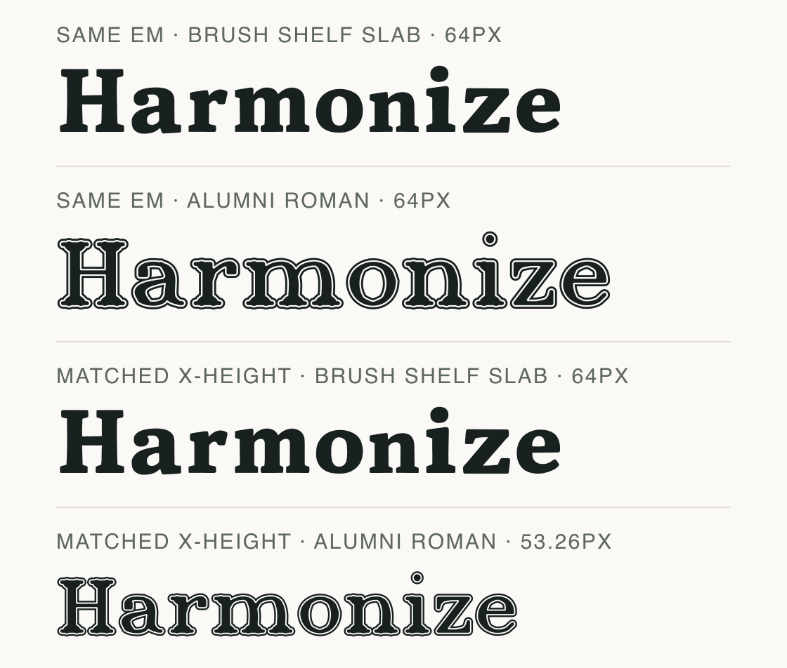
Brush Shelf Slab combines heavy, solid slab forms with a separate comparison face whose outlines are unusually ornamental. The font tables give Brush Shelf Slab a 1.119 em ascent-to-descent line-metric span and Alumni Roman 1.433 em, a 0.314 em difference; these figures do not determine the CSS line height. Matching the observed lowercase x height reduces the comparison row from 64 px to 53.26 px; the renderer changes its size to align the two x outlines.
Aa
HS$Ins
Direction
Test both full text strings at the target width, then choose whether their distinct filled and outlined forms suit the hierarchy.
The same word is rendered first at 64 px in both files, then at adjusted sizes so the measured lowercase x outlines match the first font’s observed x-height. The lower pair therefore changes pixel size; it is not a fixed 64 px comparison. Labels report the normalized size used by the renderer.
In this font pair the table declares x-height 479 units for Brush Shelf Slab and 569 for Alumni Roman; the measured lowercase x outlines are 481 and 578 units out of 1000. At 64 px/em, those outlines are about 30.78 px and 36.99 px high. The final two rows normalize the second file to 53.26 px while Brush Shelf Slab stays 64 px, bringing both measured x outlines to about 30.78 px. This matches actual observed x glyphs; it does not leave both fonts at 64 px.
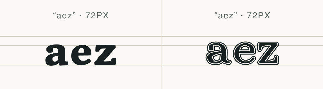
At one shared 72 px em, the solid lowercase forms in Brush Shelf Slab contrast with outlined forms in the exact Alumni Roman file. The outlines remain visible in the comparison image; neither row stands in for a generic serif or body font.
The a, e, and z forms are visibly different in fill and contour in this short specimen. Check the complete title and its line length before choosing between the two files.
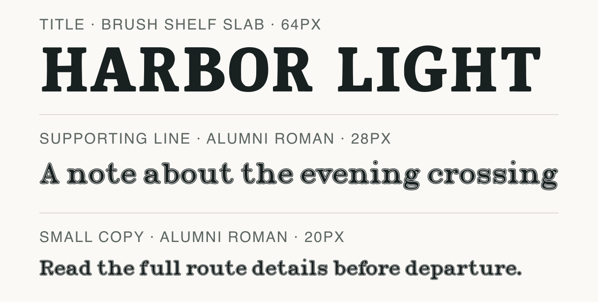
Brush Shelf Slab sets “HARBOR LIGHT”; Alumni Roman sets the supporting and small-copy lines below. The second file is an outlined display style, not a neutral text face, so the specimen tests contrast rather than a conventional title/body pairing.
At 64 px the title occupies one wide line; the 28 px supporting phrase and 20 px small-copy sentence also remain single rows in this 608 px sample. Both companion rows use Alumni Roman’s outlined forms, which may compete with the slab headline.
The current Brush Shelf Slab pack contains OTF, TTF, WOFF, and WOFF2 files. The WOFF2 specimen is 39,208 bytes and the cmap maps 327 characters; these facts describe this version, not transfer time or loading speed.
The URL, format, weight, style, and unicode-range below refer to this current pack file. The descriptor selects this face when a page needs one of those code points; it does not create a subset or reduce the WOFF2 download.
@font-face {
  font-family: "Brush Shelf Slab";
  src: url("/font-files/bf59106d-a366-472c-a570-94ed3b5b172b/1/BrushShelfSlab-Regular.woff2") format("woff2");
  font-weight: 400;
  font-style: normal;
  font-display: swap;
  unicode-range: U+20-7E, U+C0-D6, U+D8-DD, U+E0-EF, U+F1-F6, U+F8-FF, U+102-107, U+10B-112, U+116-11B, U+11E-11F, U+122-123, U+126-129, U+12E-12F, U+131, U+136-137, U+139-13E, U+141-142, U+144-148, U+150-151, U+153-155, U+158-15B, U+15E-161, U+164-165, U+168-16B, U+16E-17B, U+17D-17E, U+1A0-1A1, U+1AF-1B0, U+218-21B, U+259, U+1E80-1E85, U+1EA0-1EB9, U+1EBC-1EC7, U+1EC9-1ECD, U+1ED0-1EDB, U+1EDD, U+1EE0-1EE5, U+1EE8-1EEB, U+1EEE-1EF5, U+1EF8-1EF9, U+FFFF;
}Test
Type the words you plan to use and adjust size, line height, and letter spacing. The preview uses the final font file.
The quick brown fox jumps over the lazy dog
Like how it sets? It comes with Pro or Studio, or as a Font Pass pick for personal projects.
Get this fontSpecimens
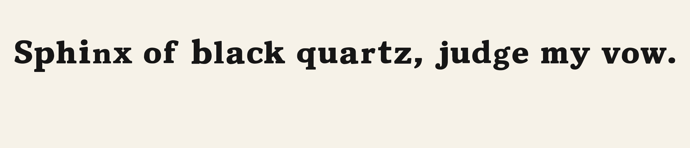
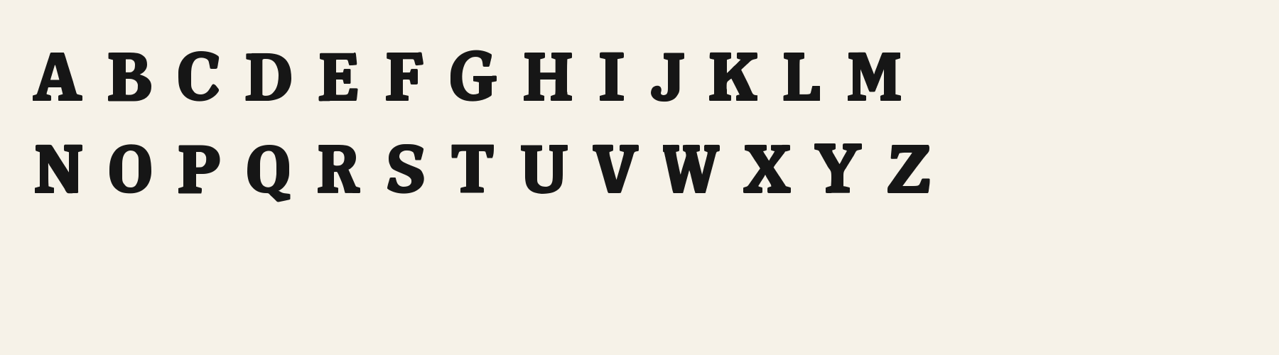
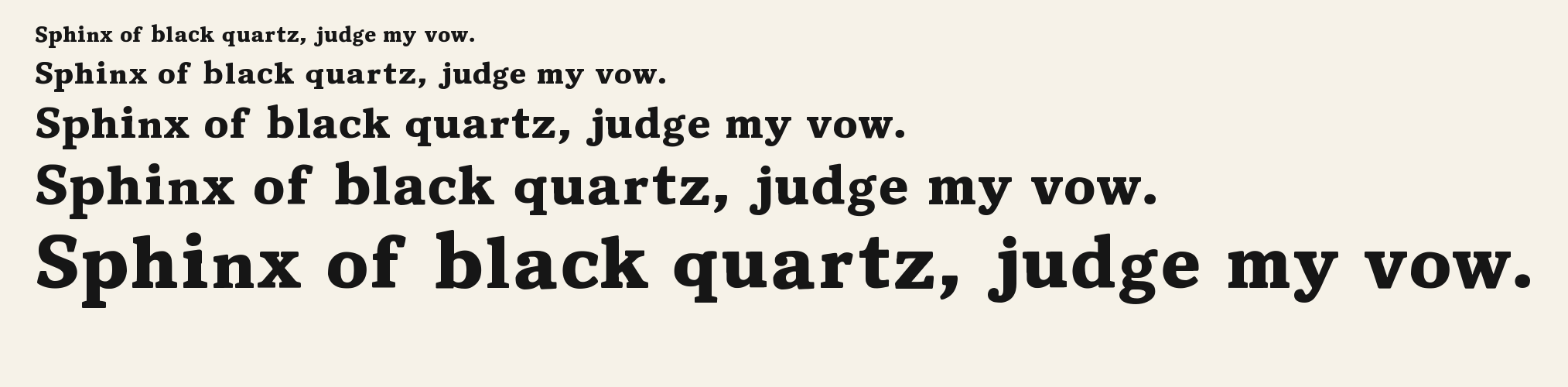
Rendered from the font files, without retouching.
Choose
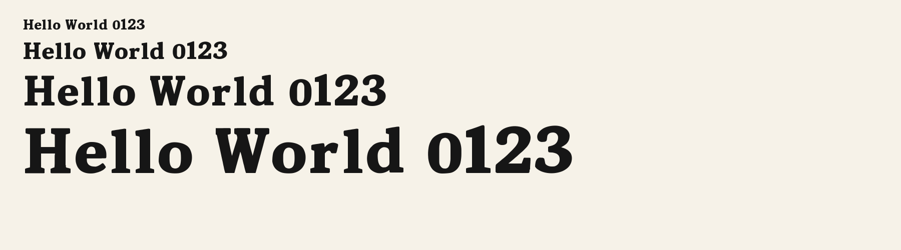
The capital H in “Harmonize” has broad slab terminals in the solid Brush Shelf Slab row.
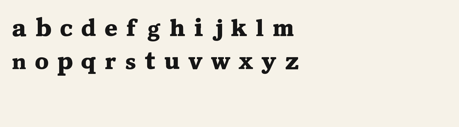
The lowercase a in “aez” has a solid, compact counter in Brush Shelf Slab; the matched Alumni Roman glyph is an outlined form.
The lowercase e and z in the same specimen make the difference between solid fills and outlined contours visible at one shared 72 px em size.
Good for
Compare the exact files when deciding how a strongly filled display title will sit beside an ornamental outlined companion.
Check before using
The outlined Alumni Roman specimen has its own display character, so it may compete with rather than quiet the title. One word and three lines do not establish a general pairing or app behavior.
About
Its x-height is 69.1% of the cap height, near the 69.1% typical of display fonts in the library. Ascenders on b, d, h, k and l line up with the capitals (100% of their height), and descenders on g, j, p, q and y drop 27.3% of the cap height below the baseline. The o is close to a circle, 1.07 times as wide as it is tall, and W is the widest capital, at 1.09 times the width of H. The O tops out level with H and dips 1.1% below the baseline.
The letters stand upright, leaning less than 2.5° either way. Vertical stems measure 24.8% of the cap height. Strokes change thickness with direction: the sides of o and O are 2.1 times as thick as their tops and bottoms.
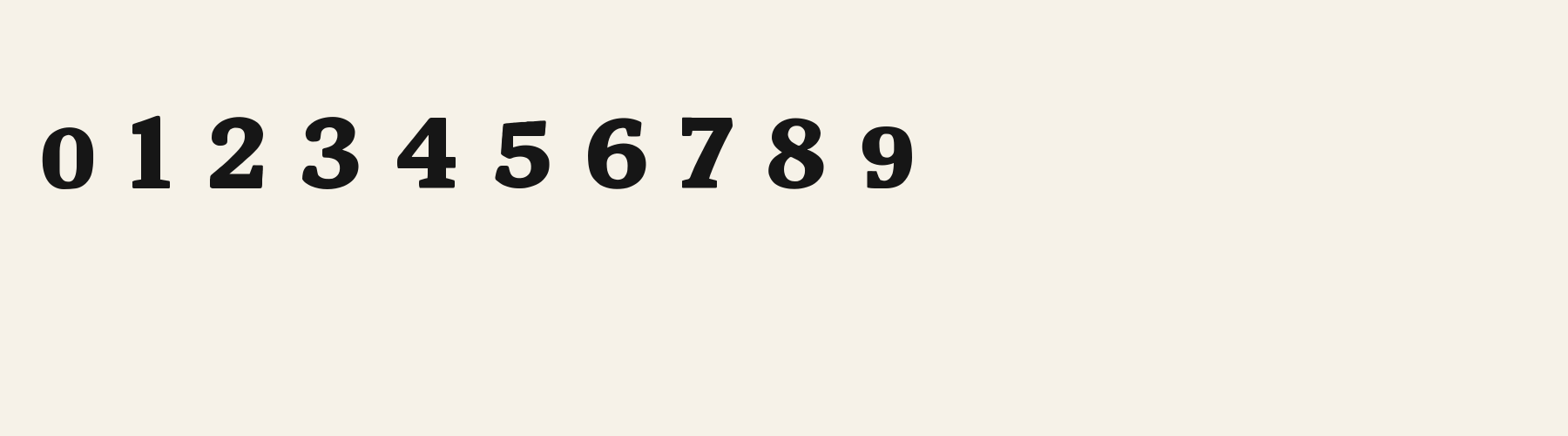
Its 326 characters include 283 Latin letters, plus 43 figures, punctuation marks and symbols; 231 of the Latin letters are accented or special forms beyond A to Z. The word space measures 45.9% of the cap height, and the blank space either side of a lowercase letter takes up 11.8% of its width. The font carries no kerning, so spacing comes from each letter’s own side bearings. The figures have different widths, so columns of numbers set in Brush Shelf Slab will not line up exactly.
Measured from the version 0.1.2 font file. Comparisons are with the 1 published library fonts measured on November 4, 2026, 1 of them display fonts.
Characters
Download
Choose the license that matches your project before downloading.
See plans or browse fonts that are free to download.
Client work, products and redistribution need a commercial license. Library fonts include it with Pro or Studio; fonts you make include it when you make them on Pro or Studio. A Font Pass is for personal projects.
TTF · OTF · WOFF · WOFF2
Tools
Free tools that run in your browser. Images you make with them, such as a signature PNG, can be used for any purpose.
Similar
Display1 style17 languages
Compared with Brush Shelf Slab: Heavier strokes · taller x-height
Display1 style17 languages
Compared with Brush Shelf Slab: 14% narrower · taller x-height
Display1 style30 languages
Compared with Brush Shelf Slab: 11% narrower
Display1 style18 languages
Compared with Brush Shelf Slab: 33% wider · taller x-height
Method
The font files were checked locally for the characters shown, and the samples were rendered with the named fonts. AI helped describe the observed letterforms and draft sample compositions. These are specimen examples, not customer work; preview settings are illustrative.
The current text and font-file specimens received an independent review.
Bubble Puffy Serif keeps filled, footed display lettering but rounds its serifs into cushions, instead of the crisper a, e and z edges in Brush Shelf Slab. Its g reserves 0.637 em compared with 0.580 em here, making it a wider lowercase alternative.
Acorn Birch gives g a 0.289 em advance; here it is 0.580 em. The alternative sets that character more tightly.
FAQ