
Atelier Light
Serif1 style19 languages
Pro · plan or Pass
a g R S & Aa
Serif · 1 style · 216 characters · Version 0.1.2 · Published November 5, 2026
Atelier Wide sets the uppercase sample with generous horizontal room: the broad O and capital M make their shapes easy to compare, while the short all-caps label takes substantial width. Its 216 mapped characters keep the discussion focused on the supplied repertoire rather than implying broad language coverage.
Aa
agRS&
Direction
Keep the title short, then test the complete wording in the actual container so line breaks are decided by the real file.
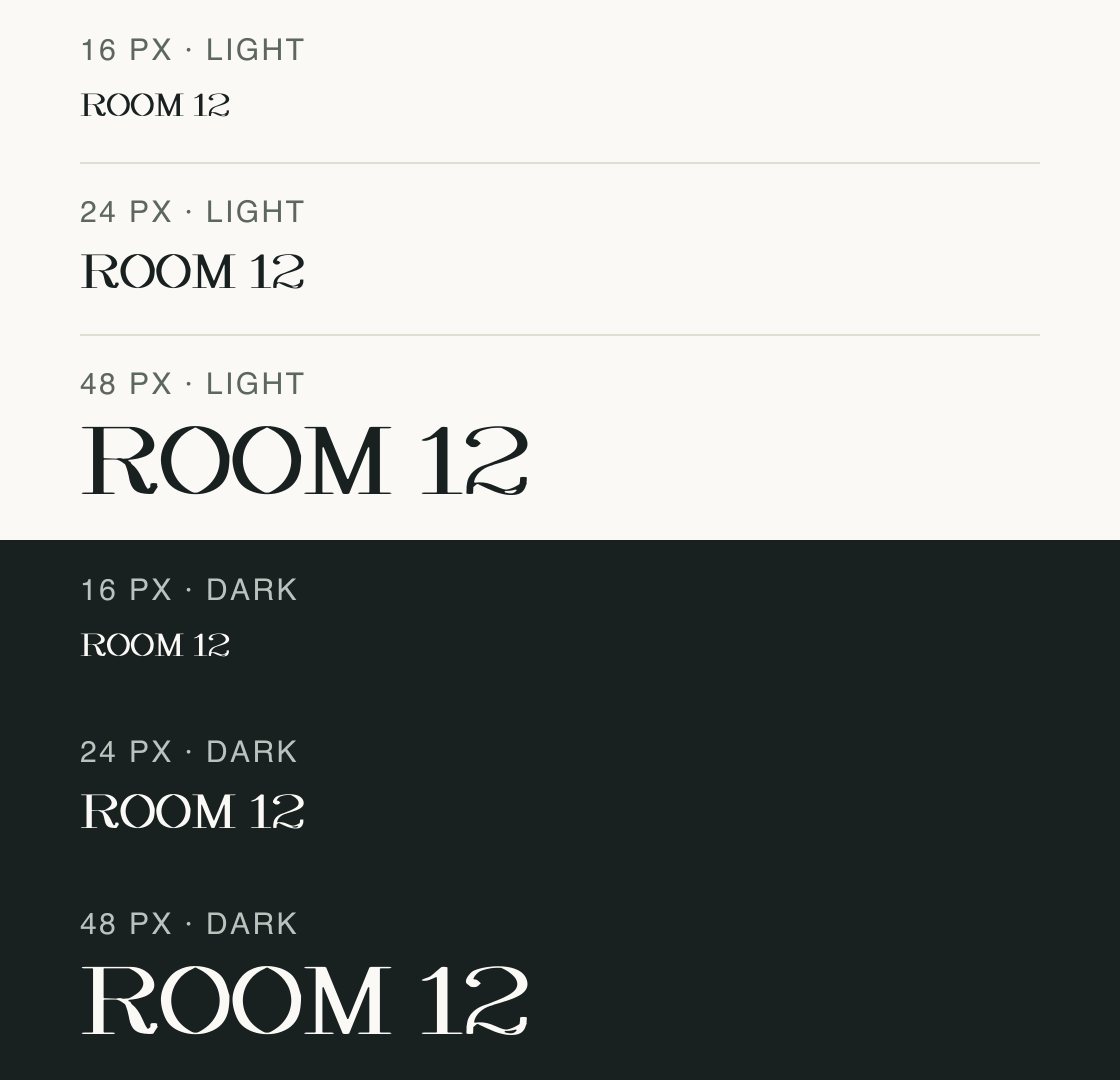
The all-caps label “ROOM 12” is repeated at 16, 24, and 48 px on both backgrounds. Compare the broad capital O and M in the larger rows, then check how the complete phrase fits its container.
The renderer uses this file and fixed preview settings. Device scaling and antialiasing can change small-size appearance.
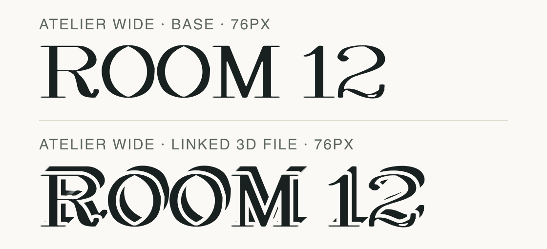
The same “ROOM 12” wording appears in the base file and its explicit 3D companion. The lower row uses the separate linked font file, so its offset outline is part of that glyph design.
Test
Type the words you plan to use and adjust size, line height, and letter spacing. The preview uses the final font file.
The quick brown fox jumps over the lazy dog
Like how it sets? It comes with Pro or Studio, or as a Font Pass pick for personal projects.
Get this fontSpecimens
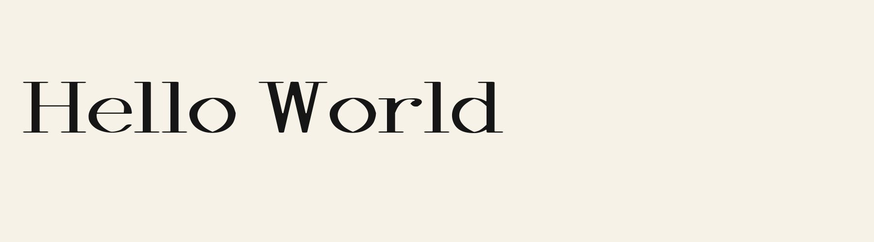
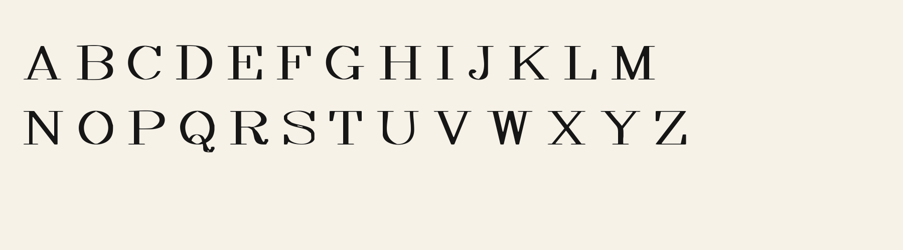
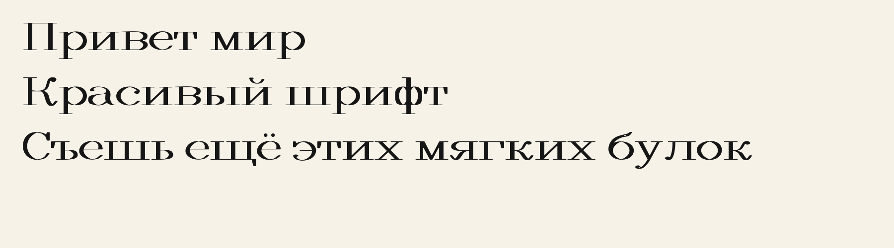
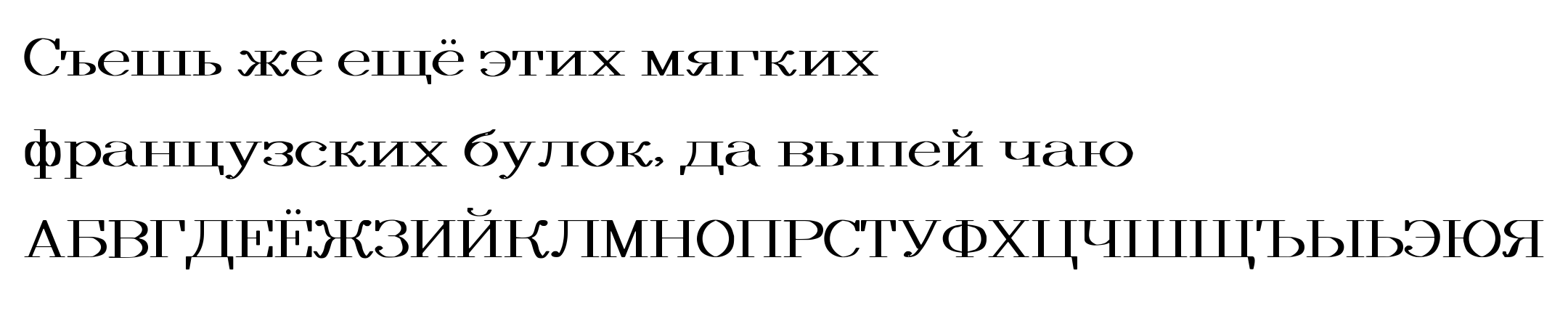
Rendered from the font files, without retouching.

Choose
The capital M has widely separated outer stems in the rendered sample.
The two uppercase O forms have broad oval counters beside the straight stems of M.
The numeral 2 in “ROOM 12” finishes with a curled lower stroke.
Good for
Check the width and pixel size of a short uppercase display line before using Atelier Wide in a fixed-width banner or app header.
Check before using
A single specimen line cannot predict the width of every heading, and the shown pixel steps are not a universal reading-size recommendation.
About
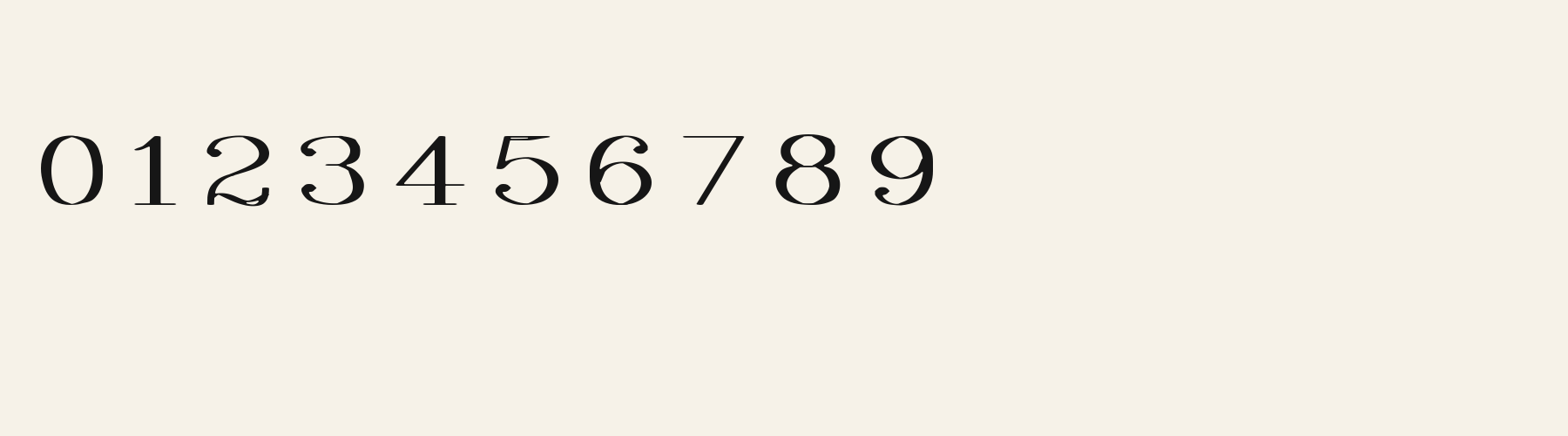
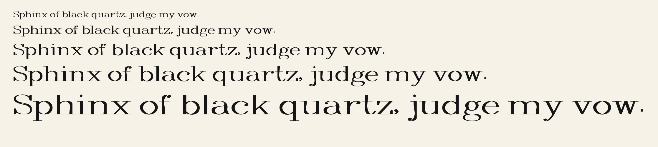
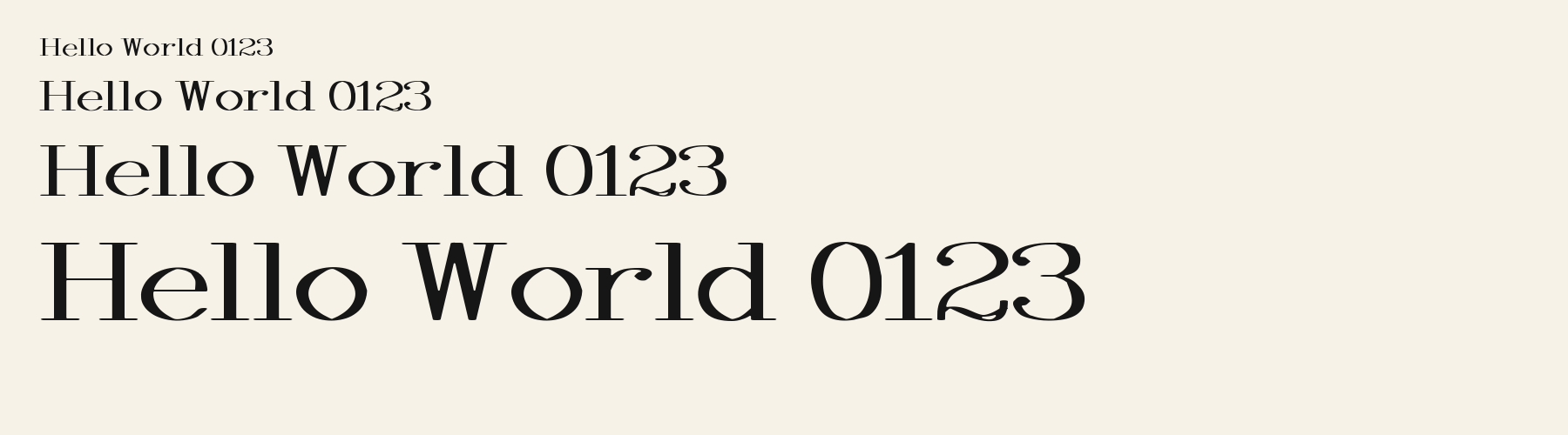
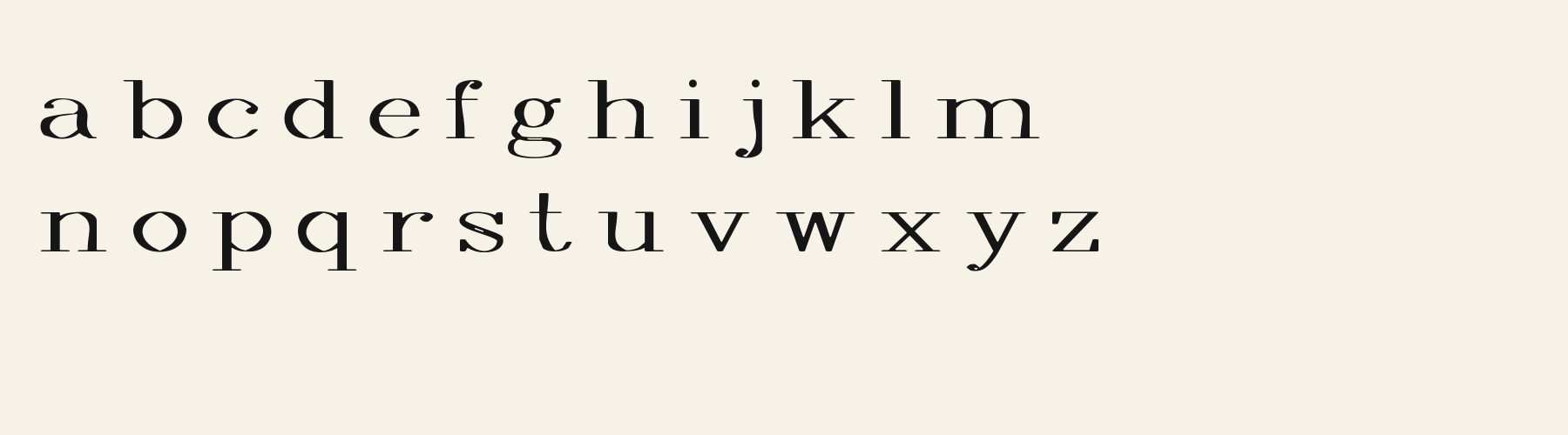
Its x-height is 67.4% of the cap height, near the 67.4% typical of serif fonts in the library. Ascenders on b, d, h, k and l line up with the capitals (100% of their height), and descenders on g, j, p, q and y drop 32.9% of the cap height below the baseline. The o is wider than it is tall, 1.32 to 1, and W is the widest capital, at 1.09 times the width of H. The O rises 1.3% of the cap height above H and sits on the baseline.
The letters stand upright, leaning less than 2.5° either way. Vertical stems measure 15.7% of the cap height. Strokes change thickness with direction: the sides of o and O are 6.6 times as thick as their tops and bottoms.
Its 215 characters include 105 Latin and 66 Cyrillic letters, plus 44 figures, punctuation marks and symbols; 53 of the Latin letters are accented or special forms beyond A to Z. The word space measures 40.3% of the cap height, and the blank space either side of a lowercase letter takes up 5.5% of its width. Spacing is adjusted with 47 kerning pairs, the most of all 1 serif fonts. The tightest of them is VA, which closes up by 16.5% of the cap height. The figures have different widths, so columns of numbers set in Atelier Wide will not line up exactly.
Measured from the version 0.1.2 font file. Comparisons are with the 1 published library fonts measured on November 4, 2026, 1 of them serif fonts.
Съешь же ещё этих мягких французских булок, да выпей чаю.
Zhvillimi i gjuhës shqipe është një çështje e rëndësishme.
Magandang umaga sa inyong lahat.
Selamat pagi, apa khabar hari ini?
Habari za asubuhi, karibu nyumbani.
Characters
Download
Choose the license that matches your project before downloading.
See plans or browse fonts that are free to download.
Client work, products and redistribution need a commercial license. Library fonts include it with Pro or Studio; fonts you make include it when you make them on Pro or Studio. A Font Pass is for personal projects.
TTF · OTF · WOFF · WOFF2
Tools
Free tools that run in your browser. Images you make with them, such as a signature PNG, can be used for any purpose.
Similar
Serif1 style19 languages
Compared with Atelier Wide: 17% narrower · lower x-height
Serif1 style24 languages
Compared with Atelier Wide: 27% narrower · leans about 13°
Serif1 style37 languages
Compared with Atelier Wide: 34% narrower
Serif1 style38 languages
Compared with Atelier Wide: Heavier strokes · 13% narrower
Method
The font files were checked locally for the characters shown, and the samples were rendered with the named fonts. AI helped describe the observed letterforms and draft sample compositions. These are specimen examples, not customer work; preview settings are illustrative.
The current text and font-file specimens received an independent review.
For R, Acorn Vetch reserves 0.634 em versus 0.827 em in Atelier Wide. Its narrower advance can help when that capital repeats in a compact heading.
Acorn Birch gives g a 0.289 em advance; here it is 0.671 em. The alternative sets that character more tightly.
FAQ