Bubble Puffy Serif
Display1 style17 languages
Pro · plan or Pass
a g R S & Aa
Display · 1 style · 175 characters · Version 0.1.3 · Published November 22, 2026
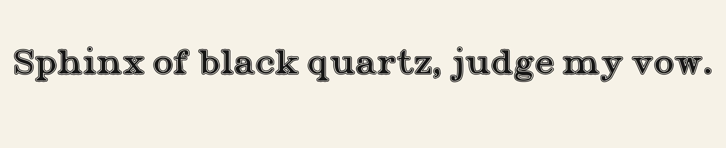
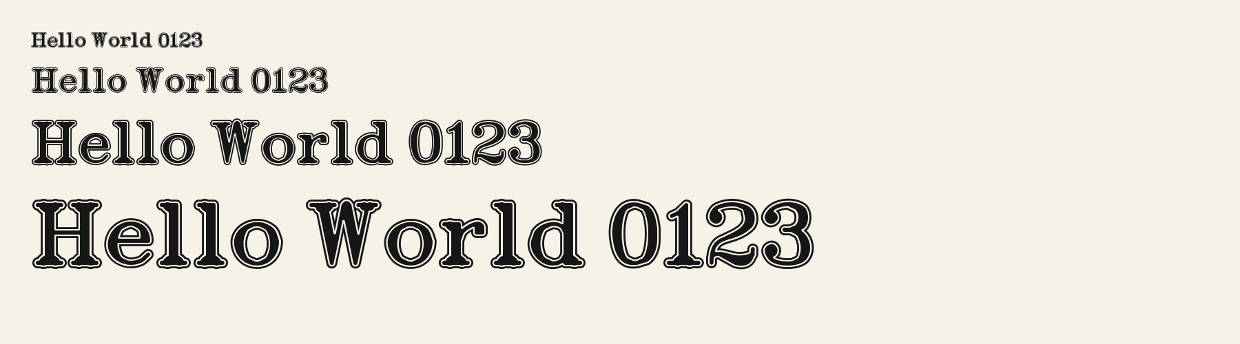
Alumni Roman wraps heavy slab-serif strokes in a separate dark ring. The white channel follows the triangular A, the bowl of R and both loops of g, so reducing the lettering compresses more detail than a solid varsity face would.
Also available as: Alumni Roman 3D
Aa
agRS&
Direction
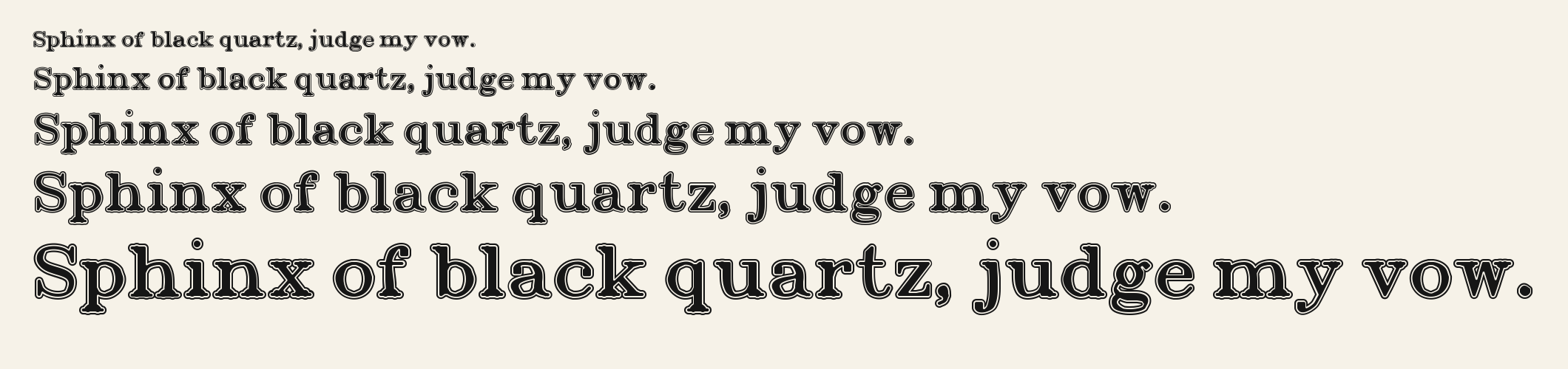
The five steps keep the outlined A, R and g in one proof. At the larger settings the separate rim and slab feet become easier to inspect.
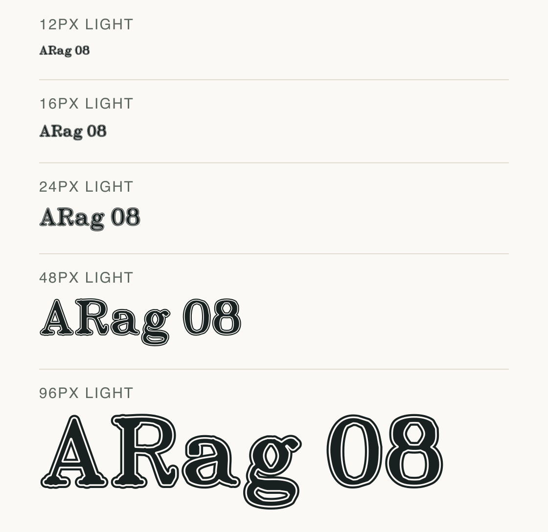
The same word and sizes are reversed here. Watch the thin dark channel inside the pale lettering, particularly around the g loop.
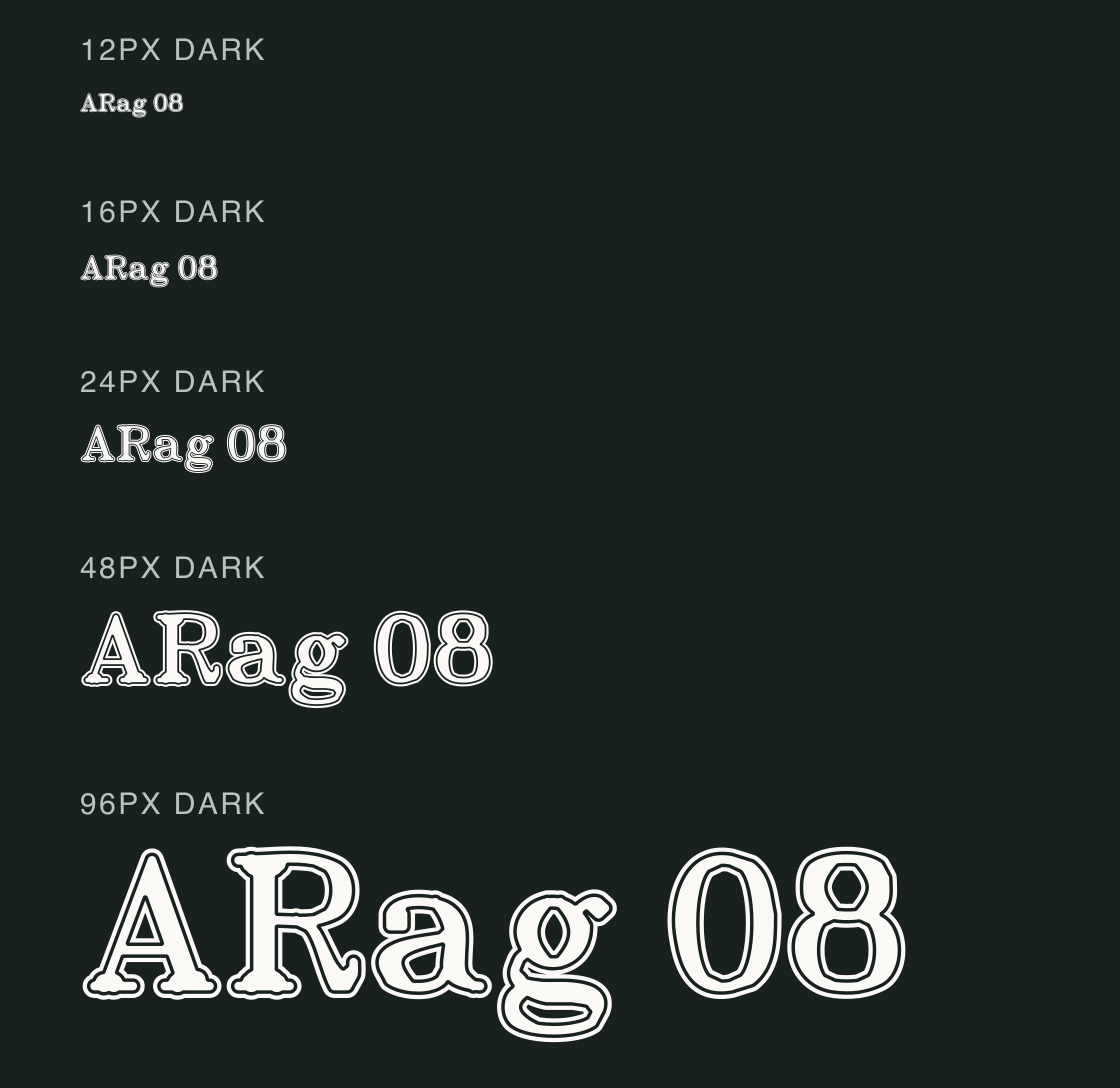
Start with the 48px or 96px proof for a short name, then inspect the full word at its intended viewing size.
The small proofs still show a serif silhouette, but the ring and counters are more crowded. These are preview comparisons, not a tested minimum for every screen or printing process.
Each linked font has its own download access.
Test
Type the words you plan to use and adjust size, line height, and letter spacing. The preview uses the final font file.
The quick brown fox jumps over the lazy dog
Like how it sets? It comes with Pro or Studio, or as a Font Pass pick for personal projects.
Get this fontSpecimens
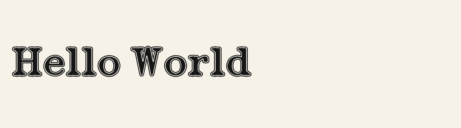
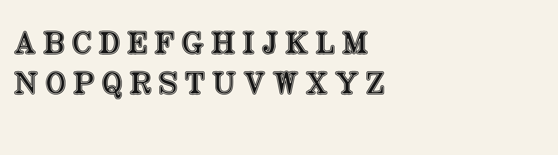
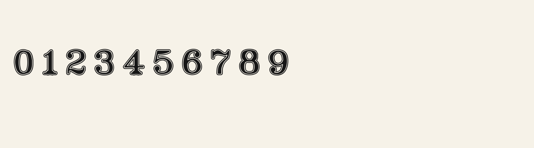
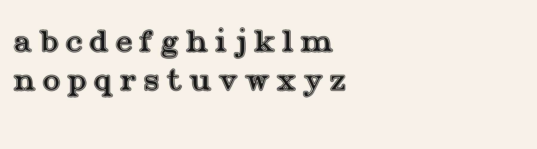
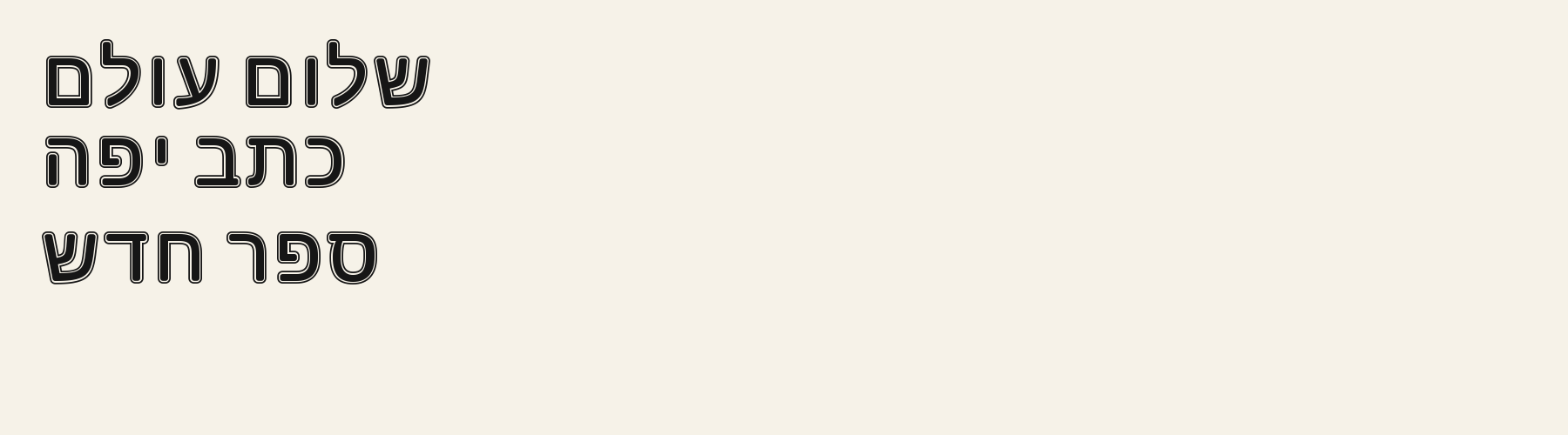
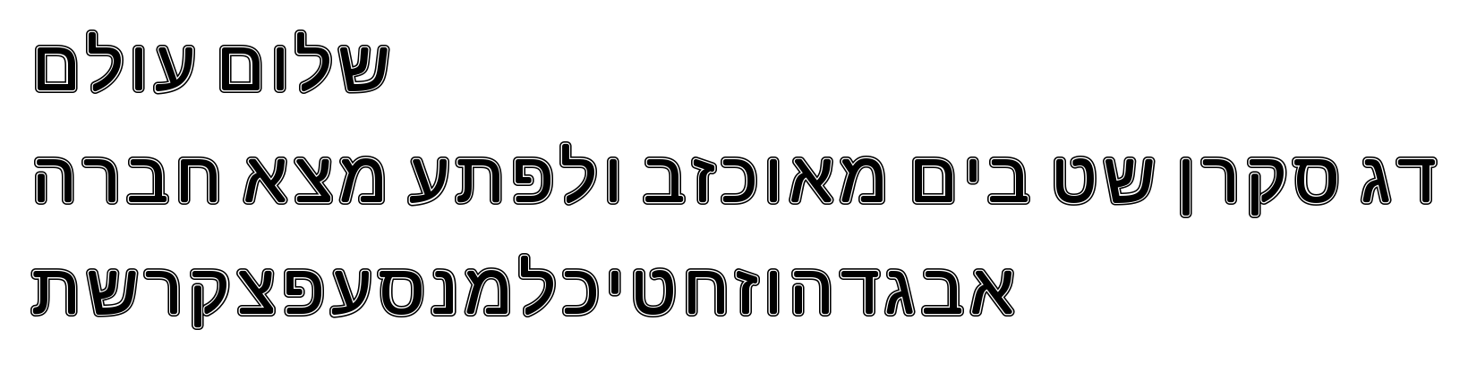
Rendered from the font files, without retouching.
Choose
A has a broad foot and a pointed triangular opening.
R turns from a rounded bowl into a sweeping leg.
The two-storey g repeats the surrounding ring around its descending loop.
Good for
Try short reunion headings or team names where the outlined slab shapes have room to separate.
Check before using
Reserve dense schedules and small captions for a simpler companion; the narrow white channel is part of the letterform and cannot be widened with tracking.
About
Its x-height is 72.5% of the cap height, near the 72.5% typical of display fonts in the library. Ascenders on b, d, h, k and l line up with the capitals (100% of their height), and descenders on g, j, p, q and y drop 27.4% of the cap height below the baseline. The o is close to a circle, 1.05 times as wide as it is tall, and M and W are the widest capitals, at 1.08 times the width of H. The O tops out level with H and stands 1% above the baseline.
Each solid letter is ringed by an outline with a clear gap between them, as on college lettering.
Its 175 characters include 105 Latin and 27 Hebrew letters, plus 43 figures, punctuation marks and symbols; 53 of the Latin letters are accented or special forms beyond A to Z. The word space measures 29.6% of the cap height, and the blank space either side of a lowercase letter takes up 5% of its width. Spacing is adjusted with 288 kerning pairs, the most of all 1 display fonts. The tightest of them is VA, which closes up by 26.3% of the cap height. Its OpenType tables also hold ligatures (liga, dlig). The figures have different widths, so columns of numbers set in Alumni Roman will not line up exactly.
Measured from the version 0.1.3 font file. Comparisons are with the 1 published library fonts measured on November 17, 2026, 1 of them display fonts.
דג סקרן שט בים מאוכזב ולפתע מצא חברה
Ons sê dankie vir die mooi weer en die rooi wyn.
Zhvillimi i gjuhës shqipe është një çështje e rëndësishme.
Magandang umaga sa inyong lahat.
Quel vituperabile xenofobo zelante assaggia il whisky ed esclama: alleluja!
Selamat pagi, apa khabar hari ini?
À noite, vovô Kowalsky vê o ímã cair no pé do pinguim queixoso.
El veloz murciélago hindú comía feliz cardillo y kiwi.
Habari za asubuhi, karibu nyumbani.
Flygande bäckasiner söka hwila på mjuka tuvor.
Characters
Download
Choose the license that matches your project before downloading.
See plans or browse fonts that are free to download.
Client work, products and redistribution need a commercial license. Library fonts include it with Pro or Studio; fonts you make include it when you make them on Pro or Studio. A Font Pass is for personal projects.
TTF · OTF · WOFF · WOFF2
Tools
Free tools that run in your browser. Images you make with them, such as a signature PNG, can be used for any purpose.
Similar
Display1 style17 languages
Compared with Alumni Roman: Heavier strokes · plain letters
Display1 style18 languages
Compared with Alumni Roman: 37% wider · plain letters
Display1 style17 languages
Compared with Alumni Roman: Heavier strokes · plain letters
Display1 style17 languages
Compared with Alumni Roman: Heavier strokes · plain letters
Method
Local font files were read to check character mappings and shaped outlines. AI assisted the observations and example compositions. The images use the named font files without substituted specimen glyphs; their hashes and versions are recorded for an independent check. Preview settings are illustrative, and file measurements come from the delivered bytes.
FAQ