How to Choose a Font for Blocky Letters in Headings
Choose a font for blocky letters by comparing square shapes, heavy strokes and slab serifs, then checking your heading's spacing, fit and license.
- Display Fonts
- Font Selection
- Font Licensing
On this page
The distinction between unjoined handwriting, drawn lettering and an editable typed heading is clear. They serve different tasks: block letters, whether individual or printed by hand, are essentially forms of handwritten script, with the difference being that practice printables are designed to be used as printable materials for learning how to write them correctly, rather than being intended to look attractive. On the other hand, you’ll often see headings created with fonts; these files contain all the information necessary to render the font, from top to bottom. The question then becomes which one to use when trying to create something more stylized, such as Hull Block.
Hull Block is a paid downloadable font file that includes TTF (TrueType), OTF (OpenType), WOFF (Web OpenFont Format) and WOFF2 files. Choose the license that matches your project before downloading it from the Hull Block page. In this case, we’re interested in how to best choose fonts that appear blocky within your design. Let’s explore what makes a blocky letter, how to test it and what options exist.
What Makes Blocky Letters
There are many choices when selecting a font with blocky appearance, such as square geometry, stroke weight and slab-serif construction. Some may provide further variation based on width, height, sharp or rounded endings, and upright or slanted axes.
For instance, a typical blocky font has wide, square shapes, with broad rectangular capitals and a strong, nearly uniform stroke throughout. Other options allow for slightly wider or narrower letters, depending upon the desired effect. Taller or shorter proportions also play a role, allowing for lighter or heavier strokes to add additional visual impact. A blocky font can be sans serif or have a slab serif construction, where the serifs are thick, almost like blocks, to give it that extra punch. This gives Rockwell that classic blunt, angular terminal shape at the end of its letters. If instead you prefer rounded terminals at the ends of a blocky font, then Courier may be the one to consider. To test Hull Block, enter your exact heading in its tester at the intended size; you can adjust line height and letter spacing using the final font file. Before choosing it, use the supplied specimen to inspect the A counter, broad M and R leg.
In addition, the way the actual letters are formed adds another layer to the design possibilities. Straight edges with curves at the top or bottom of the letterform offer different optical gaps, while diagonals may also be added. When testing the spacing of your chosen blocky font, remember that equal measured spaces do not always translate into equal apparent spaces. Instead, the hand-lettering principle is applied here: just because two letters have the same number of spaces between them doesn’t mean they should look equal.
Test Heading Fit and Orientation
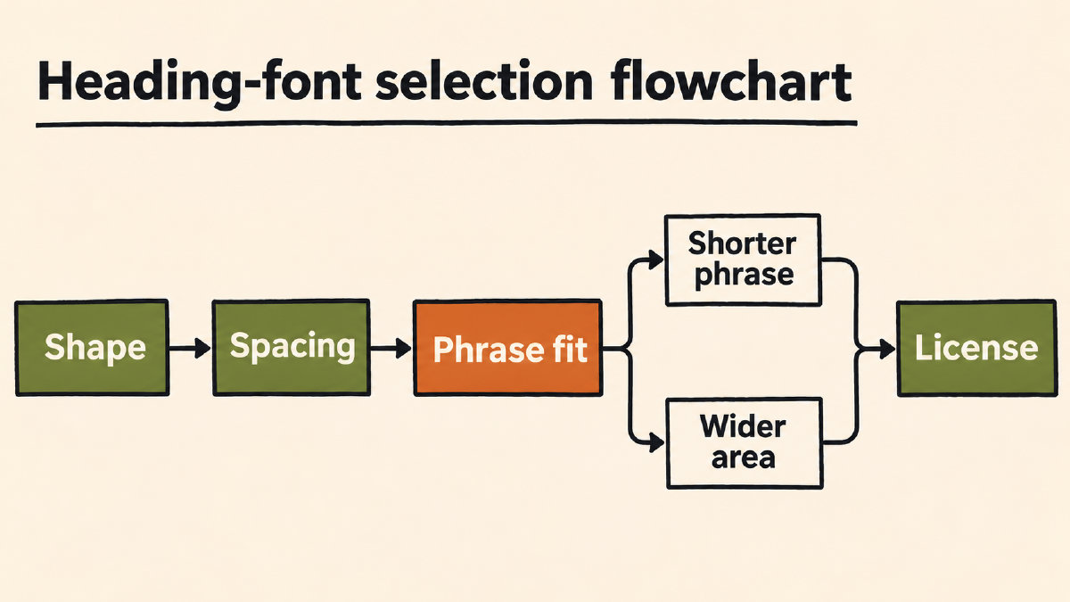
You’ll need to test the phrase fit across the whole heading. In this case, I’ve used the documented screen layout to explain when a shorter phrase is needed or a wider area. The broad capitals occupy most of the width quickly, but the documented sleeve layout needs two lines; a single-line treatment would need a shorter phrase or a wider area. We’ve done our documentation of screen preview settings and only performed the screen layout preflight.
If vertical setting is suitable for your short text, then balancing its layout possibilities against the readability problems long or unfamiliar stacked words present could help. For example, the Bungee font was designed to accommodate both horizontal and vertical text, though its use in vertical layout presents a number of readability issues for long or unfamiliar words. One possible solution is changing orientation and simply rotating a line of text so it reads vertically down the page.
Check Font Permissions and Licensing
When choosing any font, it is important to check permissions for the named font and acquisition route. These are separate from the personal use or commercial licensing you might purchase. SIL’s Open Font License means Bungee is free, and open-source. However, Hull Block is included with the Pro and Studio plans under a commercial license that continues after the plan ends. If you are planning to use Hull Block, there’s also the option of purchasing a Hull Block Font Pass, one of five fonts available for personal use. It’s important to note that permission to use each font is specific to that font, and the method of acquiring the font will determine the appropriate license.
Sources
More in Font Guides
- What the Pilcrow Sign Means and How to Use It in TextThe pilcrow sign (¶) identifies a paragraph. Learn how it differs from §, how to insert it on Mac, and what it means in Word.
- How to Choose Number Fonts for Prices, Dates and LabelsChoose number fonts for prices, dates and labels by previewing your text, checking symbols and comparing available numeral styles.
- How to Choose Letter I Fonts for Initials and Short TextChoose letter I fonts by comparing uppercase I, lowercase i, l and 1, previewing your full text, and separating font files from Unicode symbols.