
How to Choose Number Fonts for Prices, Dates and Labels
Choose number fonts for prices, dates and labels by previewing your text, checking symbols and comparing available numeral styles.
- Font Selection
- Numeral Typography
On this page
In our first example of choosing the right font to use in your project, we’re going to look at some number fonts: those that will help with pricing labels, dates, and time markers. The idea is that you can choose a styled character set for copying and pasting or install an entire font on your system so that you have all the tools necessary to produce your design.
Styled characters versus installing a font
The first choice is between what we might call “styled characters” (e.g., Unicode symbols) versus installing an actual font. In either case, you’ll be able to preview the results of each option as part of this process, though I’d suggest trying them both out.
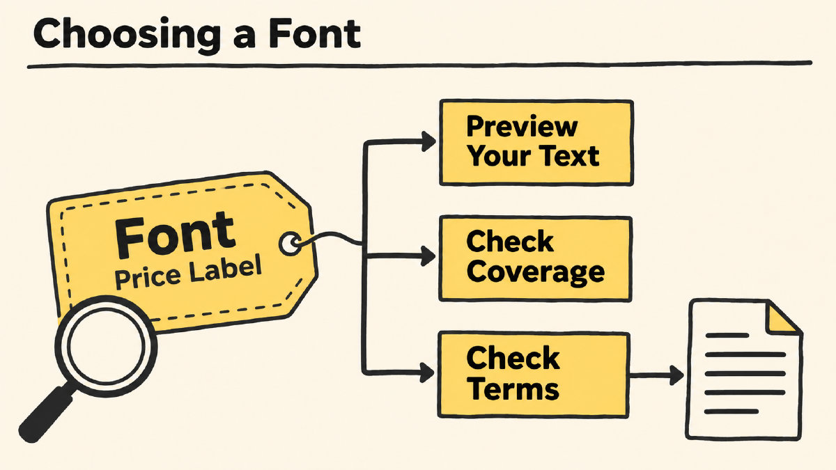
You can compare your candidates side by side by using the same text from your project — just a few numbers here and there — and inspect how the digits look in relation to one another and the punctuation. You may not want the numbers to match exactly with one another if it’s part of a larger design, but they should look consistent enough.
If you use the AIFontGen library, you can even create custom-text previews. For instance, I’ve used these two examples:
0123456789
$19.99
These examples are not meant to cover all characters, nor to guarantee complete coverage of the characters that your application might require, such as prices ($19.99), dates (2026), and time labels (08:08).
Lining and oldstyle figures
When comparing the figures themselves, you’ll need to decide whether lining figures, which align along the top of other letters, are better suited to all-capital text, while oldstyle figures appear in normal mixed-case text. Microsoft OpenType documentation explicitly notes that lining figures fit better with all-capital text, and it makes sense that you’d use oldstyle figures for most text and lining figures when you’re creating a header. Oldstyle figures don’t typically sit higher than other capital letters, so they make more sense when combined with other text. Lining figures, on the other hand, sit alongside all caps and work well in headers.
Choosing a figure style leaves you free to pick a width setting. You’ll probably need to check the font’s documentation and that of your application to determine whether proportional or tabular options are available, if any. Inlining and oldstyle are simply styles; pnum refers to proportional figure-width feature, while tnum refers to tabular. The OpenType standard defines the term “figure style” as distinct from figure width, according to Adobe.
Check character coverage and terms
Finally, once you’ve turned your preferred preview into a font-specific coverage and terms check against the project’s complete character requirements, you won’t want to treat appearance or a style name as proof that a particular font is suitable. Always verify that the individual font page covers all the required digits and that all the currency signs you need are included as well as any separators that might be needed.
Sources
More in Font Guides
- What the Pilcrow Sign Means and How to Use It in TextThe pilcrow sign (¶) identifies a paragraph. Learn how it differs from §, how to insert it on Mac, and what it means in Word.
- How to Choose a Font for Blocky Letters in HeadingsChoose a font for blocky letters by comparing square shapes, heavy strokes and slab serifs, then checking your heading's spacing, fit and license.
- How to Choose Letter I Fonts for Initials and Short TextChoose letter I fonts by comparing uppercase I, lowercase i, l and 1, previewing your full text, and separating font files from Unicode symbols.