How to Choose Letter I Fonts for Initials and Short Text
Choose letter I fonts by comparing uppercase I, lowercase i, l and 1, previewing your full text, and separating font files from Unicode symbols.
- Font Selection
- Letterform Readability
On this page
When you’re choosing a font that will be used for initials, or short text like a title, label, or heading, it’s easy to overlook the fact that each of those fonts may render your letter “I” differently. It might seem insignificant at first, but when you start looking closely, there are quite a few differences between how various fonts render an “I.” Some look more stylized than others, and some may even appear quite different from one another.
If you’re not careful, you can end up selecting a font that looks great in general, but fails completely on this particular letter. So how do you choose? Here are five steps to help you find the right font for your project.
Step 1: Know the difference between choosing a typeface and copying a styled character
It’s very important to understand the difference between choosing a typeface (i.e., selecting a font) and copying a styled character. For example, if you search for “letter I fonts,” you’ll get many results that display what is called a “styled character.” In other words, they are not actually using the letter “I” as part of their font file. Instead, they’re using a separate Unicode character (like 𝐈, 𝓘, or ℑ) which has been styled separately and then copied into a graphic. These aren’t downloadable-font specimens showing you how the letter “I” would be rendered by a specific font.
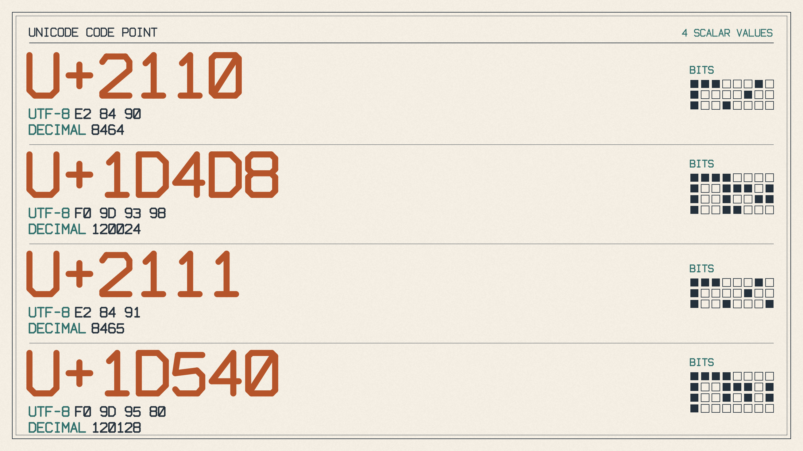
The point is, these styled characters don’t represent the actual rendering of the letter “I” by a specific font. They’re just copies of someone else’s stylized version of the letter “I.” And while they may give you an idea of what you’re looking for, they’re not a good representation of how a font will render the letter “I.”
So instead, when you’re browsing fonts, look at them in ordinary text rather than fancy Unicode versions of letters. This way, you’ll see how the actual letter “I” will be rendered in the font. Keep in mind that copied special characters need rendering support to display properly. Unicode also discourages using mathematical styled characters as substitutes for styling ordinary text.
Step 2: Use serif and sans serif as initial browsing categories
Start with a category such as serif or sans serif. Then move through script or cursive for connected lettering, or decorative or blackletter for detailed display work. Keep in mind that these are starting points only — there’s no guarantee that any given font will have a particular shape for its “I” or “i.”
But if you’re going for something with a bit of flair, you might want to look through a cursive collection, since the joins, loops, and slant can make a big difference in appearance. And if you’re making titles, labels, or ceremonial graphics, you might want to look through a decorative collection and see what kind of Gothic, blackletter, uncial, or Art Nouveau details appeal to you.
Step 3: Check uppercase and lowercase separately
When judging a font, it’s always important to check both uppercase and lowercase, especially when the name contains both. The reason for this is because an appealing capital “I” doesn’t necessarily mean that the lowercase “i” will be equally appealing.
Of course, you can’t judge the lowercase based solely on the uppercase. So when you’re looking for a font, inspect both the uppercase and lowercase separately. Make sure to match the preview to the case you’ll use in your project. And when you’re comparing fonts, make sure to compare the actual initials or complete name in each candidate.
Step 4: Compare potentially confusable characters
This is where things can get tricky. You’ll often find that the most visually appealing font for your project will also contain some potentially confusable characters. That means that if you’re going to use a font that renders your letter “I” beautifully, you might have to put up with some other characters that could confuse readers.
One way to handle this is to create a visual comparison of all of the potentially confusable characters. Start by displaying them all in a shared preview: I, i, l, and 1. Look for bars, dots, feet, hooks, and differences in stroke shape where they’re present.
Then, move to the complete name at the intended size and judge the visible distinctions:
Finally, you can use an editorial selection exercise to determine whether or not the font is suitable for your project. But keep in mind that this is a subjective process, so the final decision should rest on your own visual judgment rather than on measured readability results or family-wide readability rankings.
Step 5: Turn the shortlist into a project-specific choice
Once you’ve got a shortlist of fonts that look great for your project, it’s time to turn that list into a project-specific choice. The best way to do this is to perform a side-by-side comparison of the complete wording.
In addition to checking the complete wording, you should also check the cursive joins, loops, and slant at the intended size. Finally, before making your final selection, be sure to check the individual font page to confirm coverage and terms.
Sources
More in Font Guides
- What the Pilcrow Sign Means and How to Use It in TextThe pilcrow sign (¶) identifies a paragraph. Learn how it differs from §, how to insert it on Mac, and what it means in Word.
- How to Choose Number Fonts for Prices, Dates and LabelsChoose number fonts for prices, dates and labels by previewing your text, checking symbols and comparing available numeral styles.
- How to Choose a Font for Blocky Letters in HeadingsChoose a font for blocky letters by comparing square shapes, heavy strokes and slab serifs, then checking your heading's spacing, fit and license.