
Bubble Confetti Round
Display1 style17 languages
Pro · plan or Pass
H S $ I O a
Display · 1 style · 342 characters · Version 0.1.3 · Published November 5, 2026
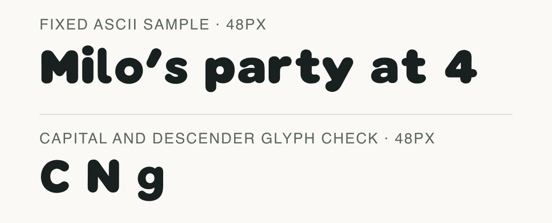
Bubble Pebble Sans uses continuous, low-contrast strokes with mild changes around rounded bowls. The fixed ASCII sample "Milo's party at 4" shows its lowercase rhythm, while the glyph plate makes the capital and descender forms available for checking.
Aa
HS$IOa
Direction
Test the exact text you plan to use and treat accented combinations as a separate check.
The exact ASCII string "Milo's party at 4" is a public example, not a user submission. The direct mappings and shaped run are recorded for this exact local font file.
All 17 code points in the ASCII example are mapped; the shaped run contains no .notdef glyph and has an advance of 9.291em. The added glyph row displays C, N and g separately for outline inspection. Accented or decomposed text needs its own check.
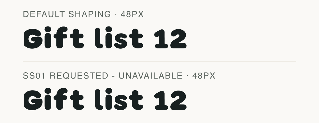
The default mapped line is the available path for this file. An ss01 request is shown only to make the absent alternate feature explicit.
The file scan found no OpenType feature tags, and no alternate glyph path is available. Both rows therefore represent the same default shapes; this is not a working stylistic-set control.
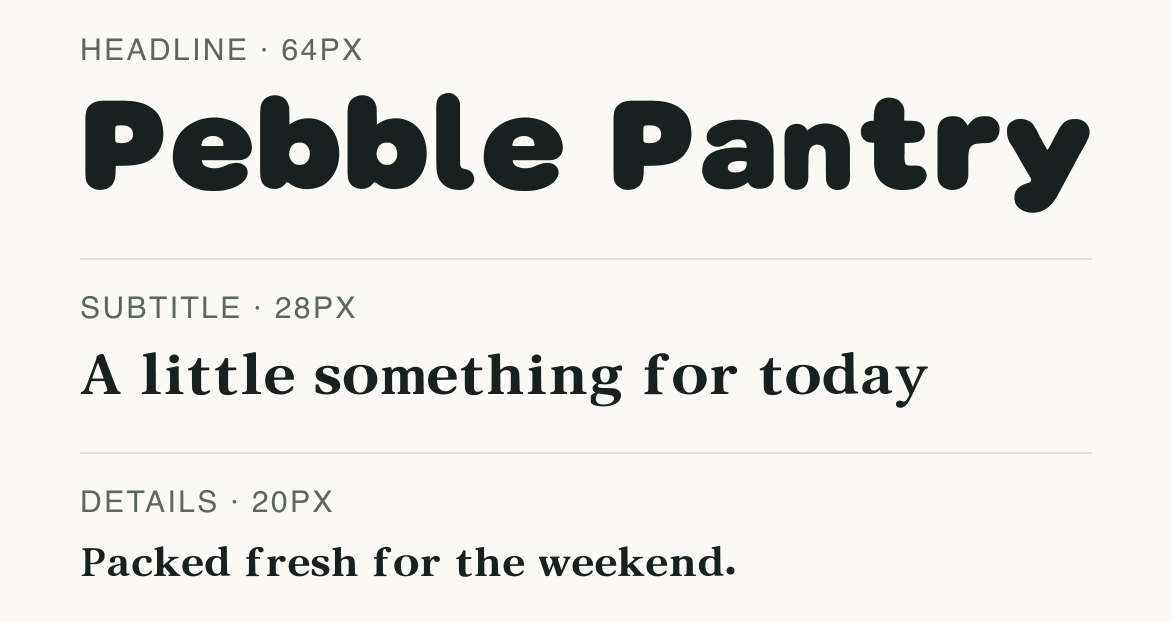
Bubble Pebble Sans keeps the heading warm without added ornaments. Serif Book Warm gives the supporting line a clear change of structure.
Test
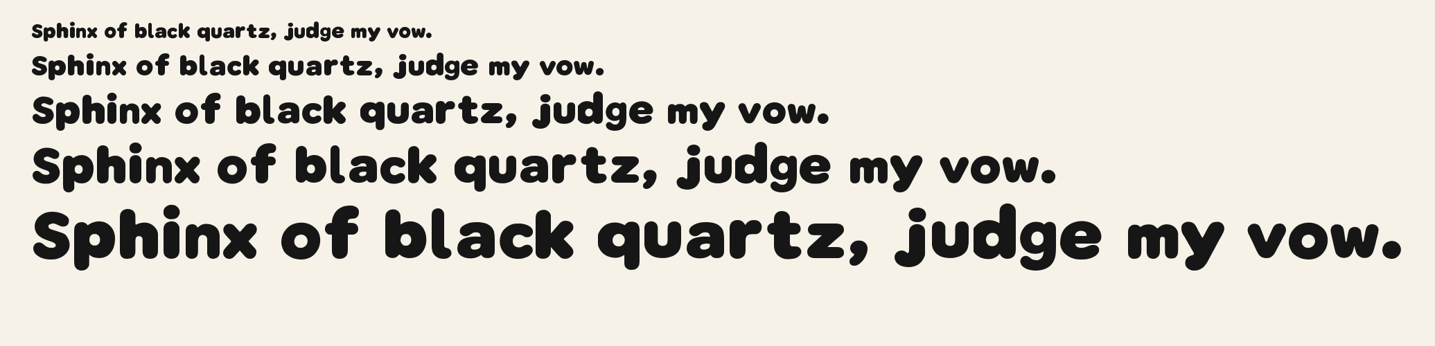
Type the words you plan to use and adjust size, line height, and letter spacing. The preview uses the final font file.
The quick brown fox jumps over the lazy dog
Like how it sets? It comes with Pro or Studio, or as a Font Pass pick for personal projects.
Get this fontSpecimens
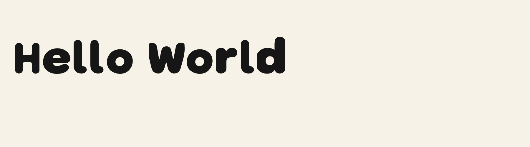
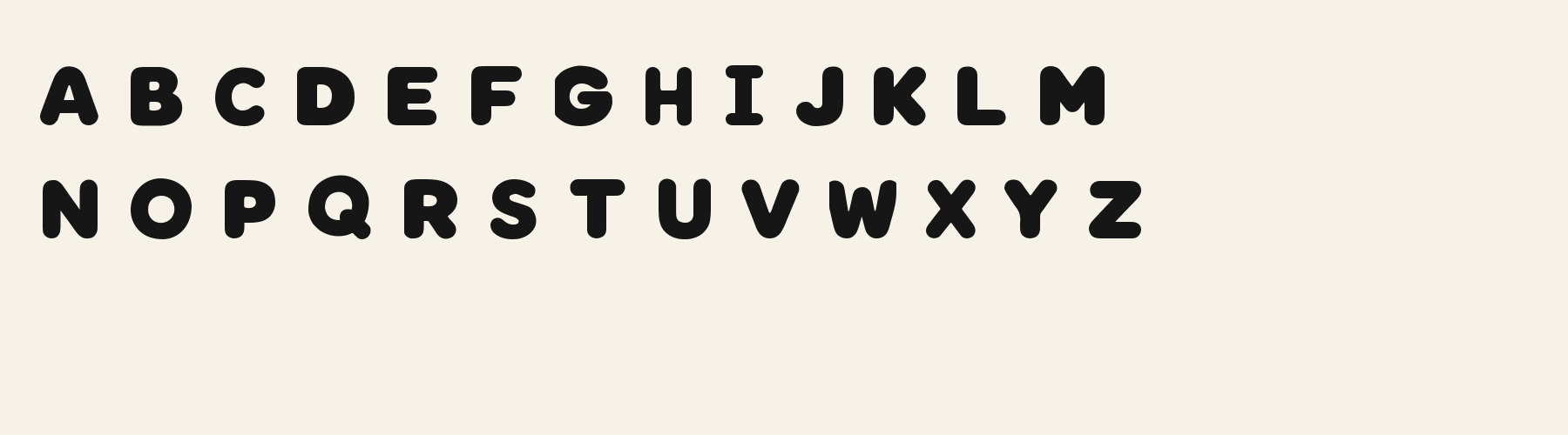
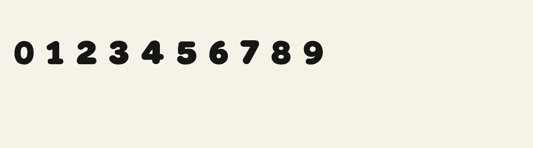
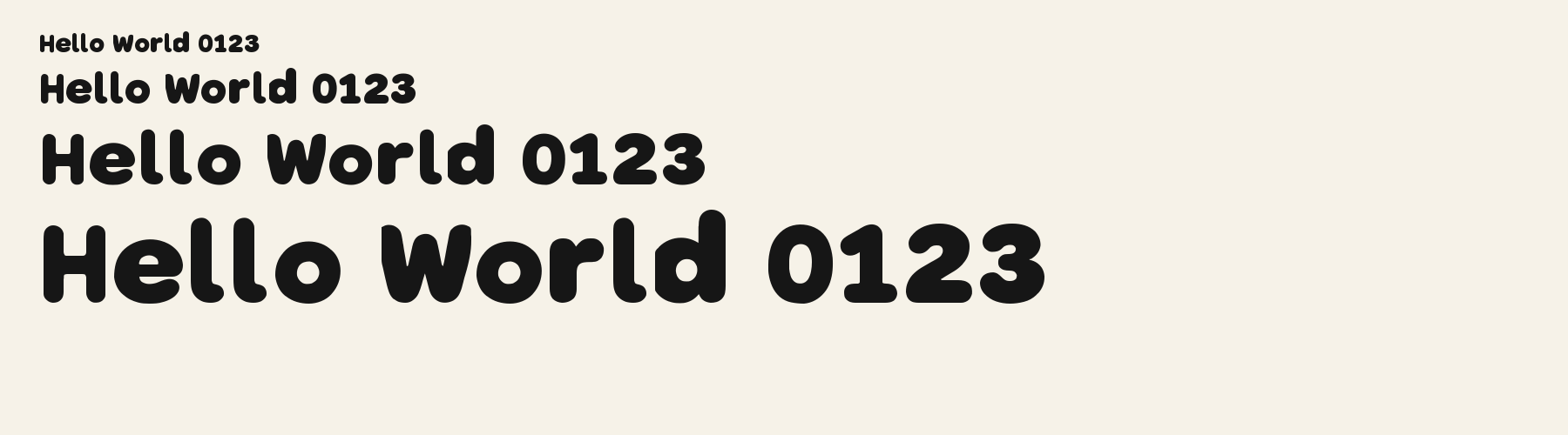
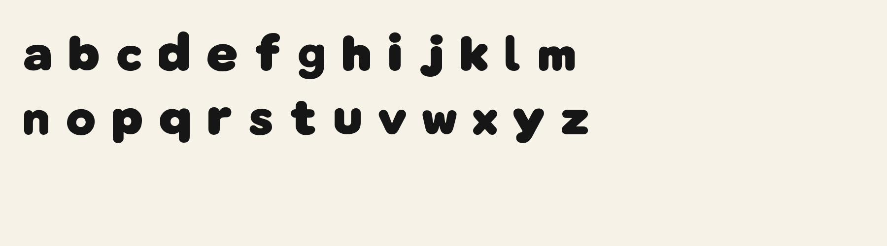
Rendered from the font files, without retouching.
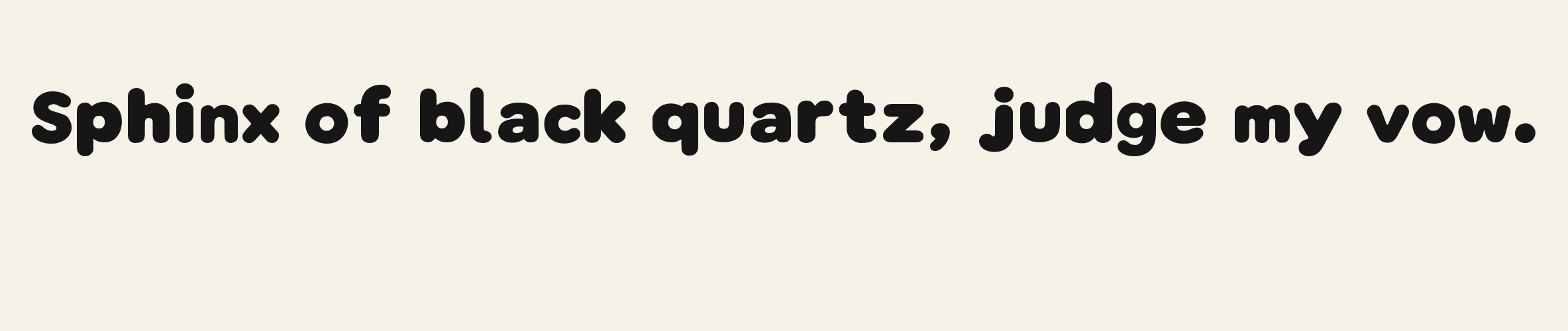
Choose
The added C sample keeps an open aperture.
The added N sample has a full diagonal joining its uprights.
The added lowercase g has a true descender in the glyph plate.
Good for
Use the face for short packaging copy or names when a rounded sans is wanted without attached icons or outline effects.
Check before using
This check covers a bounded ASCII sample only. It does not establish every language, accent sequence or user-entered string.
About
Bubble Pebble Sans's lowercase x reaches 75.3% of the capital height, close to the 75.3% median for display fonts. Ascenders on b, d, h, k and l rise 7.2% above the capitals, and descenders on g, j, p, q and y drop 25.3% of the cap height below the baseline. The o is close to a circle, 1.05 times as wide as it is tall, and M is the widest capital, at 1.34 times the width of H. Round letters overshoot: O rises 2.2% of the cap height above H and dips 1.1% below the baseline.
The letters stand upright, leaning less than 2.5° either way. Vertical stems measure 26.5% of the cap height. It is close to monoline, with the sides of o and O 1.06 times as thick as their tops and bottoms.
Its 341 characters include 298 Latin letters, plus 43 figures, punctuation marks and symbols; 246 of the Latin letters are accented or special forms beyond A to Z. The word space measures 45.9% of the cap height, and the blank space either side of a lowercase letter takes up 11.4% of its width. The font carries no kerning, so spacing comes from each letter’s own side bearings. The figures have different widths, so columns of numbers set in Bubble Pebble Sans will not line up exactly.
Measured from the version 0.1.3 font file. Comparisons are with the 1 published library fonts measured on November 4, 2026, 1 of them display fonts.
Characters
Showing the first 240 of 246 mapped characters in this group.
Download
Choose the license that matches your project before downloading.
See plans or browse fonts that are free to download.
Client work, products and redistribution need a commercial license. Library fonts include it with Pro or Studio; fonts you make include it when you make them on Pro or Studio. A Font Pass is for personal projects.
TTF · OTF · WOFF · WOFF2
Tools
Free tools that run in your browser. Images you make with them, such as a signature PNG, can be used for any purpose.
Similar
Display1 style17 languages
Display1 style17 languages
Compared with Bubble Pebble Sans: 16% narrower · lighter strokes
Display1 style30 languages
Compared with Bubble Pebble Sans: Lighter strokes · lower x-height
Display1 style30 languages
Compared with Bubble Pebble Sans: 13% narrower · lighter strokes
Method
AI assisted the observations and sample compositions. The examples use the named font files; measurements describe the supplied font files, and preview settings are illustrative.
The current text and font-file specimens received an independent review.
Bubble Pillow Square is another solid roundcap option for a short party title. The exact “PARTY TIME!” line takes 6.802 em there and 6.968 em here; the alternative saves some line width without using an outline effect.
Bubble Ribbon Knot keeps the heavy rounded silhouette while giving the lowercase g a broad, low curved tail. That g advances 0.591 em against 0.600 em here, so the contour matters more than the small width difference.
FAQ