What It Means to Kern Text and How to Judge Letter Spacing
Learn what it means to kern text, how to spot uneven letter pairs, and when to increase or reduce spacing in a heading or logo.
- Kerning
- Typography
On this page
Kerning is an important part of typography, but it’s one of the more confusing topics. This article explains what kerning is, how to adjust text, and how to judge spacing between letters.
Kerning is when you adjust two letters to change the space between them. But there are several different ways that this can be done — which leads to some confusion over what exactly kerning is. In general, though, we usually refer to “kerning” as making adjustments between individual pairs of glyphs. However, in practice, we’ll also make adjustments for groups of multiple characters (such as a logo or heading) that appear together.
The distinction between kerning and spacing
When we talk about adjusting text spacing, we’re referring to the amount of whitespace between characters: each glyph’s left and right sidebearings help determine that space. Adjusting those sidebearings is what is known as spacing. Sometimes, spacing may seem uneven or too open/closed, even after all the pairs have been adjusted. To judge whether spacing is appropriate, check how nearby characters look.
This brings up an important distinction between kerning and spacing. Kerning refers to adjusting the spacing between pairs of letters. For example, a pair such as VA might be slightly optimized by reducing the amount of white space between them. If you do not want to change the spacing for V and A individually, then you’ll need to use kerning to close the gap between them. Otherwise, they will look like they’ve been placed too far apart from each other.
If you reduce the amount of whitespace between V and A, however, you might find that the V appears to be spaced closer to its neighbors than A does. In that case, it may be necessary to add additional space between V and its neighboring glyph. The problem with spacing adjustment is that you need to ensure that the entire text block appears consistent and readable.
How to judge letter spacing
Once you’ve made your initial adjustments, there are two methods to judge spacing: looking at the actual space between two specific letters or considering how nearby letters look. The first method works best if you have an eye for subtle differences. The second is often used by experienced designers who are able to determine visually if something is off. Either way, it helps you identify problems and adjust the text accordingly.
In the Glyphs tutorial’s VAND example, the V and A have optimized sidebearings. However, the remaining space between the two appears excessive, creating an awkward visual imbalance. That means that there should probably be less space between these two letters.
In most cases, I’ve found that using the second method is easiest. By comparing how surrounding letters look, you can quickly see if anything’s wrong.
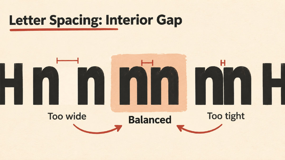
The first headline has very little unnecessary space between the Ns and Hs. If I zoom in on the second one, you can see that there is more white space between the Hs than there is between the Ns.
Adjusting text manually
Sometimes, you’ll need to bring two letters closer together if their spacing appears to be excessive. If they collide, then you need to move them further apart instead.
As with everything else, the correction you apply depends upon the particular pair of letters. Some pairs require negative kerning (reduced space) while others require positive kerning (added space). Most fonts offer a number of pre-adjusted pairs, but many font developers provide tools for adding custom adjustments. If you have the opportunity to review a typeface before it is released, you’ll want to look for these options so you can choose the spacing for your project.
Judging headings and logos
Finally, if you are designing a heading or a logo, you’ll want to ensure that your spacing looks good at the size it will actually appear. There’s a tendency to overkern (i.e., reduce the space between characters), especially when you magnify text, but that’s not always a bad thing. What’s important is that your design has a good rhythm to it. If the spacing looks off, it will likely appear off at the intended font size as well. Keeping an unkerned reference pair nearby can help you judge that rhythm and avoid overkerning.
Sources
More in Font Guides
- What the Pilcrow Sign Means and How to Use It in TextThe pilcrow sign (¶) identifies a paragraph. Learn how it differs from §, how to insert it on Mac, and what it means in Word.
- How to Choose Number Fonts for Prices, Dates and LabelsChoose number fonts for prices, dates and labels by previewing your text, checking symbols and comparing available numeral styles.
- How to Choose a Font for Blocky Letters in HeadingsChoose a font for blocky letters by comparing square shapes, heavy strokes and slab serifs, then checking your heading's spacing, fit and license.