Brigade Wide Stencil
Stencil1 style17 languages
Pro · plan or Pass
A B O R 8 Aa
Stencil · 1 style · 160 characters · Version 0.3.3 · Published November 16, 2026
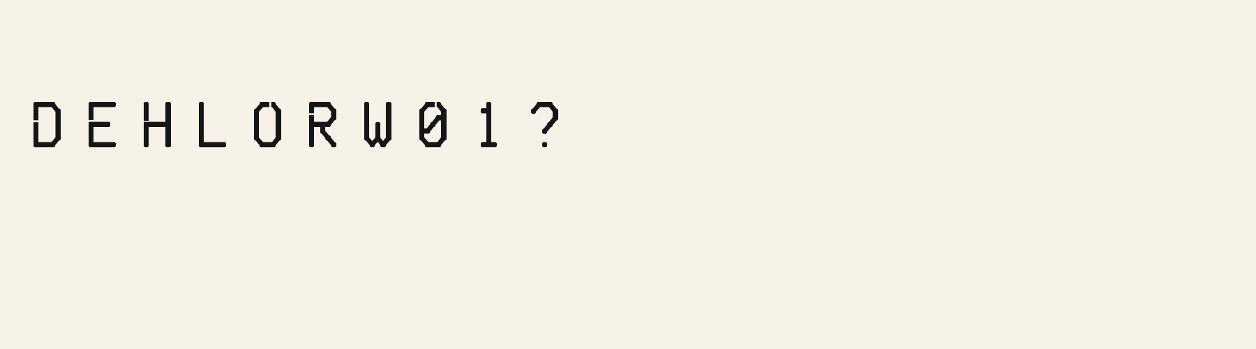
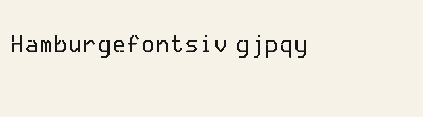
Stencil Cut Corner constructs its letters from straight segments and clipped diagonal corners. Its narrow R leg, angular g bowl and interrupted 0 make the stencil treatment visible without a heavy slab silhouette.
Aa
ABOR8
Direction
Keep the clipped headline as the visual signal, then let the smoother companion carry the location and instructions.
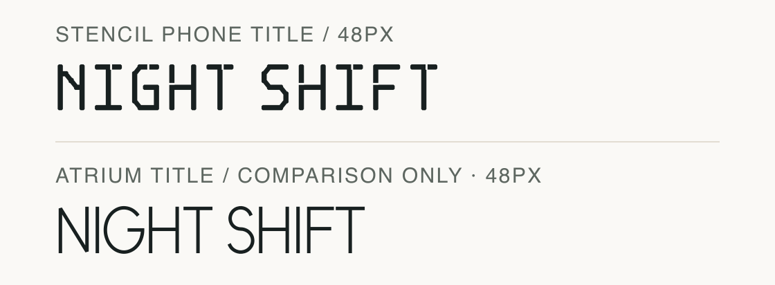
NIGHT SHIFT is shown at 48px with original spacing in both fonts. This is the proposed unbroken phone title; the 64px poster title appears in the role board.
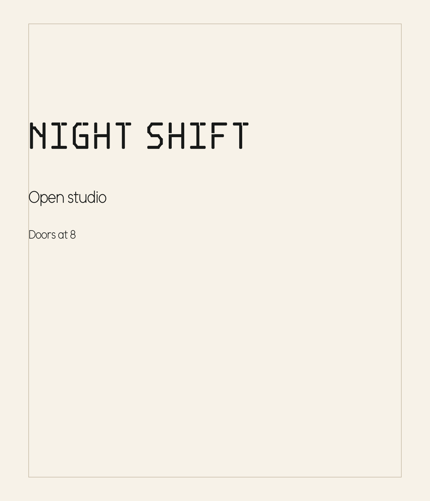
A 624px poster content width admits the Stencil Cut Corner title on one line: its shaped advance is 375.616px. A 320px phone content width does not admit that same 64px line; break at the space or use the 48px setting measured at 281.712px.
Advance is reserved horizontal space, not the outermost ink boundary. The specimen plate expands to show all outlines, so its edges are not being passed off as those content containers.
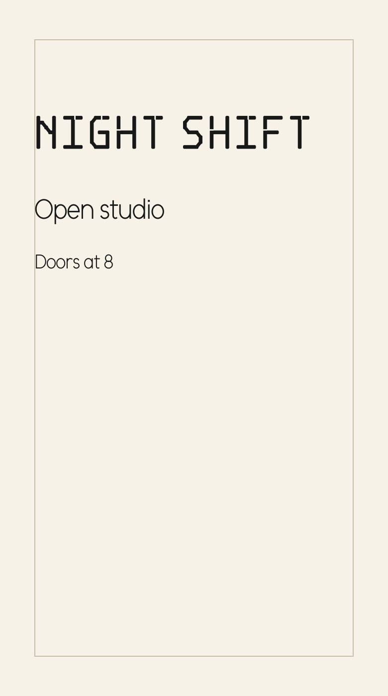
The same title, subheading and reading line appear in two defined canvases: a 720 × 840px poster and a 390 × 700px phone composition. The title changes from 64 to 48px; Atrium Sans keeps the subheading at 28px and the reading line at 20px.
The poster has a 624px content width inside 48px margins. The phone reserves 35px side margins, leaving 320px; its 48px title advances 281.712px and stays on one line. At 64px the same title would advance 375.616px, exceeding that phone budget.
The phone moves the title, subheading and reading line closer vertically: their baselines are 150, 220 and 270px, compared with 250, 340 and 400px on the poster. The visible frame marks the composition boundary. These are outline-rendered layout concepts, not browser or device screenshots.
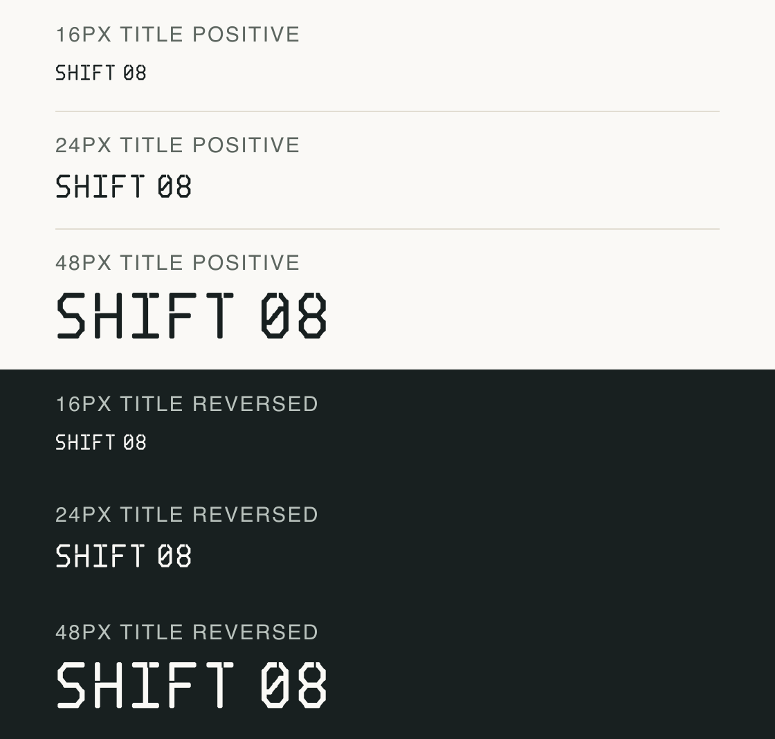
SHIFT 08 isolates the square corners and figure outlines on both grounds at 16, 24 and 48px. These stress rows complement the full title in the poster and phone recipes.
At the smallest step, the clipped contours read as a compact angular texture. The larger step separates the stencil interruptions in H and 8 more clearly; a dark ground changes their brightness without repairing the small gaps.
These 2× PNG outlines use #182020 and #faf9f6. A phone layout still needs its own browser check; this plate isolates size and polarity.
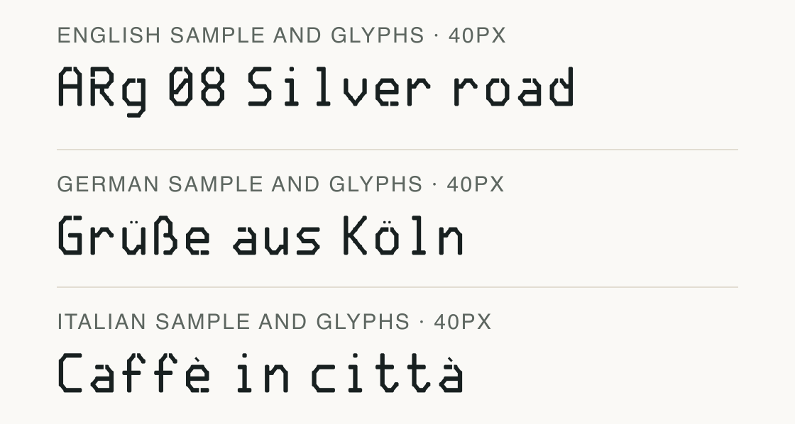
The local fixed repertoires pass for English, German, Italian, Portuguese. Passing these fixed samples does not certify every name or language variant.
Test
Type the words you plan to use and adjust size, line height, and letter spacing. The preview uses the final font file.
The quick brown fox jumps over the lazy dog
Like how it sets? It comes with Pro or Studio, or as a Font Pass pick for personal projects.
Get this fontSpecimens
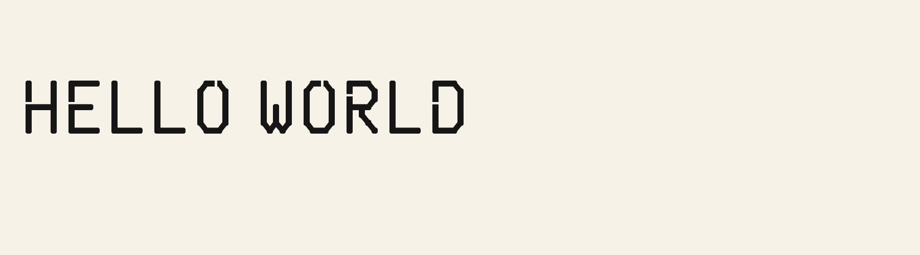
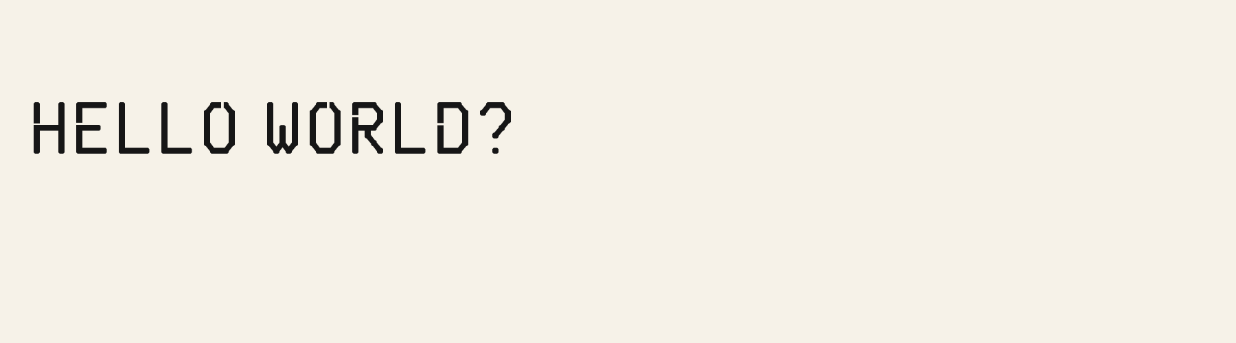
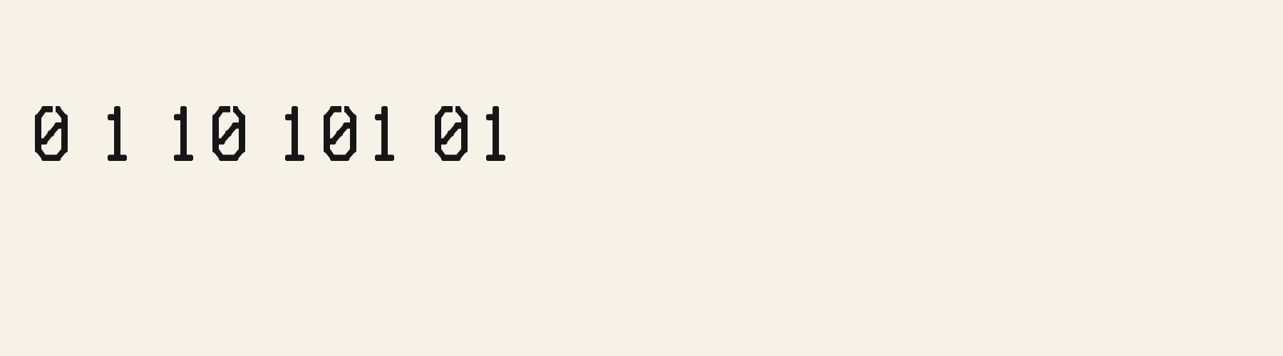
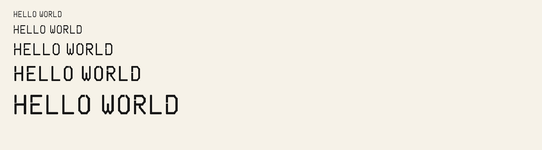
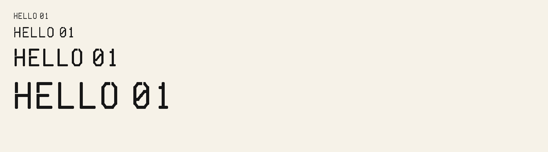
Rendered from the font files, without retouching.
Choose
A has clipped upper corners and an open interruption at the middle of its top.
The lower g descender drops straight before turning left along a short horizontal foot.
The 0 and 8 use octagonal outlines; their stencil gaps cut through otherwise continuous strokes.
Good for
Use an industrial event title with Atrium Sans carrying the explanatory copy, so the narrow segmented forms do not have to perform every reading role.
Check before using
Do not infer that these digital gaps meet a physical stencil-cutting tolerance. Check any fabrication file separately.
About
Stencil Cut Corner's lowercase x reaches 70.4% of the capital height, close to the 70.4% median for stencil fonts. Ascenders on b, d, h, k and l line up with the capitals (100% of their height), and descenders on g, j, p, q and y drop 29.6% of the cap height below the baseline. The o is an upright oval, 0.84 times as wide as it is tall, and every capital has the same width. O stands exactly as tall as H and sits on the baseline, with no overshoot.
The letters stand upright, leaning less than 2.5° either way. Vertical stems measure 11.3% of the cap height. Strokes keep one thickness in every direction: the sides of o and O measure the same as their tops and bottoms.
Its 159 characters include 116 Latin letters, plus 43 figures, punctuation marks and symbols; 64 of the Latin letters are accented or special forms beyond A to Z. The word space measures 39% of the cap height, and the blank space either side of a lowercase letter takes up 31.4% of its width. The font carries no kerning, so spacing comes from each letter’s own side bearings. All ten figures share one width, so columns of numbers line up.
Measured from the version 0.3.3 font file. Comparisons are with the 1 published library fonts measured on November 17, 2026, 1 of them stencil fonts.
Ons sê dankie vir die mooi weer en die rooi wyn.
Zhvillimi i gjuhës shqipe është një çështje e rëndësishme.
Høj bly gom vandt fræk sexquiz på wc.
Magandang umaga sa inyong lahat.
Victor jagt zwölf Boxkämpfer quer über den großen Sylter Deich.
Kæmi ný öxi hér, ykist þjófum nú bæði víl og ádrepa.
Quel vituperabile xenofobo zelante assaggia il whisky ed esclama: alleluja!
Selamat pagi, apa khabar hari ini?
À noite, vovô Kowalsky vê o ímã cair no pé do pinguim queixoso.
El veloz murciélago hindú comía feliz cardillo y kiwi.
Habari za asubuhi, karibu nyumbani.
Flygande bäckasiner söka hwila på mjuka tuvor.
Characters
Download
Choose the license that matches your project before downloading.
See plans or browse fonts that are free to download.
Client work, products and redistribution need a commercial license. Library fonts include it with Pro or Studio; fonts you make include it when you make them on Pro or Studio. A Font Pass is for personal projects.
TTF · OTF · WOFF · WOFF2
Tools
Free tools that run in your browser. Images you make with them, such as a signature PNG, can be used for any purpose.
Similar
Stencil1 style17 languages
Compared with Stencil Cut Corner: 33% wider · heavier strokes
Method
Local font files were read to check character mappings and shaped outlines. AI assisted the observations and example compositions. The images use the named font files without substituted specimen glyphs; their hashes and versions are recorded for an independent check. Preview settings are illustrative, and file measurements come from the delivered bytes.
The current text and font-file specimens received an independent review.
For R, Brigade Wide Stencil reserves 0.818 em versus 0.560 em in Stencil Cut Corner. Its wider layout space can change a short title’s line break.
Atrium Sans gives g a 0.505 em advance; here it is 0.560 em. The alternative sets that character more tightly.
FAQ